





Product Name: Phone (3)
Brand: Nothing
Category: Smartphone
Manufacturer: Nothing Technology Limited
Designer: No publicly verified individual designer has been identified for this product.
Identification Confidence: High (brand, model, category); Not Applicable (individual authorship)
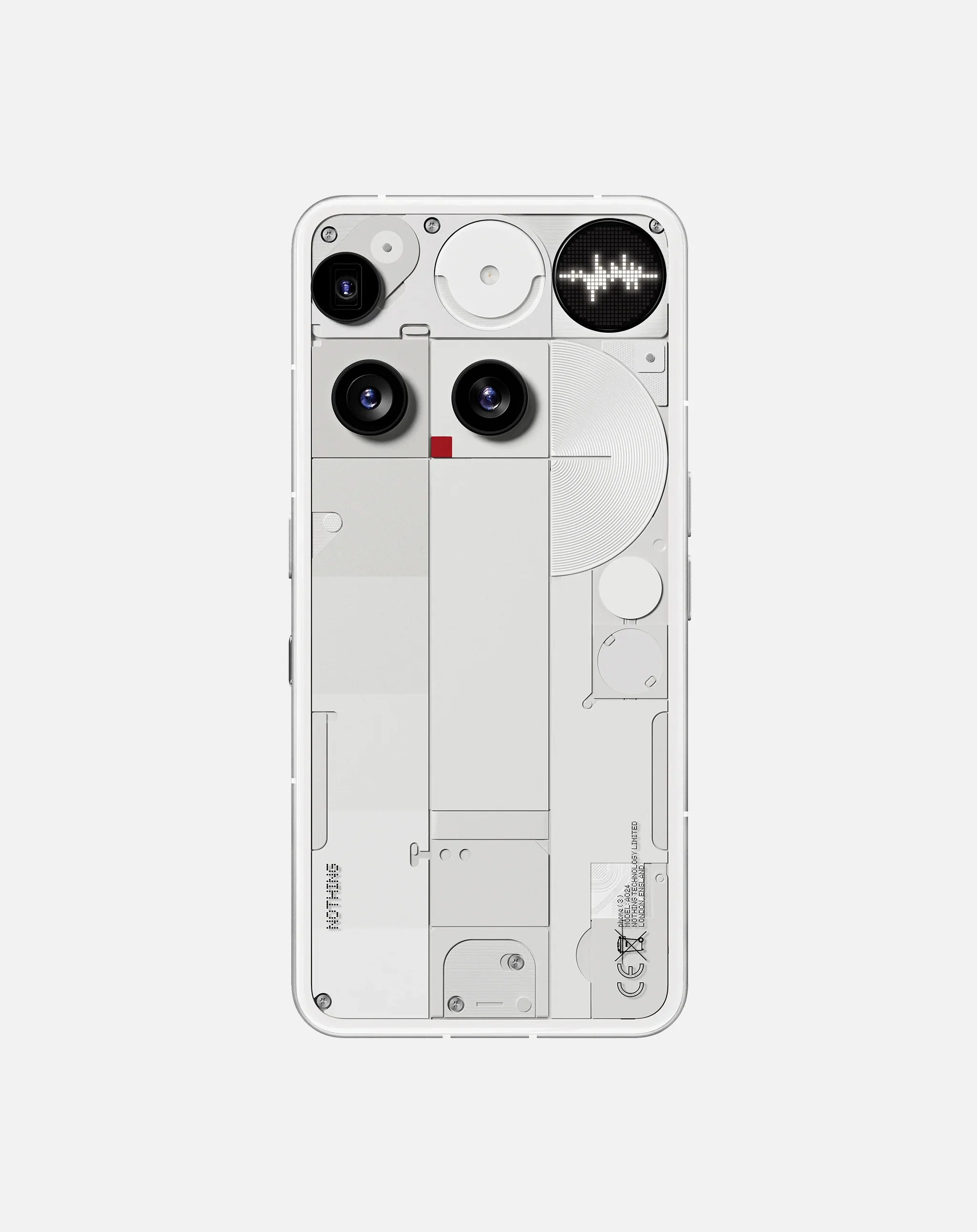
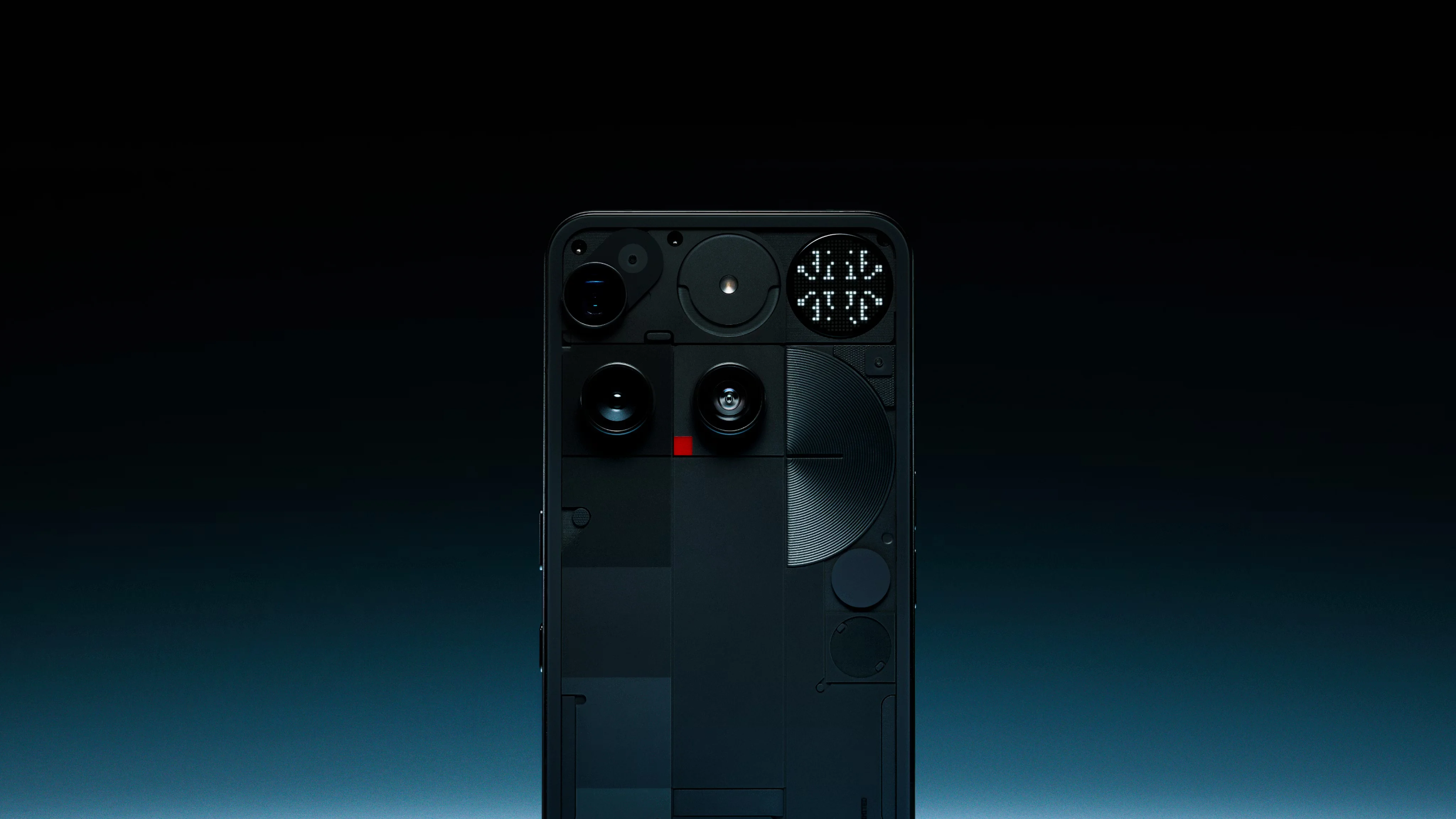
The Nothing Phone (3) commits fully to a "visible internals" design language: a scattered arrangement of circular lens housings, exposed screw heads, wireless charging coils, and a small dot-matrix display, all rendered in a deliberately mechanical, quasi-transparent aesthetic. As a piece of visual theming, this is distinctive and consistently applied — the brand's identity is unmistakable at a glance, and the composition has a genuine, if busy, visual rhythm. The concern is that this scattered arrangement of circular and rectangular forms does not clearly organize itself around actual function. Camera lenses, decorative circular elements, screw details, and the dot-matrix display all compete for attention at similar visual weight, so a viewer cannot easily distinguish functional components from purely decorative ones without prior familiarity with the product. Where the display panel shows genuine useful information — time, weather, do-not-disturb status — it is one small module competing against a dense field of visually similar circular and rectangular shapes, most of which serve no communicative function to the person holding the phone.
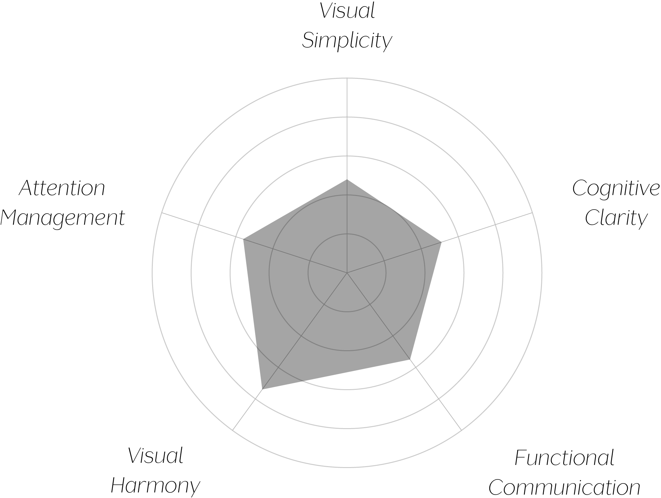
Vand Score 62/ 100
Performance across the five core Vand assessment dimensions.
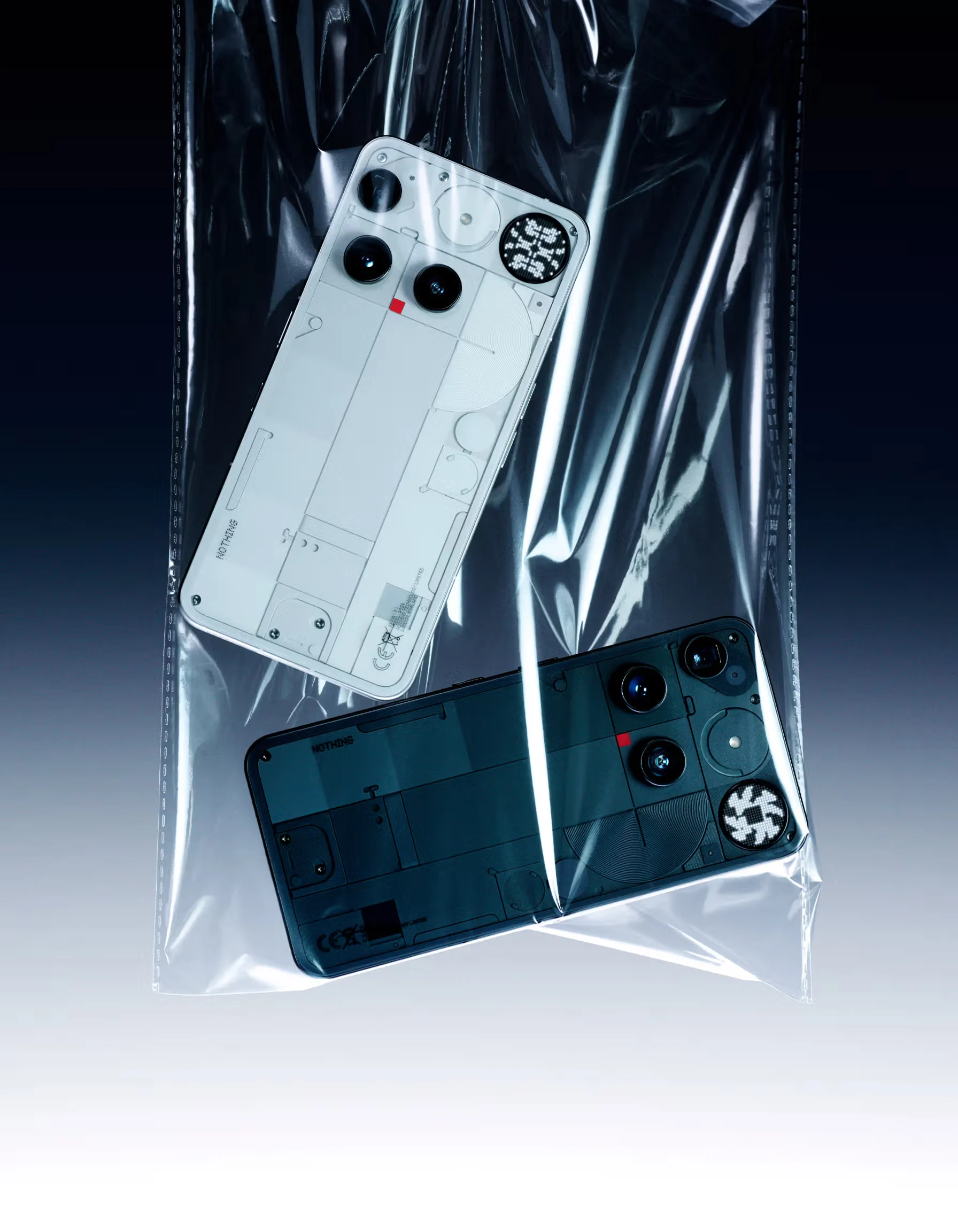
The Nothing Phone (3) demonstrates that a strong aesthetic identity and functional clarity are not automatically the same achievement. The "exposed mechanism" visual language is genuinely distinctive and consistently executed, and it succeeds completely as a piece of brand differentiation. But distinctiveness applied at the expense of legible hierarchy is a real trade-off, not a neutral styling choice.
The device also illustrates a specific tension worth naming: decorative elements that mimic the visual language of function (screw heads, schematic printing, circular "windows") can create an impression of transparency and honesty about the product's internals, while in practice communicating very little that is actually true or useful to the person holding the phone. The aesthetic of engineering is not the same as functional engineering communication.
The jury recognizes genuine distinctiveness in this design — the exposed-mechanism aesthetic is consistently and confidently applied, and it gives the object real brand identity in a category that often lacks one. But VAND Certification asks whether a design respects the person who encounters it, and a central part of that respect is helping a person quickly tell what matters from what doesn't. Here, functional elements and purely decorative ones are rendered with such similar visual weight that a first-time viewer cannot easily separate one from the other.
A design this visually confident in its own mechanism deserves an equally confident answer to a simpler question: which parts of this panel actually do something?