






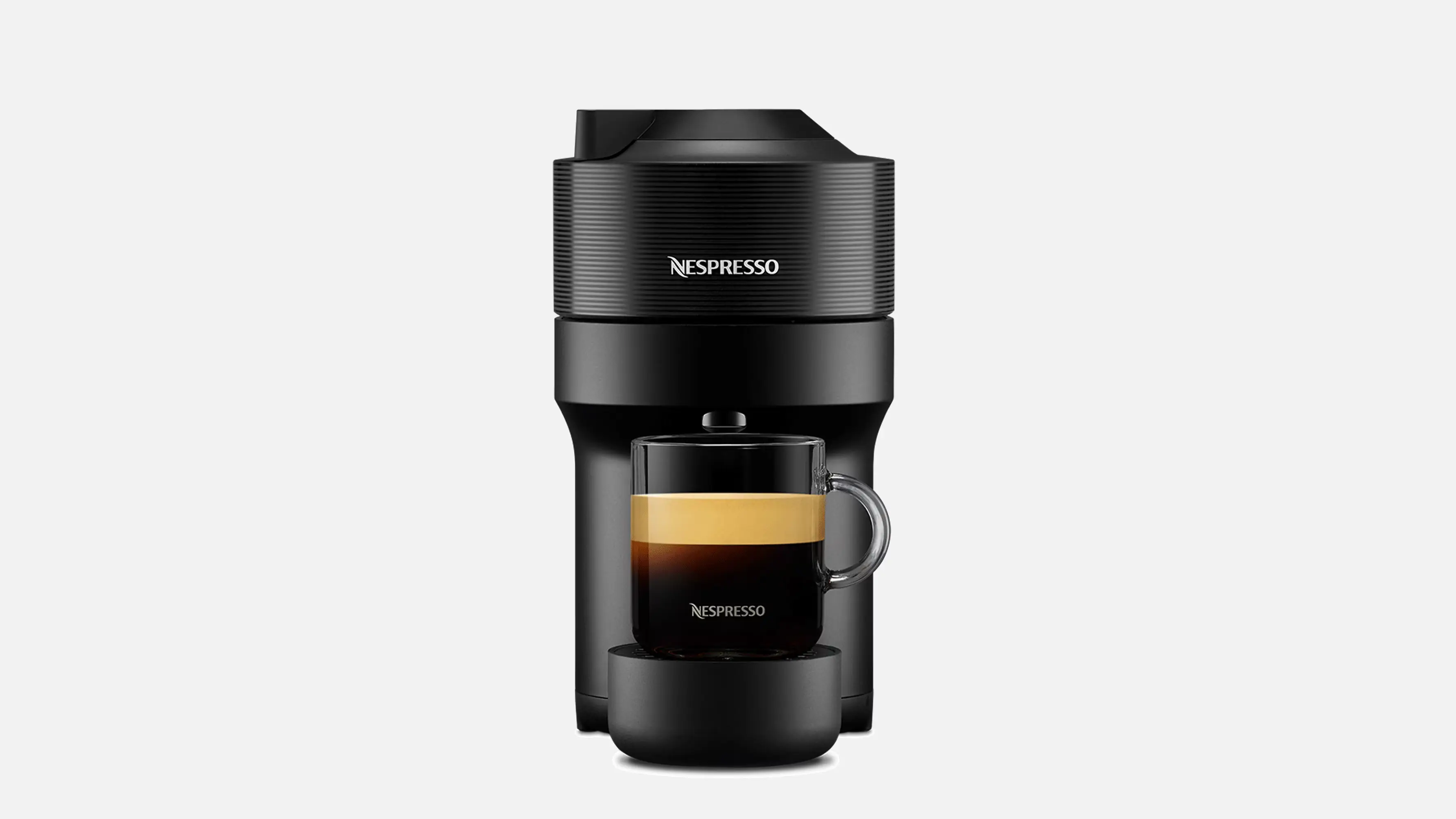
Product Name: Vertuo Pop
Brand: Nespresso
Category: Capsule coffee machine
Manufacturer: Nespresso (Nestlé), machines produced under license by Krups / De'Longhi / Breville depending on market
Designer: Designit, in collaboration with Nespresso's in-house design team
Identification Confidence: High — corroborated by multiple independent manufacturer and design-studio sources.
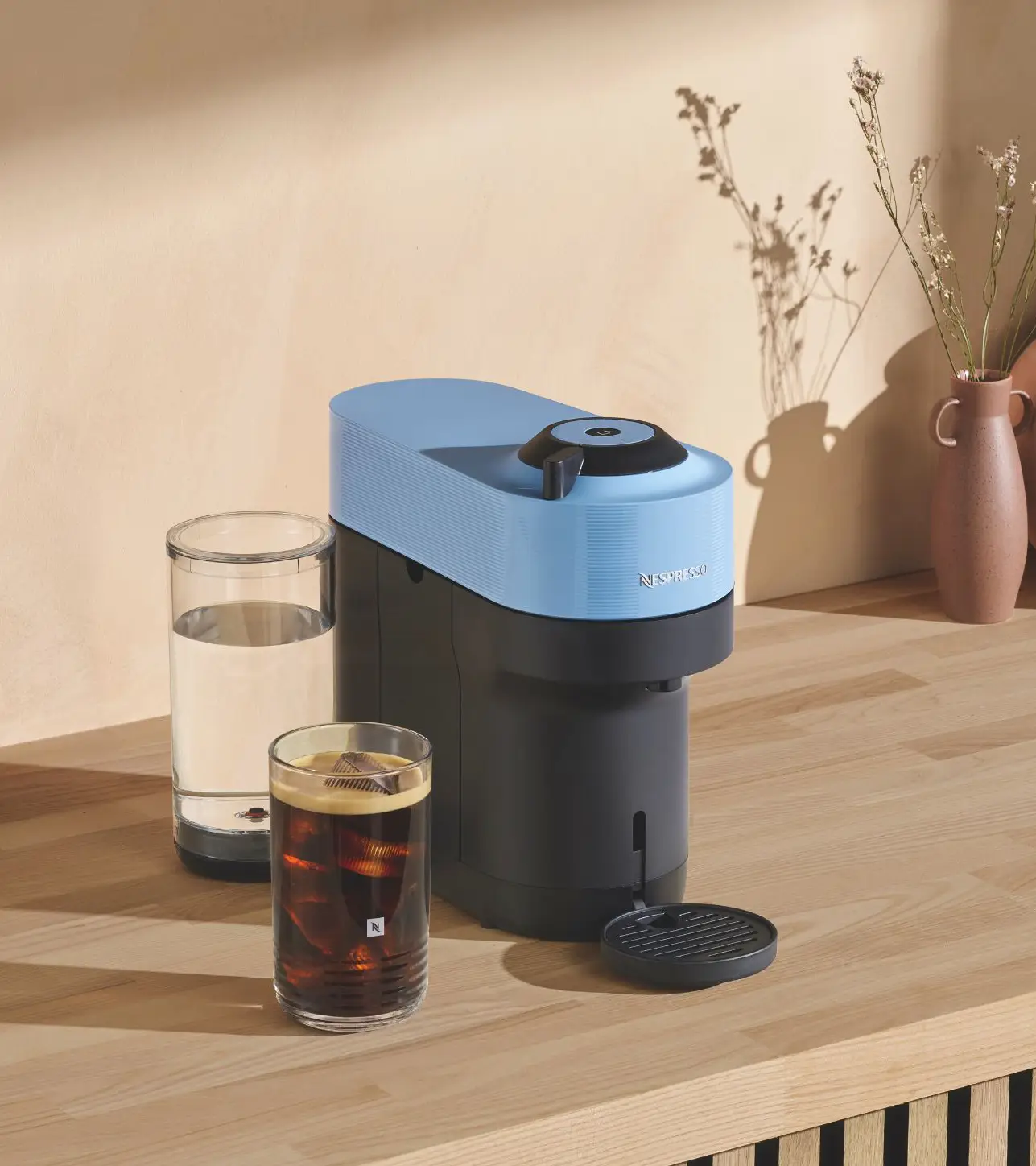
A compact, clearly operable machine whose textured upper half and plain lower half meet at a hard line rather than a resolved transition.
Vertuo Pop is built from two stacked volumes with distinct identities: a fluted, textured upper shell housing the capsule mechanism, and a plain, dark lower base holding the water tank and dispensing area. That upper texture — fine vertical ribbing across the entire white shell — gives the object a tactile, almost textile-like quality uncommon in kitchen electronics, and the circular capsule lever on top is an immediately legible focal point that signals exactly where the machine is operated. Where the design is less resolved is the meeting point between its two halves: the switch from ribbed white to smooth black happens along a single hard horizontal line, with no shared detail or gradual transition to soften the contrast. This is a design with genuine tactile ambition and strong functional clarity, let down somewhat by a proportional relationship between its two main volumes that reads as assembled rather than fully unified. It certifies in the B class.
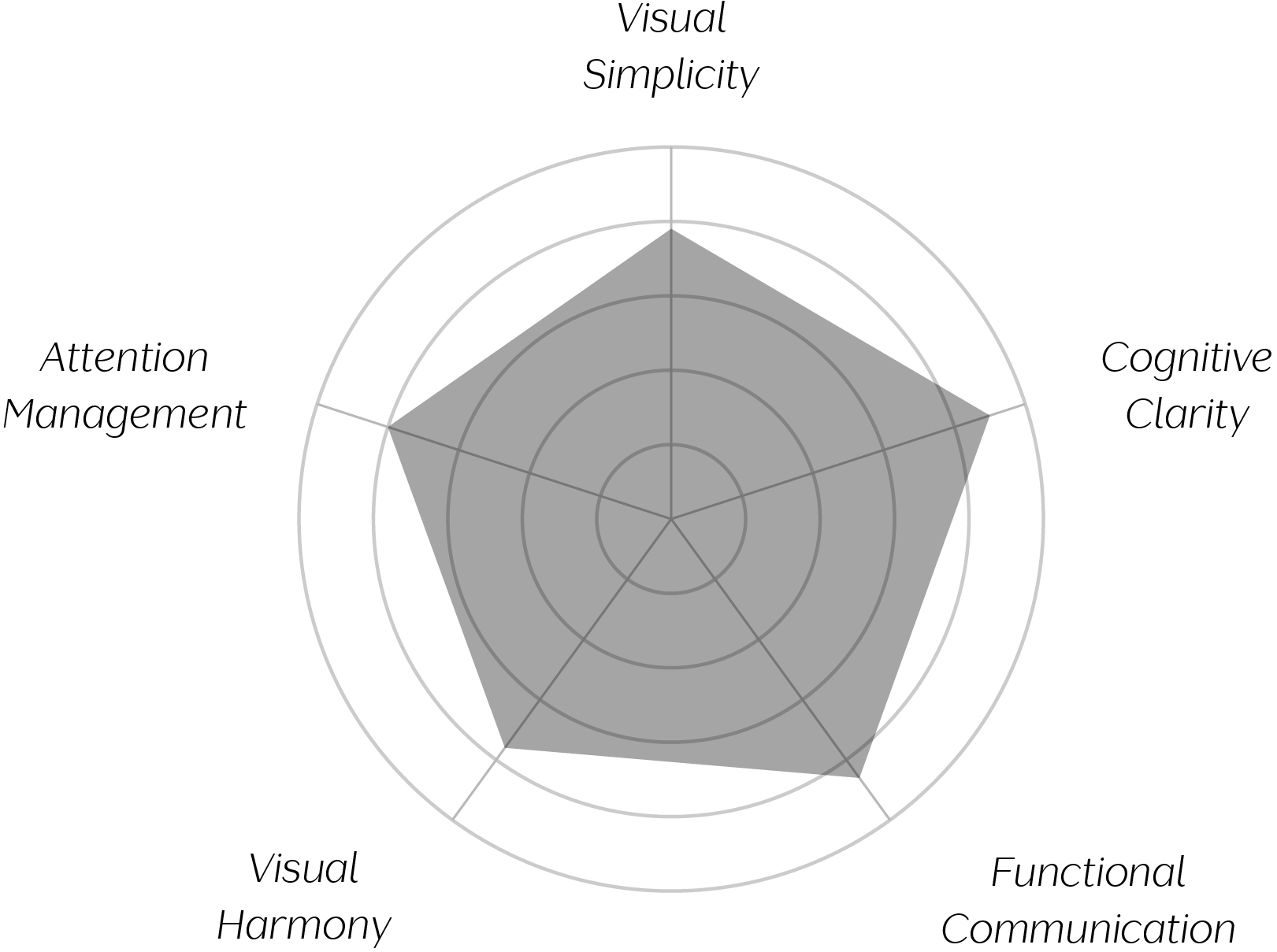
Vand Score 82 / 100
Performance across the five core Vand assessment dimensions.
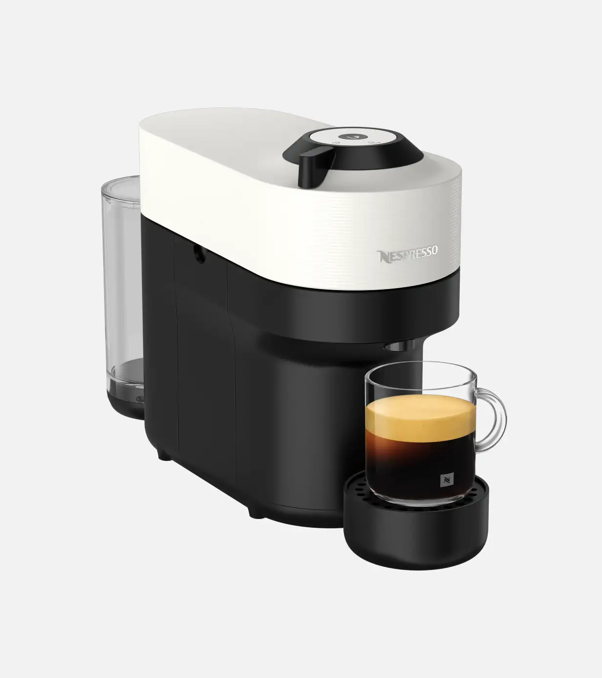
Vertuo Pop demonstrates that texture, not just colour or gloss, can serve as a primary material signal in kitchen electronics — the ribbed shell gives the object a tactile identity distinct from the smooth plastics common to its category.
It also shows that a machine's functional zones — loading, filling, dispensing — can each be made independently legible through shape and material alone, without printed labelling, if each zone is given a sufficiently distinct visual treatment.
Most instructively, the design is a useful case study in the risk of treating an object's volumes as separate design problems: each half of the machine is confidently resolved on its own terms, but the seam between them shows what is lost when that confidence isn't extended to the transition itself.
The evidence supports certification at Class B. Vertuo Pop succeeds at making a compact, one-touch appliance genuinely legible — every functional zone communicates its purpose clearly, and the ribbed upper shell gives the object a tactile identity that sets it apart from the smooth plastics typical of its category. What holds it back from a higher tier is the relationship between its two principal volumes: each is confidently designed on its own terms, but they meet along a single hard line rather than resolving into one continuous form. This is a machine that communicates its function with real clarity and takes a genuine material risk with its surface treatment, while leaving the handoff between its two halves as unfinished business. As a closing observation: Vertuo Pop shows real design conviction in its parts, and the next step is bringing that same conviction to where those parts meet.