






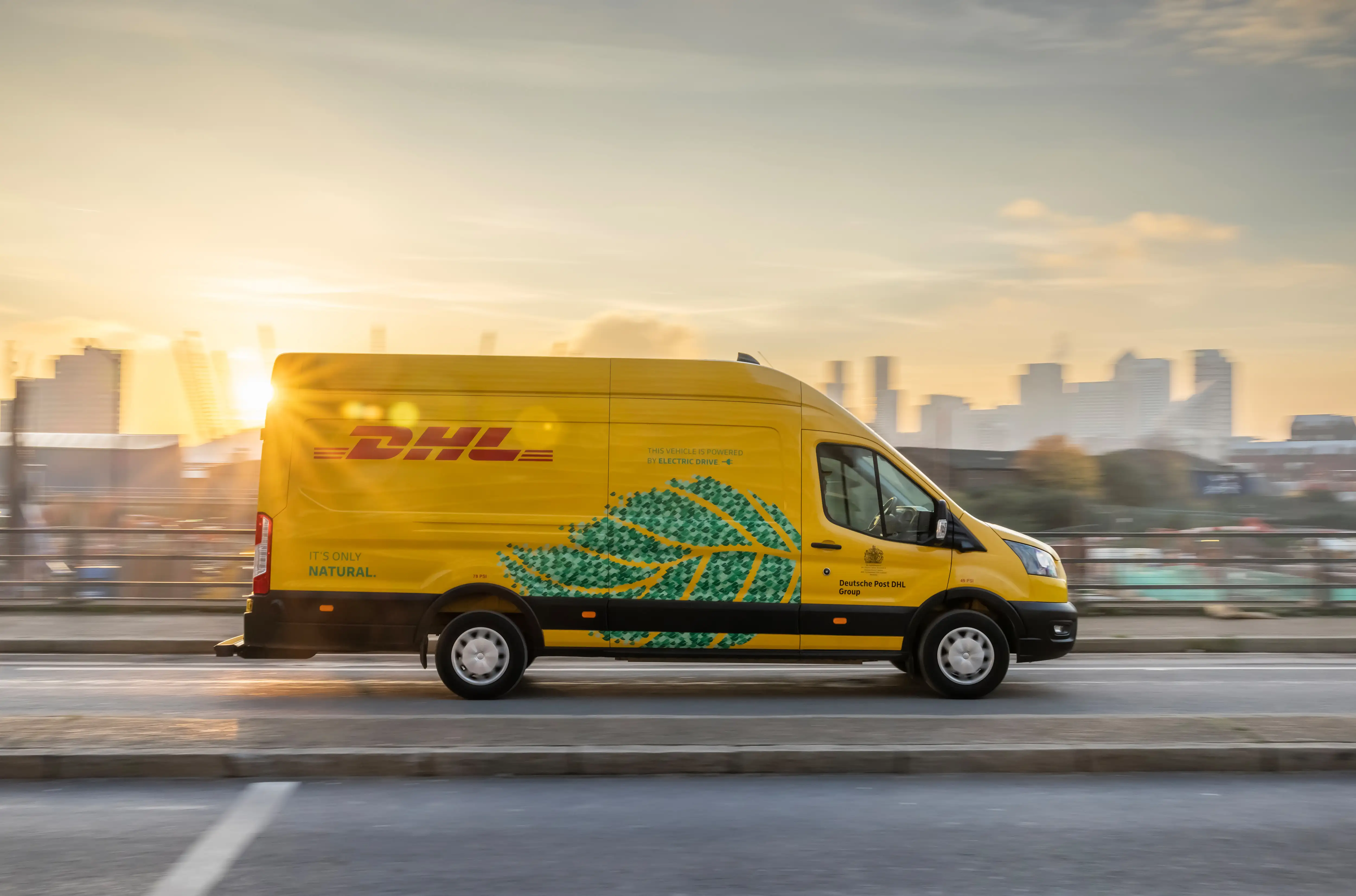
Product Name: Electric-drive delivery van livery (Ford E-Transit)
Brand: DHL
Category: Commercial vehicle livery / fleet branding
Manufacturer: Deutsche Post DHL Group (vehicle chassis: Ford)
Designer: No publicly verified designer has been identified for this specific livery.
Identification Confidence: High
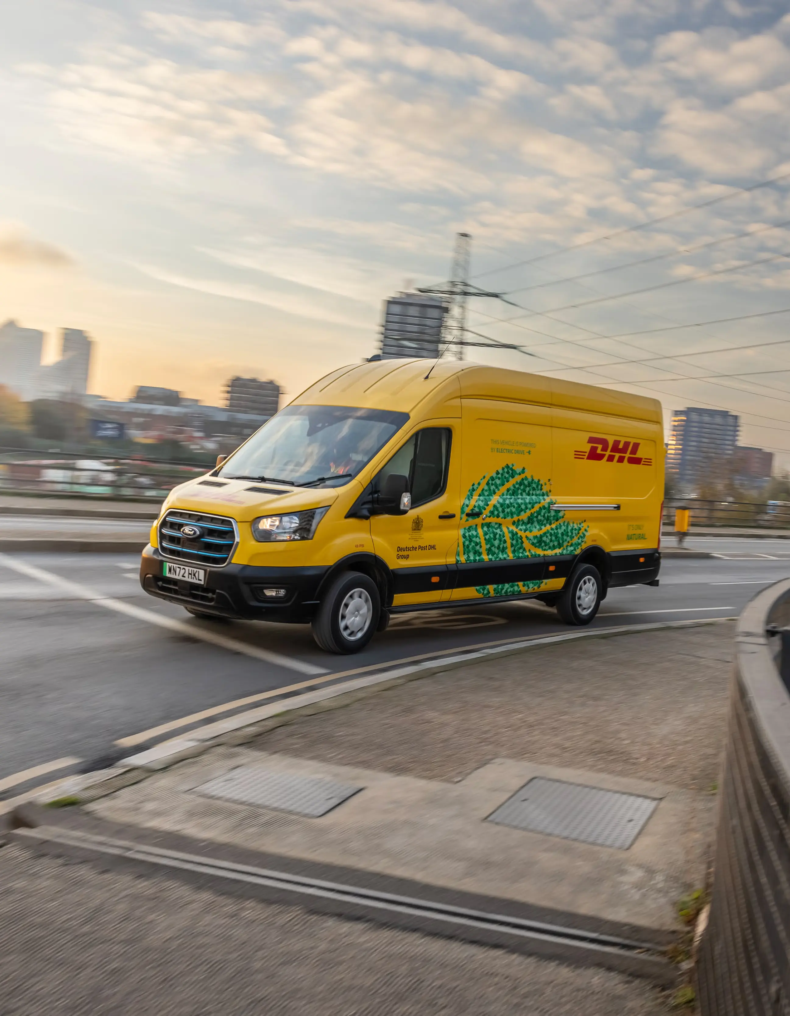
The van's base livery — solid yellow body, red DHL wordmark, black lower skirt — is a well-established and functionally legible commercial identity on its own. The addition of a large, dot-pattern leaf graphic and accompanying "It's only natural" tagline introduces a second, unrelated visual language onto that established system, and the two don't fully reconcile. The leaf's dotted, almost pixelated rendering sits awkwardly against the flat, confident geometry of the DHL wordmark beside it, and the placement — spanning the mid-body panel at a scale roughly equal to the brand mark itself — gives the sustainability graphic a visual weight that competes with, rather than supports, the core identity it's meant to accompany.
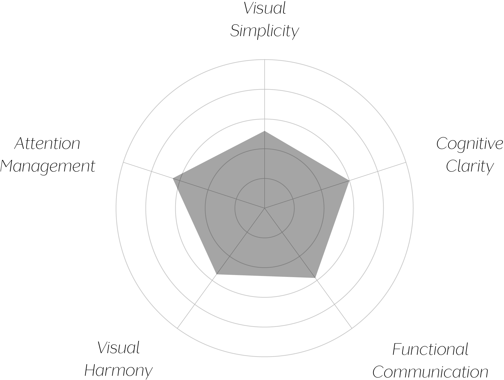
Vand Score 62/ 100
Performance across the five core Vand assessment dimensions.
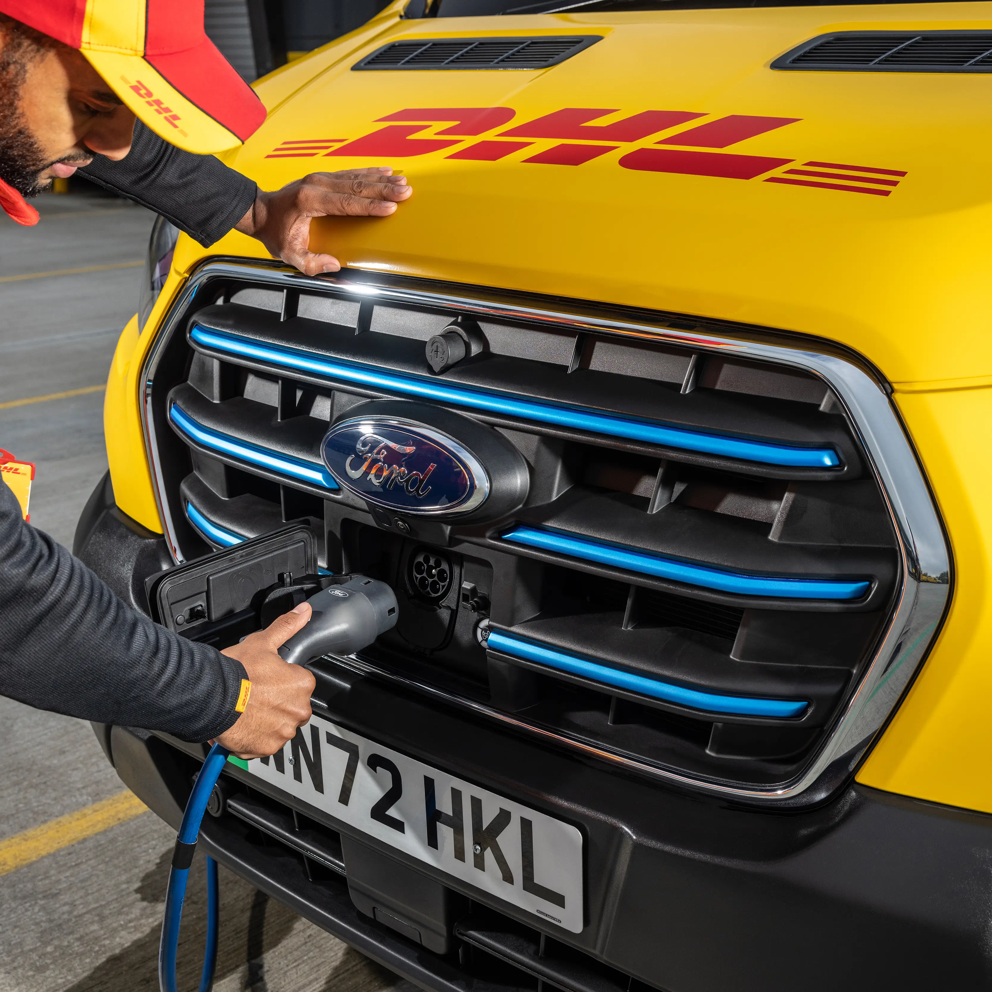
The livery demonstrates a common tension in fleet branding: sustainability messaging is often treated as a separate creative exercise from the core identity system, and when the two aren't unified in visual language, the result reads as two designs sharing one surface rather than one coherent design.
The leaf's halftone dot rendering is a particularly clear example of stylistic mismatch — it borrows a texture technique that appears nowhere else in the brand's established vocabulary, which makes it feel imported rather than native to the system.
The supporting copy's subordinated placement shows how visual weight and informational value can become disconnected — the most useful piece of information (electric drivetrain) is given the least visual priority, while the more decorative element (the leaf) receives the most.
The jury finds the underlying DHL livery system to be genuinely well-resolved, and does not dispute its functional legibility as a piece of commercial vehicle identification. The certification falls short because the environmental messaging added to that system — in scale, texture, and placement — competes with rather than reinforces the identity it's meant to accompany, leaving the vehicle's most useful piece of information visually subordinated to its most decorative one. This is a solvable problem, not a fundamental one, but as photographed, the design doesn't yet meet the threshold.
A message worth adding to a vehicle should be designed to belong there — not layered on top and left to compete.