






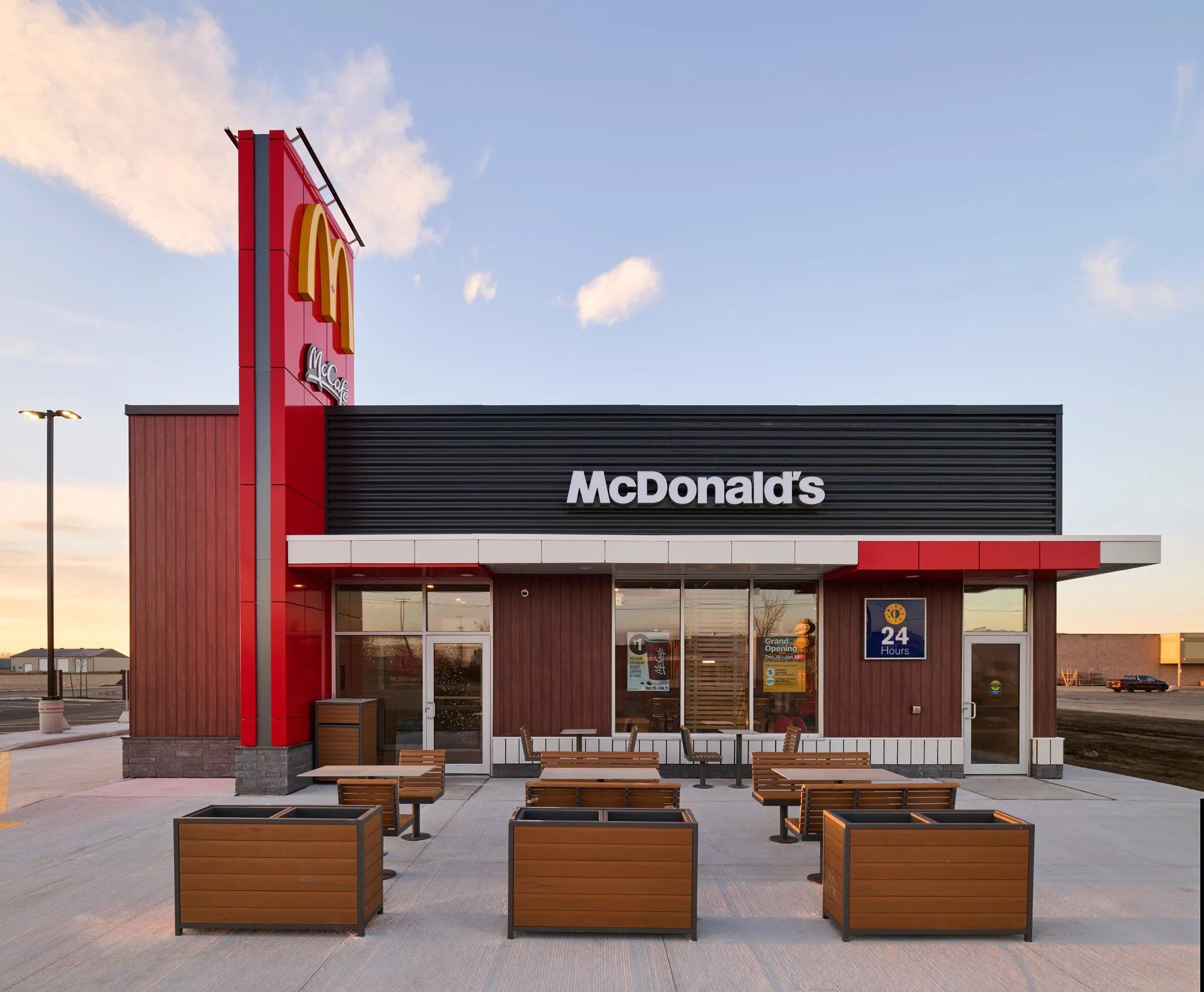
Product Name: McDonald's Standard Storefront Architecture (US locations)
Brand: McDonald's
Category: Retail/Restaurant Architectural Branding
Manufacturer: McDonald's Corporation
Designer: No publicly verified designer has been identified for this product.
Identification Confidence: High (brand and category); Not Applicable (individual authorship)
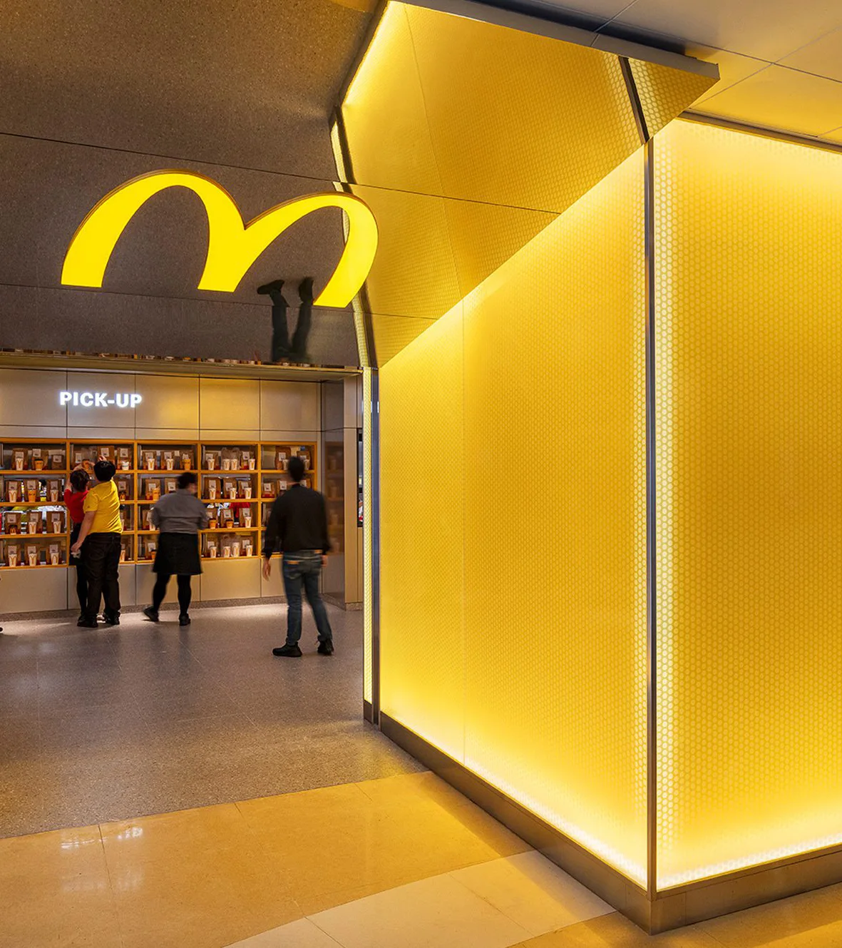
Across the three US locations submitted, the storefronts share a common design logic: a low, single-story volume, wrapped in a small set of interchangeable surface materials — stacked stone veneer, metal cladding, or brick — topped with an arched accent band and lit signage designed to be read at highway speed from a moving car. This is a coherent strategy for its stated purpose, but it is a narrow one. Each building is essentially a signage structure with a dining room attached, and little in the architecture itself communicates hospitality, permanence, or care beyond what is required to be legible from the road. The flagpole clusters, painted arrow markings, and drive-through canopy signage dominate the compositions more than the buildings themselves do, and the architectural materials — however varied from location to location — read as interchangeable applications of the same underlying template rather than considered responses to their individual sites.
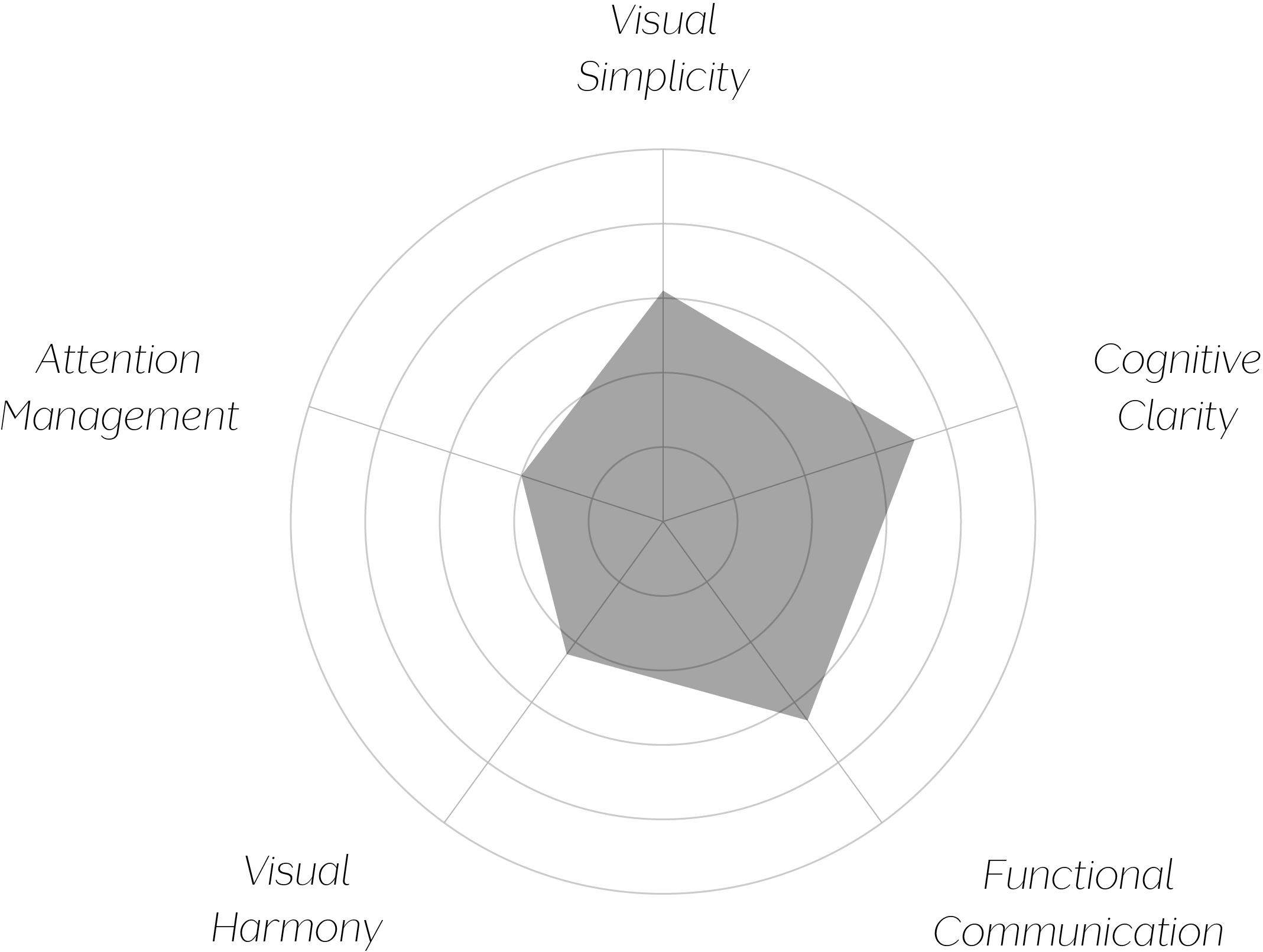
Vand Score 55/ 100
Performance across the five core Vand assessment dimensions.
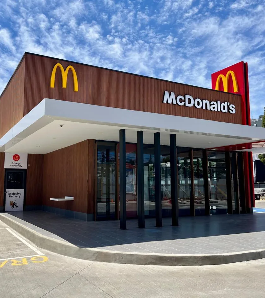
These storefronts demonstrate, clearly and consistently, what an architecture optimized entirely for vehicular legibility looks like: signage-forward, materially interchangeable, and organized around the sightline of a moving car rather than the experience of a person on foot. This is an instructive, if unintentional, case study in how a single functional priority, pursued exclusively, can crowd out other dimensions of architectural quality.
The variation in surface material across the three examples — stone, brick, metal panel — without a corresponding variation in massing or composition also illustrates a common retail-architecture pattern: material palette treated as a finish to be swapped, rather than as a driver of the building's actual form.
The jury recognizes that these buildings perform their core functional task competently: they are legible, navigable, and clearly branded from a moving vehicle. But VAND Certification asks whether a design respects the person who encounters it, and across all three examples, that respect is directed almost exclusively toward the passing driver, with comparatively little architectural consideration given to the person once they have arrived. Signage, flagpoles, and illuminated roofline accents consistently do more compositional work than the buildings' own massing and material choices.
A building this thoroughly optimized for one sightline has not yet been designed for the person standing in front of it.