






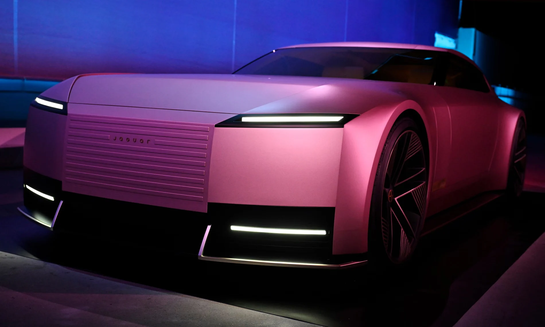
Product Name: Jaguar Brand Visual Identity (2024 rebrand)
Brand: Jaguar
Category: Corporate Visual Identity / Brand Design System
Manufacturer: Jaguar Land Rover
Designer: No publicly verified individual designer has been identified for this product.
Identification Confidence: High (brand and campaign); Not Applicable (individual authorship)
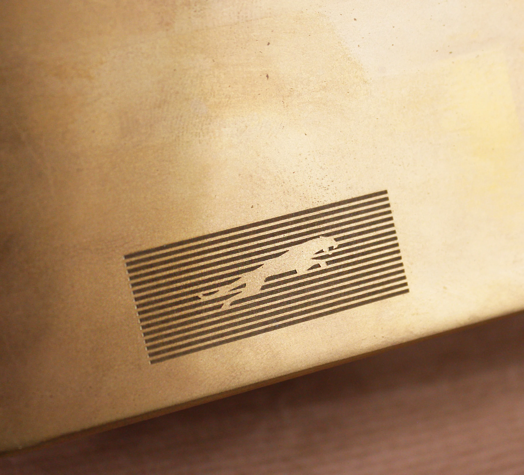
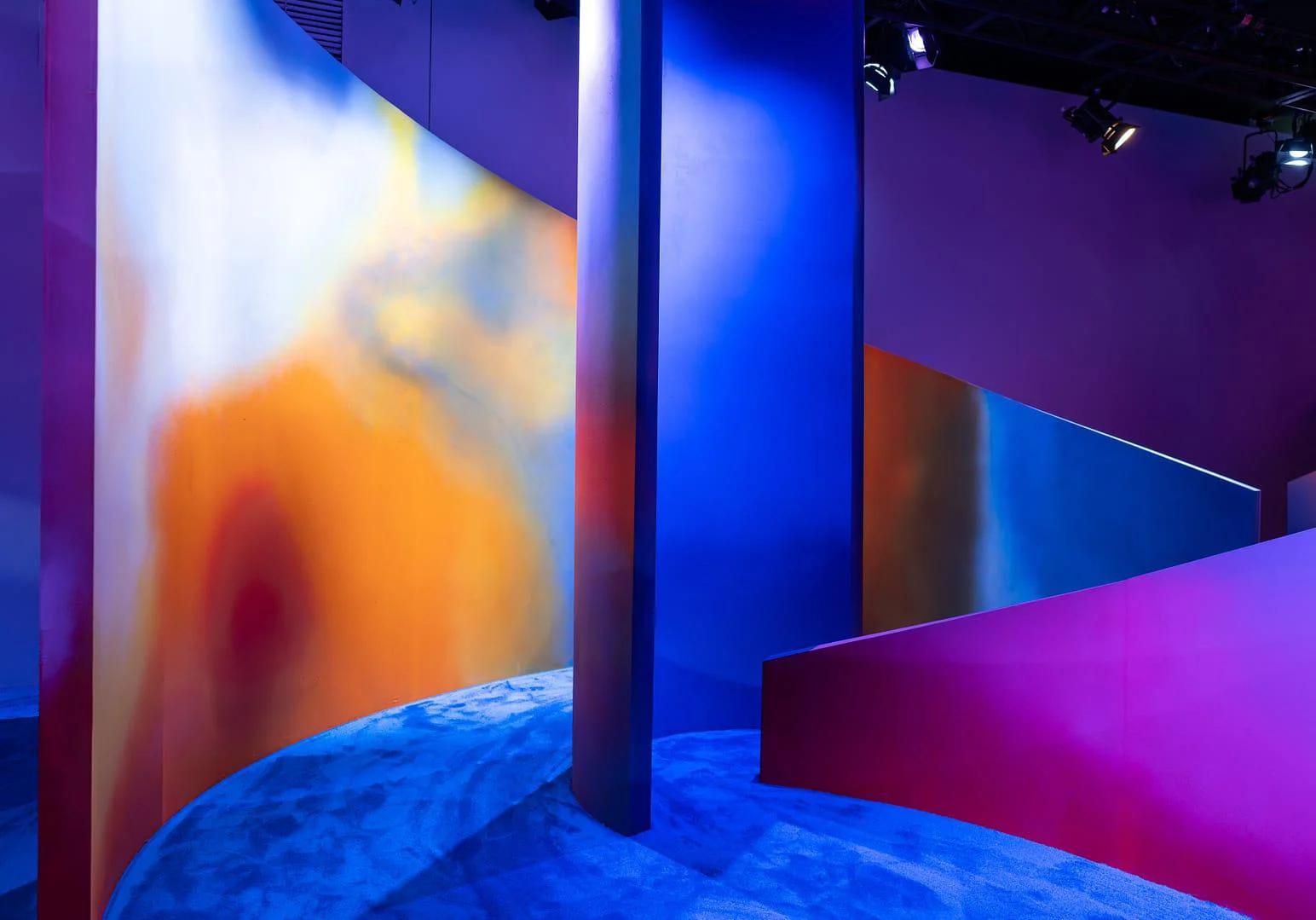
The Jaguar wordmark itself is a disciplined piece of type design: a rounded, geometric sans that softens the brand without infantilizing it, and it is rendered with real craft in its physical brass and aluminum applications. That quality, however, is repeatedly undermined by the environments the identity has been placed in. The gradient pink-to-magenta backdrops push the wordmark toward the edge of legibility, relying on contrast that is marginal rather than confident. The striped pavilion structure, while photogenic, competes with the wordmark rather than framing it, and the campaign imagery — a solitary figure in saturated red against painted stripes — communicates mood and provocation far more clearly than it communicates the brand mark itself. Considered as a system, this identity has not yet resolved the relationship between its strongest asset, the wordmark, and the noisy, high-contrast environments meant to carry it into the world.
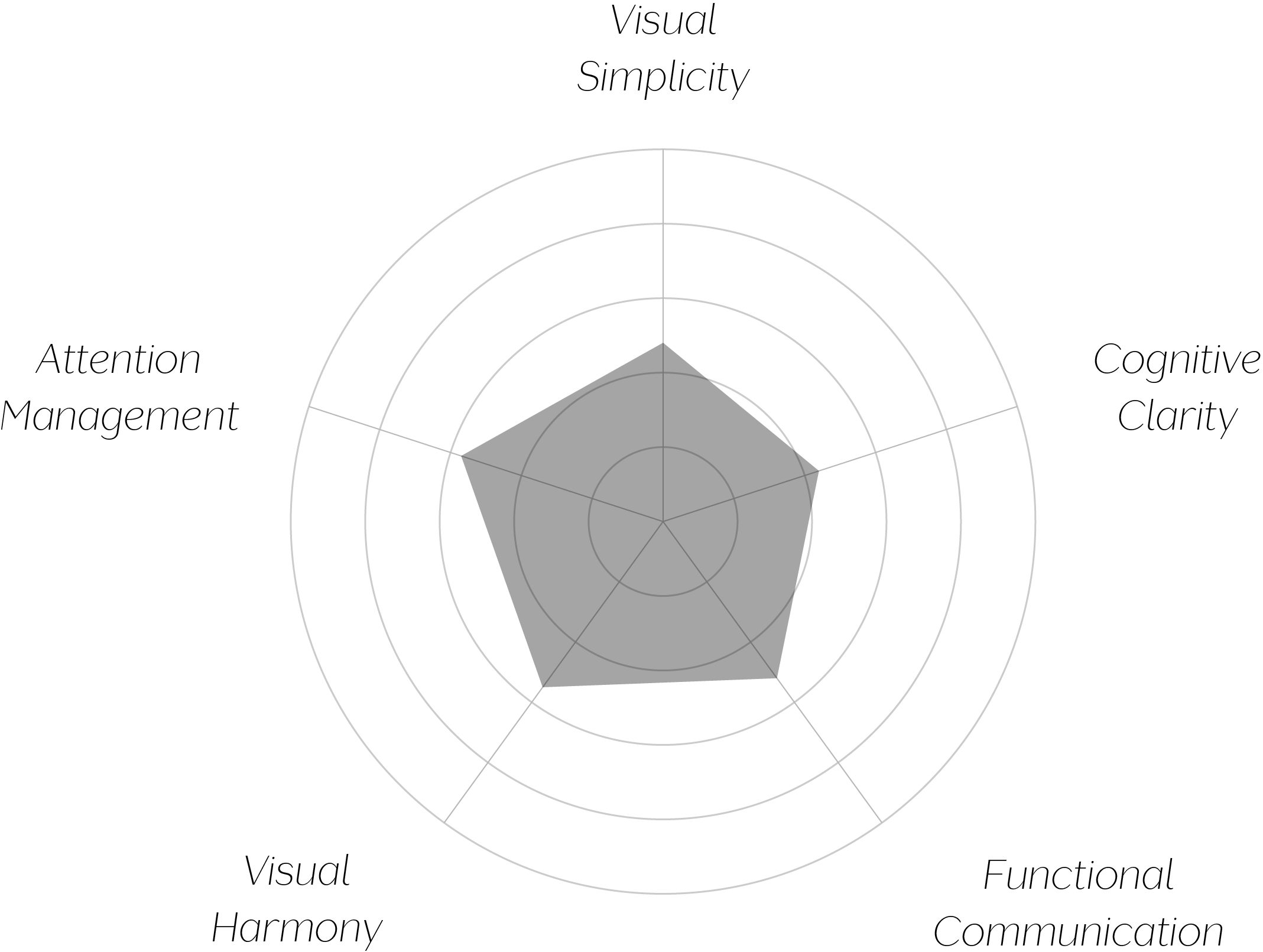
Vand Score 51/ 100
Performance across the five core Vand assessment dimensions.
The strongest lesson here is a familiar one for identity systems: a well-designed mark is not the same as a well-designed system. The Jaguar wordmark, in isolation, demonstrates real typographic discipline — restrained, geometric, and confidently made. That quality simply has not yet been extended outward into the environments and campaigns meant to carry it.
There is also a lesson in the cost of contrast-as-spectacle. The gradient and striped treatments are visually memorable, but memorability achieved at the expense of legibility is a trade the identity has not yet resolved in its own favor — a viewer may recall the color and mood of these environments more vividly than the name they were meant to introduce.
The jury does not dispute the quality of the underlying wordmark; considered alone, it is a confident, well-constructed piece of type design. But VAND Certification evaluates the design as experienced, not the design as isolated asset, and across the materials submitted, that experience is inconsistent — legibility varies by application, attention is frequently pulled toward pattern and color before the brand mark itself, and the environmental language has not yet been brought into formal agreement with the wordmark it is meant to support.
A strong mark deserves a system built to carry it clearly into the world — and on the evidence presented, this system has not yet done so.