






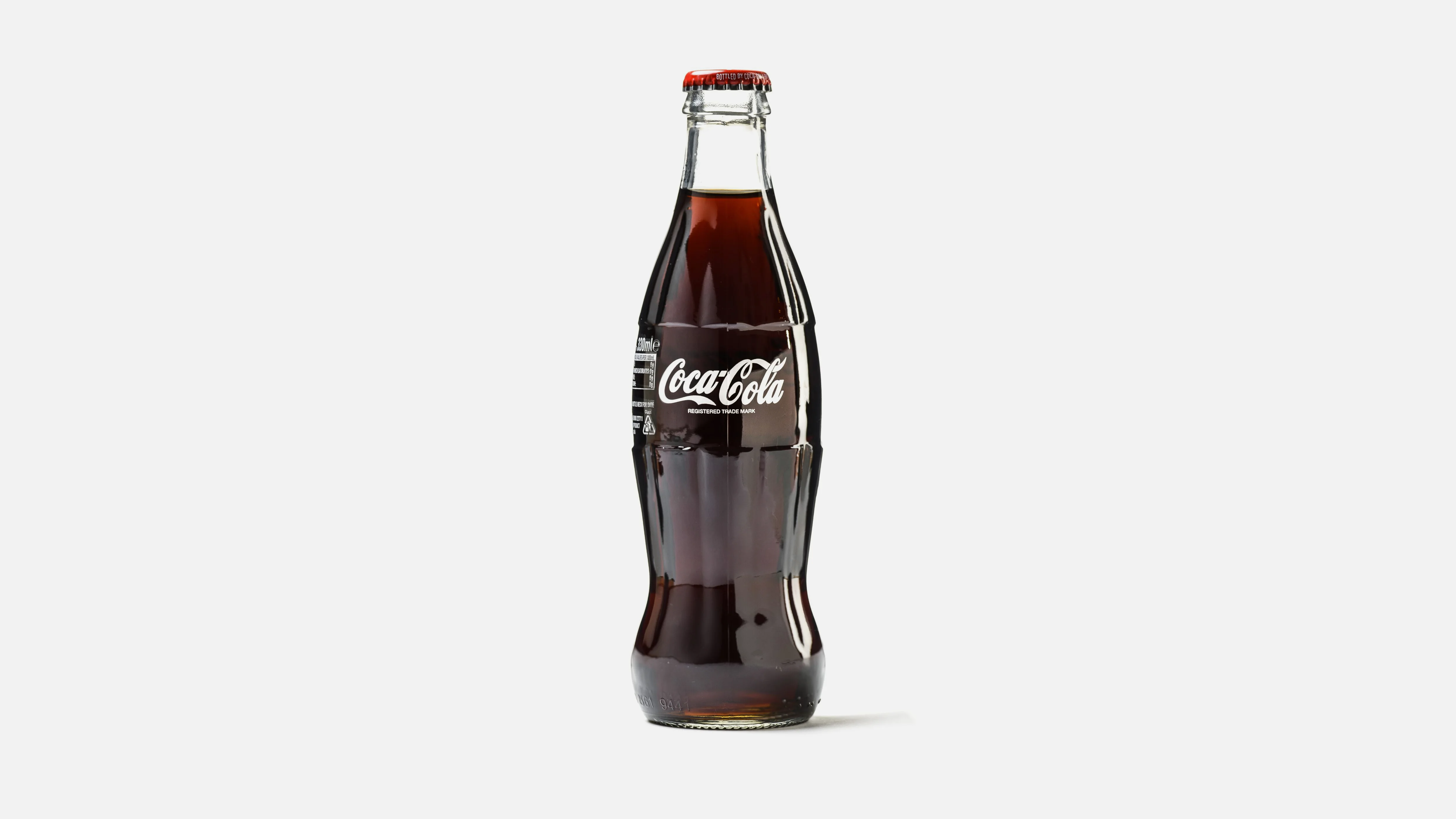
Product Name: Coca-Cola (contour glass bottle)
Brand: Coca-Cola
Category: Beverage packaging
Manufacturer: The Coca-Cola Company
Designer: No publicly verified designer has been identified for this specific product photograph, though the contour bottle form is historically attributed to the Root Glass Company design team.
Identification Confidence: High

The contour bottle's defining achievement is that its shape alone — the fluted, hourglass-like curve rising from a wide base to a narrow neck — is sufficient to identify the product even in silhouette, without visible branding. This is a rare accomplishment in packaging design, where most products depend on label graphics to carry identity. The vertical fluting adds functional grip and visual rhythm without competing with the wordmark, which is placed once, centrally, and at a scale that neither overwhelms the glass nor disappears into it. The overall result is a design where structure and graphics reinforce rather than compete with each other, a genuine rarity in beverage packaging.
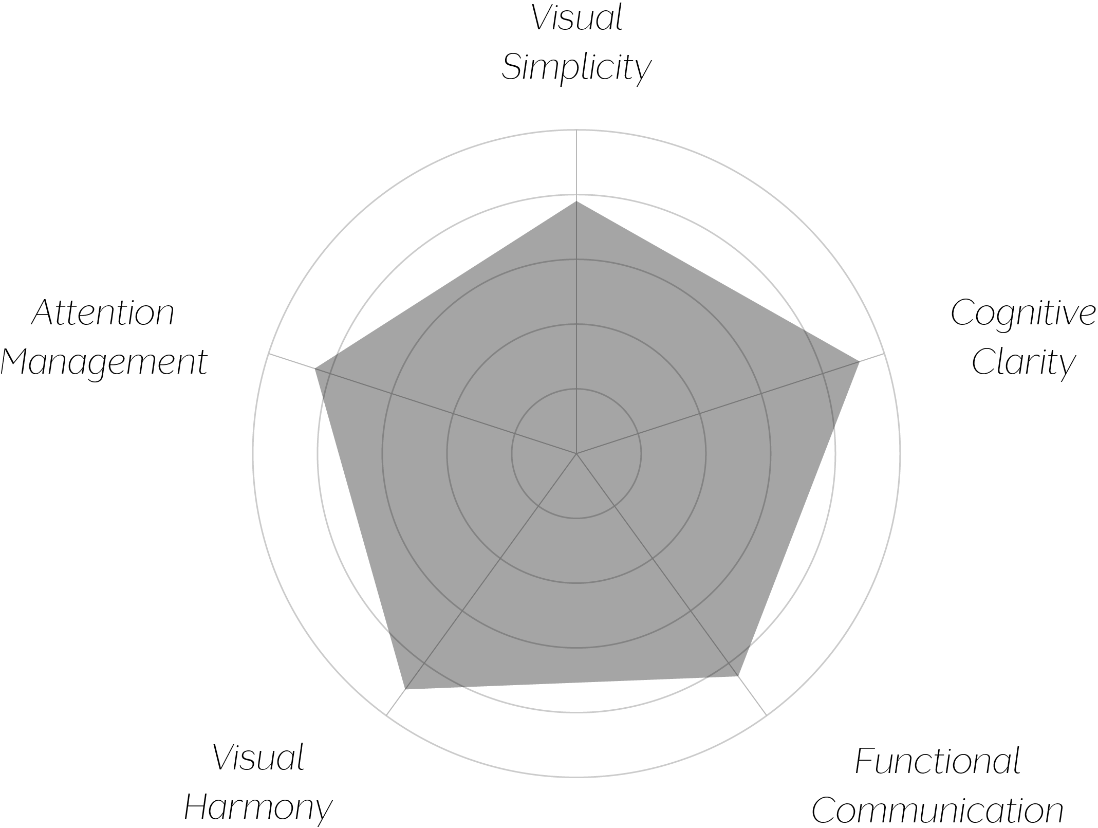
Vand Score 86/ 100
Performance across the five core Vand assessment dimensions.

This bottle demonstrates that structural form, not just graphic design, can carry brand identity — the silhouette alone does work that most packaging asks its label to do entirely on its own.
The single, centrally placed wordmark shows genuine restraint: in a category prone to accumulating claims, seals, and secondary badges over time, this design has resisted that accumulation across generations of use.
The fluted ribbing is a reminder that functional details — here, grip — can be integrated into a design's identity rather than treated as an afterthought bolted onto an otherwise smooth surface.
The jury certifies this design at Class A for achieving a rare feat in packaging: brand recognition through form before graphics are even read. The restraint shown in limiting the bottle to one wordmark, one accent color, and one structural gesture is a genuine discipline, sustained across what is evidently a long-standing design rather than a recent simplification. The minor visual complexity introduced by the fluted surface is a reasonable functional tradeoff rather than a design flaw, and it does not meaningfully detract from an otherwise highly resolved object.
A shape that tells you what's inside before you've read a single word has done more design work than most labels ever attempt.