





Product Name: Booking.com (mobile application)
Brand: Booking.com
Category: Travel booking mobile application
Manufacturer: Booking Holdings Inc.
Designer: No publicly verified designer has been identified for this specific interface iteration.
Identification Confidence: High
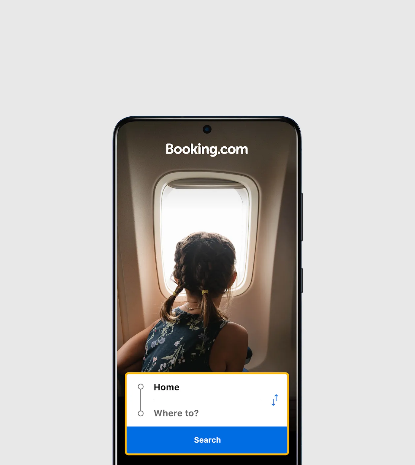
Each individual screen in this set is, on its own terms, reasonably well organized: search fields are legible, hotel cards follow a consistent layout, and the booking-management screen groups itinerary items sensibly by trip. But the promotional layer running through several screens — the struck-through "$183" next to a highlighted "$156," the green "Mobile-only price" badge, the amber "Check-in until 11 PM" warnings — consistently frames information in a way designed to create urgency or a sense of a fleeting deal rather than to simply inform. This pattern, repeated across multiple screens rather than appearing once, is enough to weigh meaningfully against certification, regardless of how clean the surrounding layout is.
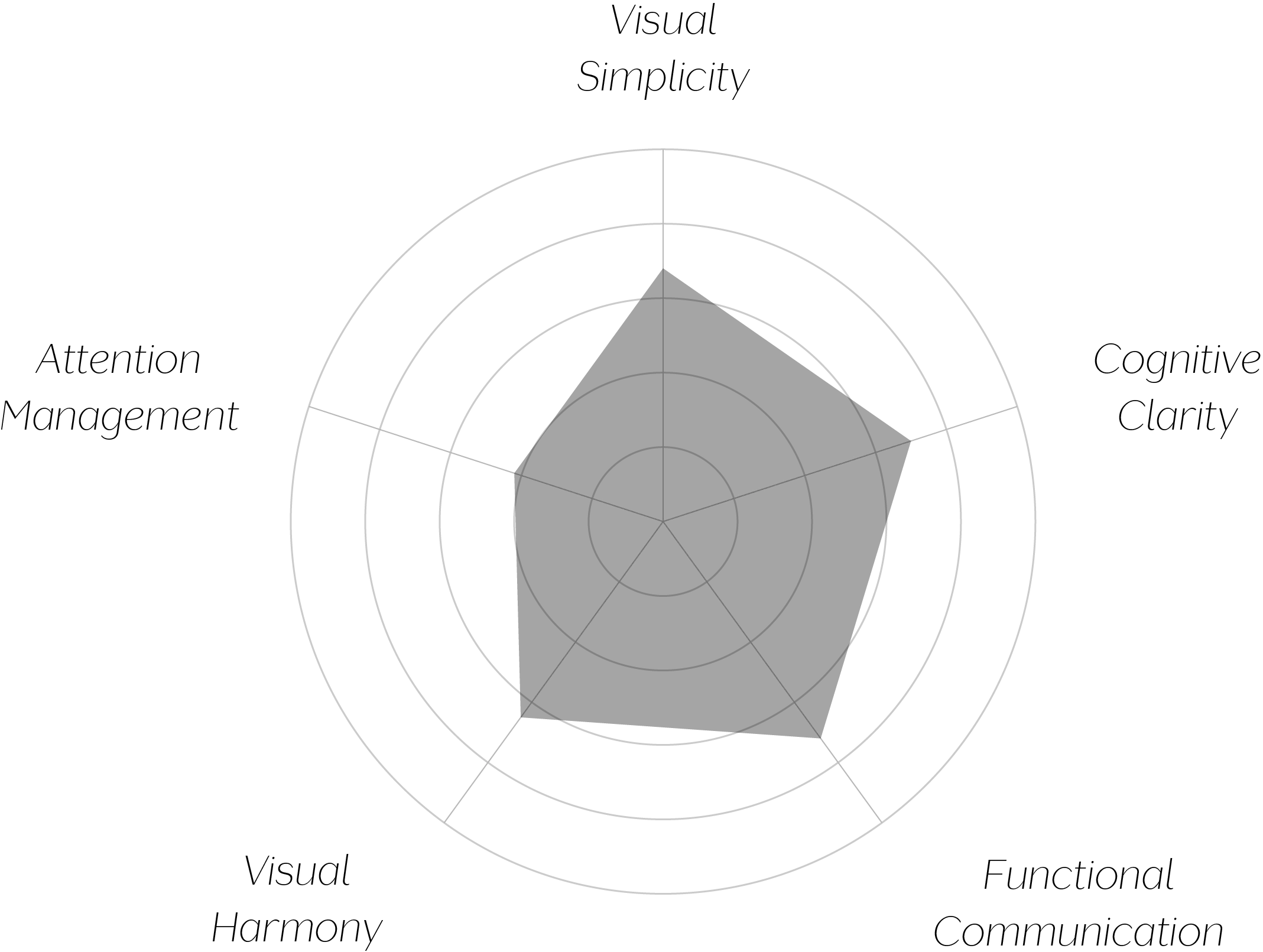
Vand Score 58/ 100
Performance across the five core Vand assessment dimensions.
The contrast between this app's clean structural layout and its urgency-driven pricing presentation is instructive: strong information architecture doesn't guarantee respectful communication if the content layered on top of it is designed to accelerate decisions rather than clarify them.
The repeated use of alert-style visual treatment (bold color, warning icons) for non-urgent information — a checkout time, a routine price comparison — shows how easily a design can borrow the visual grammar of genuine urgency to create a false sense of one, diluting the meaning of that grammar when real urgency does arise.
The "Mobile-only price" framing is a particularly clear example of how a badge can imply exclusivity and scarcity without requiring the design to state either explicitly — the visual language does the persuasive work the copy doesn't have to.
The jury finds real competence in this interface's underlying structure — search, browsing, and trip management are all clearly organized and easy to navigate. But certification asks whether a design respects the person using it, and a pricing presentation built around struck-through comparisons and exclusivity badges, paired with alert-styled treatment for routine information, is a pattern that works against the user's ability to make an unhurried, well-informed decision. This pattern recurs across the review set rather than appearing once, which is what keeps the design below the certification threshold.
Clean layout can't fully offset a design that asks the user to decide faster than the decision deserves.