







Product Name: Visual identity system (marketing site, illustrations, and social assets)
Brand: Anthropic / Claude
Category: Brand identity / visual design system
Manufacturer: Anthropic
Designer: No publicly verified designer has been identified for this specific identity system.
Identification Confidence: High
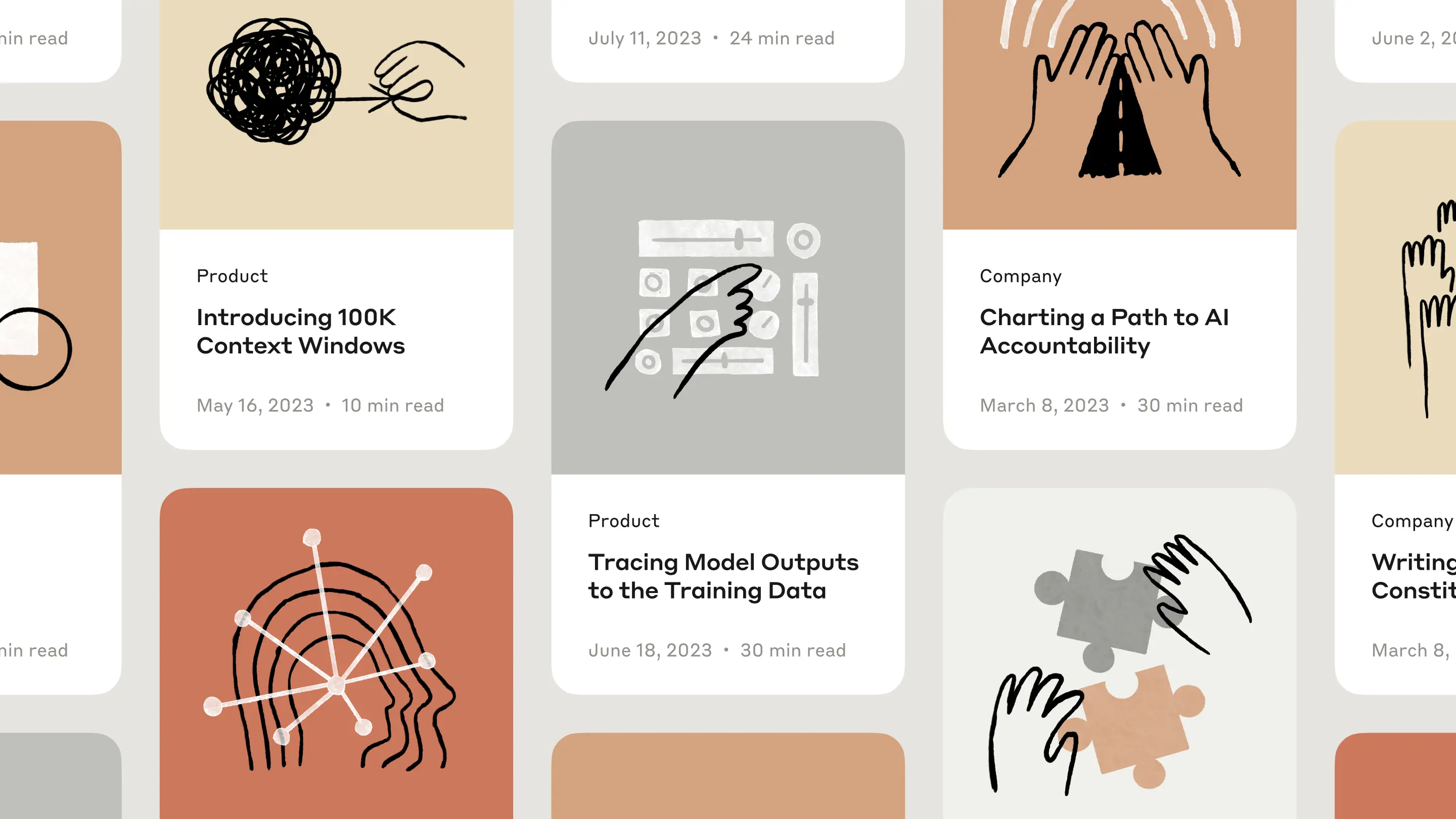
Across marketing pages, blog cards, and social placements, this identity holds to a small, disciplined set of components: a warm, muted orange-and-cream palette, a serif logotype paired with a hand-drawn asterisk mark, and a recurring illustrated figure — a simplified profile and open hand — reaching toward a changing central object. What changes from application to application is only that central shape: an atom, a cursor, a puzzle piece, a lightbulb-like orb. This is a system that has found one genuinely flexible idea and mined it thoroughly rather than accumulating a library of unrelated graphics. The result feels warm and consistently human across a wide range of contexts, from dense editorial grids to single-panel social ads.
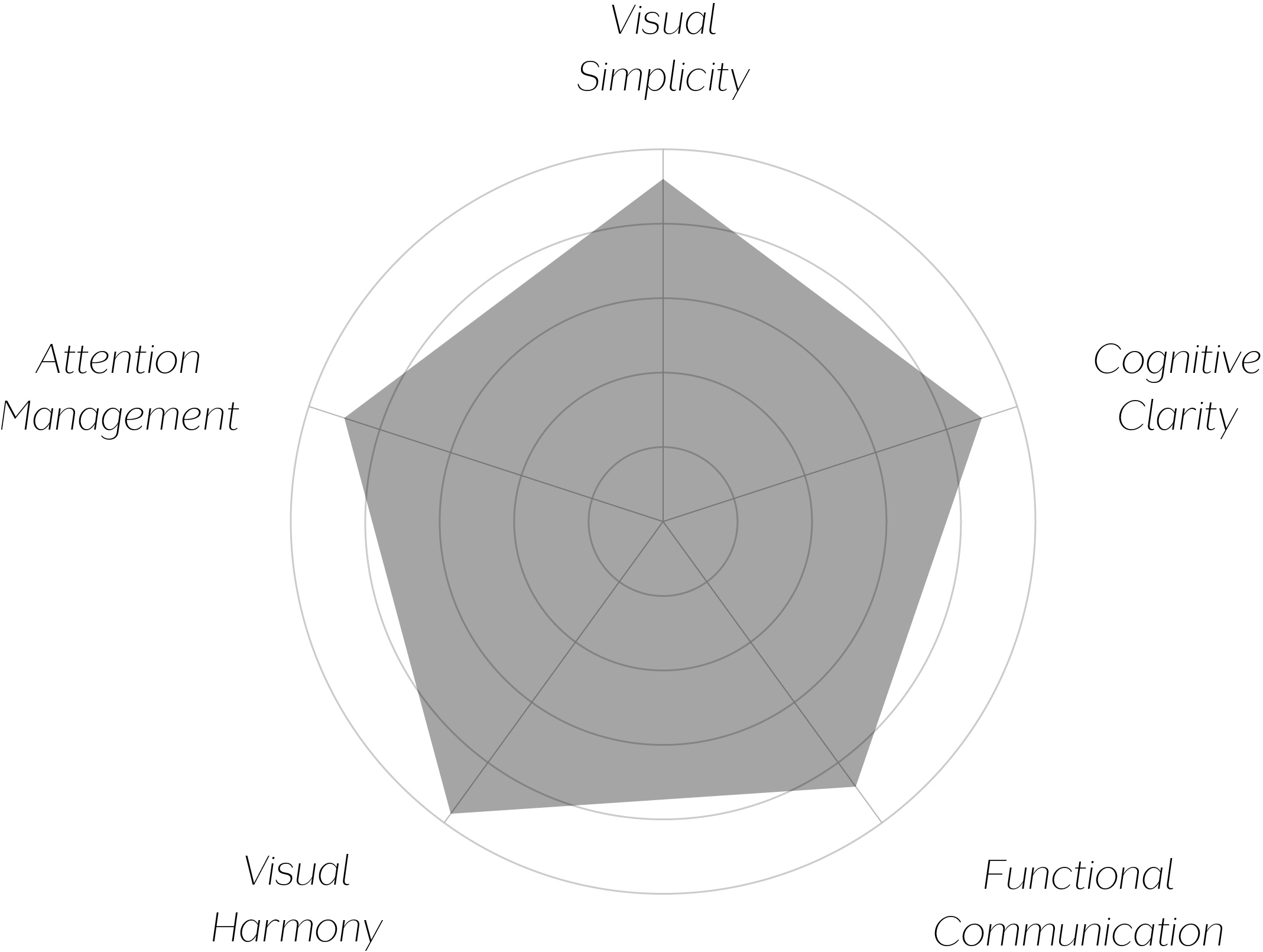
Vand Score 96/ 100
Performance across the five core Vand assessment dimensions.

The system's central lesson is that a single illustrated motif, varied only in its central object, can carry more brand recognition than a larger, less disciplined icon library — recognizability comes from repetition of relationship, not repetition of exact image.
The hand-drawn line quality does real work beyond aesthetics: its consistent imperfection signals a human, unautomated sensibility that would be lost if the same compositions were rendered in clean vector geometry, and the system correctly preserves this quality at every scale, from hero-sized to thumbnail-sized.
The palette's narrowness is a discipline choice with compounding returns — because so few colors are ever introduced, each application immediately reads as part of the same family even when the layout, headline, and context differ completely.
The jury certifies this identity system at the highest tier for the rare discipline of building genuine visual range from a single recurring motif rather than a library of disconnected assets. The hand-drawn quality, restrained palette, and consistent compositional logic hold together across contexts as different as a dense editorial grid and a single-panel social ad — a demonstration that coherence, sustained this thoroughly, is itself a form of respect for the viewer's attention.
A brand doesn't need many ideas to feel rich — it needs one idea trusted enough to be drawn again and again, differently each time.