







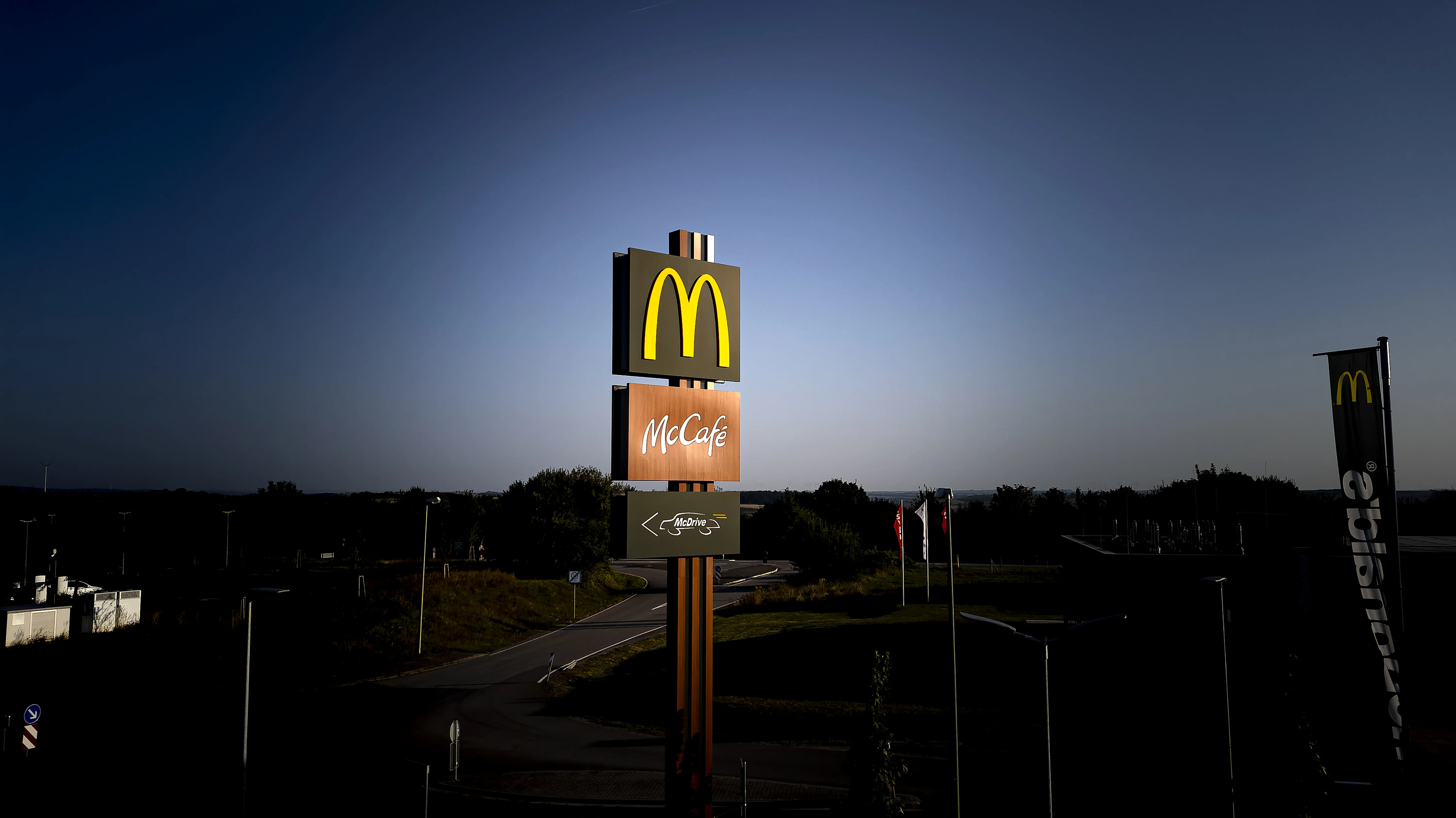
Product Name: McDonald's Storefront Signage & Facade Adaptation (European locations)
Brand: McDonald's
Category: Retail/Restaurant Architectural Branding
Manufacturer: McDonald's Corporation
Designer: No publicly verified designer has been identified for this product.
Identification Confidence: High (brand and category); Not Applicable (individual authorship)

Across the four European storefronts submitted — Milan's Galleria, a City of London corner, a second Milan facade, and a Haussmannian Paris block — the McDonald's identity shows real, if inconsistent, sensitivity to historic context. The golden arches are consistently reduced to a single small mark rather than a large illuminated sign in the Milan and London examples, and dark, low-contrast fascia treatments replace the brand's usual saturated red field in several locations. This is meaningful restraint for a global identity built on high-visibility signage. But the adaptation is uneven: the Paris location reintroduces a large, brightly lit wordmark directly against ornate stonework with comparatively little concession to the building's scale or material, and even in the more restrained locations, illuminated signage boxes and applied lettering sit somewhat abruptly against carved stone and ironwork that were never designed to accommodate them. The result is a brand that has clearly made an effort to soften itself for historic European streetscapes, but has not done so with full consistency across locations.
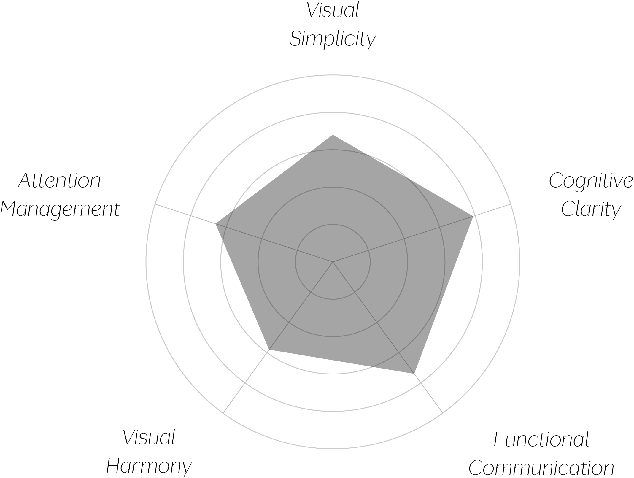
Vand Score 69/ 100
Performance across the five core Vand assessment dimensions.

The strongest lesson here is that architectural sensitivity in a global retail identity is achievable without abandoning brand recognition — the Milan and London examples prove a small, quiet arches mark is still instantly legible as McDonald's, even without the brand's usual scale or color intensity.
The inconsistency across locations is itself instructive: it suggests the constraint being applied in the more successful examples is a site-specific decision rather than an internalized design principle. A brand genuinely committed to contextual respect would apply that same discipline uniformly, rather than making it conditional on the perceived prominence or protection status of a given street.
The jury's judgment reflects real, if inconsistent, effort. Where McDonald's has chosen to reduce its usual visual scale and let historic architecture lead, as in Milan and London, the result is a genuinely respectful adaptation that preserves brand recognition without overwhelming its surroundings. Where that discipline is not applied, as in Paris, the storefront reverts to a more conventional and less considered presence.
Certification at Class C reflects a brand capable of real restraint, but one that has not yet made that restraint a consistent standard rather than a selective exception.
A brand this recognizable does not need volume to be understood — the Milan and London storefronts prove it. The rest of the system has not yet caught up to that lesson.