



Product Name: Klarna App & Payment Experience
Brand: Klarna
Category: Financial Technology / Digital Payment Interface
Manufacturer: Klarna Bank AB
Designer: No publicly verified individual designer has been identified for this product.
Identification Confidence: High (brand and product); Not Applicable (individual authorship)

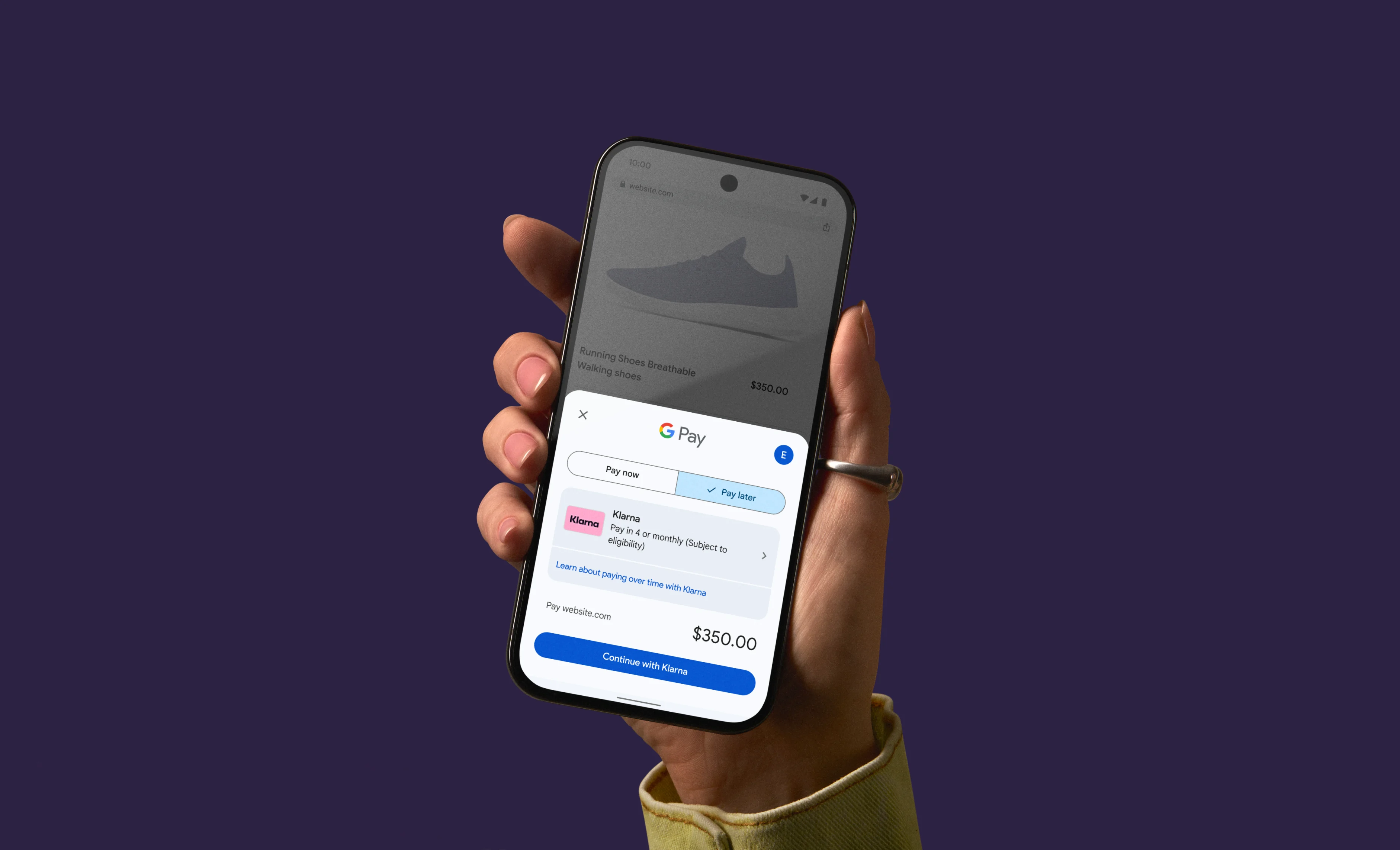
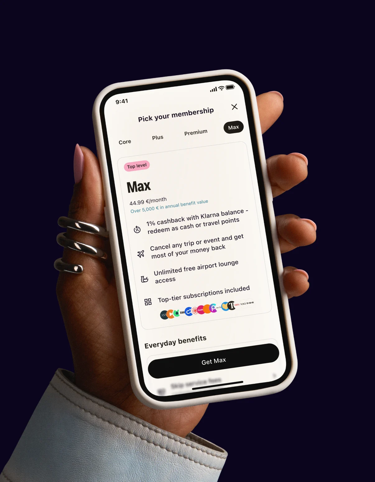
Klarna's visual identity is distinctive and well-handled at the surface level: the pink field, the rounded wordmark, and the black-on-pink card treatment are applied consistently enough to be instantly recognizable across app screens, payment sheets, and campaign photography. But as a functional financial product, the interface repeatedly subordinates its most consequential information — what is owed, when, and under what terms — to shopping content, social imagery, and promotional modules. Screens built around discovery, wish lists, and lifestyle photography are visually louder and more prominent than the screens showing actual payment obligations, which appear smaller, later, and with less visual weight than the browsing experience surrounding them. For a product whose core function is deferred payment, this hierarchy is a meaningful design concern rather than a stylistic footnote, and it is the primary reason this assessment does not reach certification.
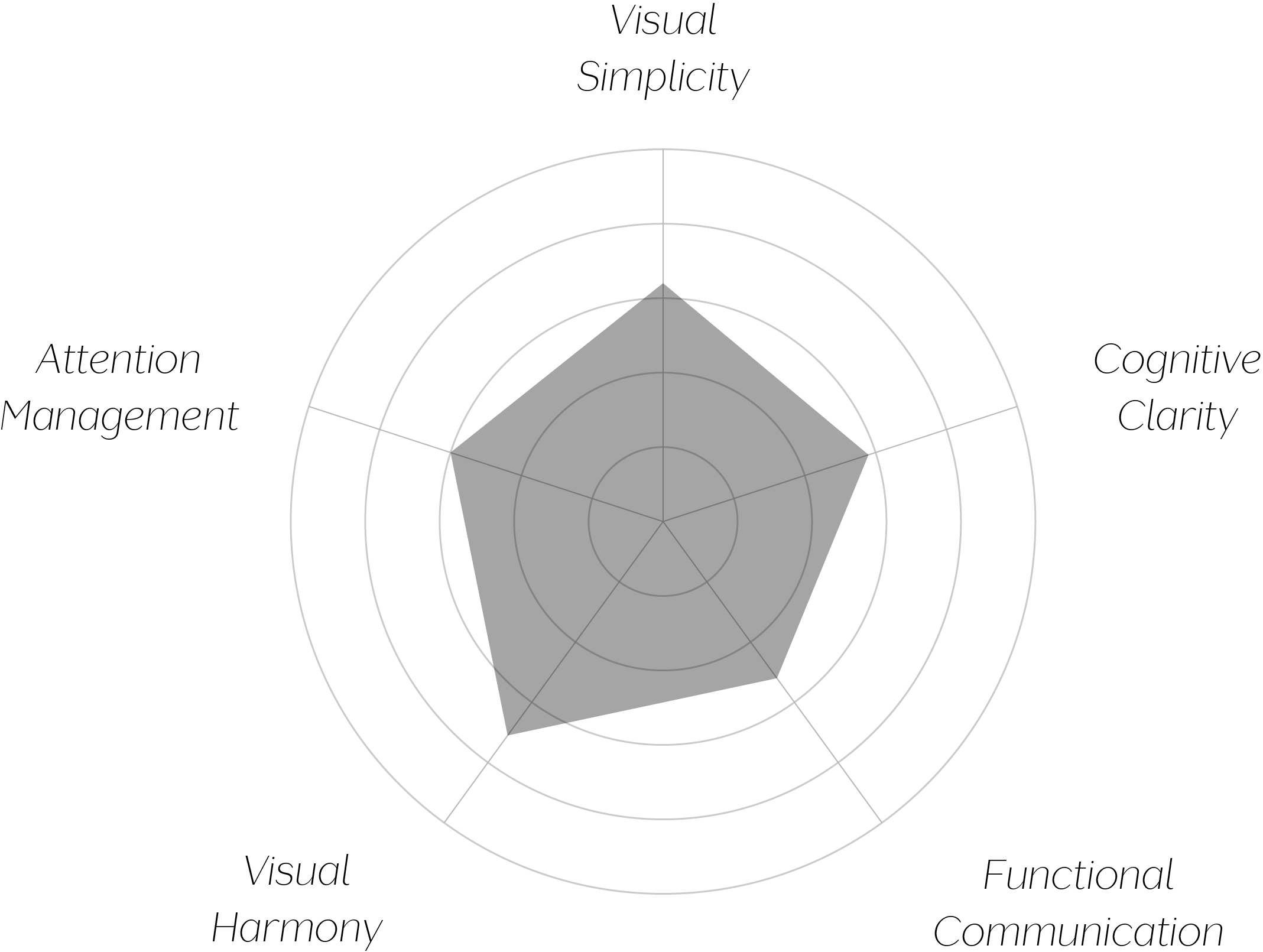
Vand Score 61/ 100
Performance across the five core Vand assessment dimensions.
The clearest insight here concerns the difference between brand consistency and functional honesty. Klarna's visual identity succeeds at making every screen recognizably "Klarna," but recognizability is not the same as the interface prioritizing what matters most to the person using it. A financial product's design is ultimately judged by what it makes easy to see, and this system makes shopping easier to see than debt.
There is also a structural insight in how shopping and payment functions are woven together on the same screens. Presenting wish lists, deals, and a payment obligation within a single, similarly styled interface can blur the psychological line between browsing and owing — a pattern worth naming carefully, since it affects how clearly a person can track their actual financial position at a glance.
The jury recognizes real craft in Klarna's visual identity — the color system, the wordmark, and the component language are consistently and confidently applied. But VAND Certification asks whether a design respects the person who encounters it, and for a payment product, respect begins with making financial consequence at least as visible as the invitation to spend. Across the materials submitted, that balance is not yet struck: shopping and discovery consistently receive the interface's strongest visual treatment, while the obligations a payment product exists to clarify are rendered comparatively quiet.
A well-branded interface is not the same as a well-prioritized one — and on the evidence here, brand has been allowed to lead where function should.