




Product Name: Cooper (Hardtop 2 Door, 5th generation / F66)
Brand: MINI
Category: Compact hatchback
Manufacturer: MINI (BMW Group)
Designer: Oliver Heilmer, Head of MINI Design, and the MINI Design team
Identification Confidence: High — corroborated by multiple independent manufacturer and automotive-press sources.

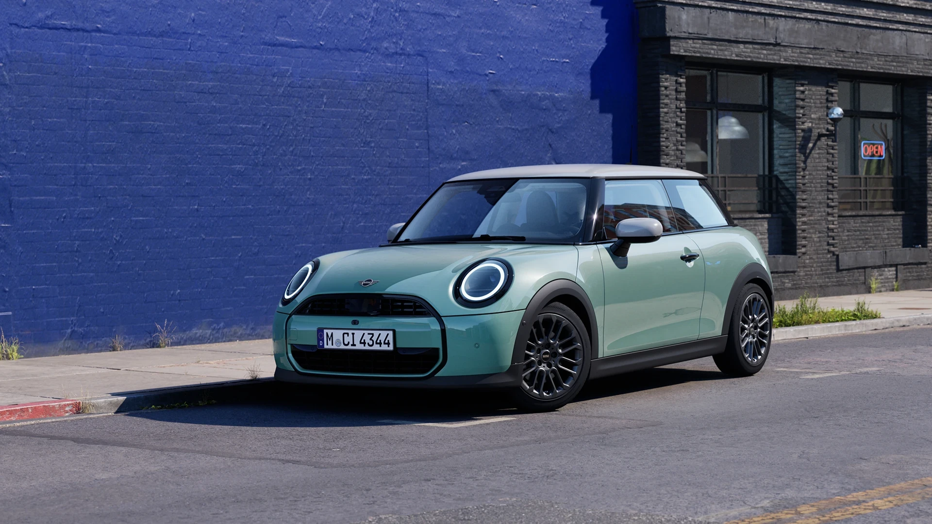
A face reduced to almost nothing but two round eyes, proving that a brand's identity can survive — even strengthen — through radical subtraction.
This Cooper's front end is organized around one clear idea: the circular headlight, treated as a glowing ring rather than a conventional lamp cluster, doing nearly all the work of establishing the car's character. The hood is shortened enough that the wheels sit close to the body's front edge, a proportion that reads as compact and eager rather than merely small. Colour is handled with equal discipline — a soft sage green body meets a contrasting light roof along one clean line, a two-tone treatment that has been part of this brand's visual signature for decades and is executed here with real precision. Black cladding wraps each wheel arch, giving the car a grounded, protected stance without needing additional ornament. Every element present is doing real work, and very little has been added beyond what's necessary to communicate the brand's personality. It certifies in the A class for a design that achieves genuine warmth and character through subtraction rather than addition.
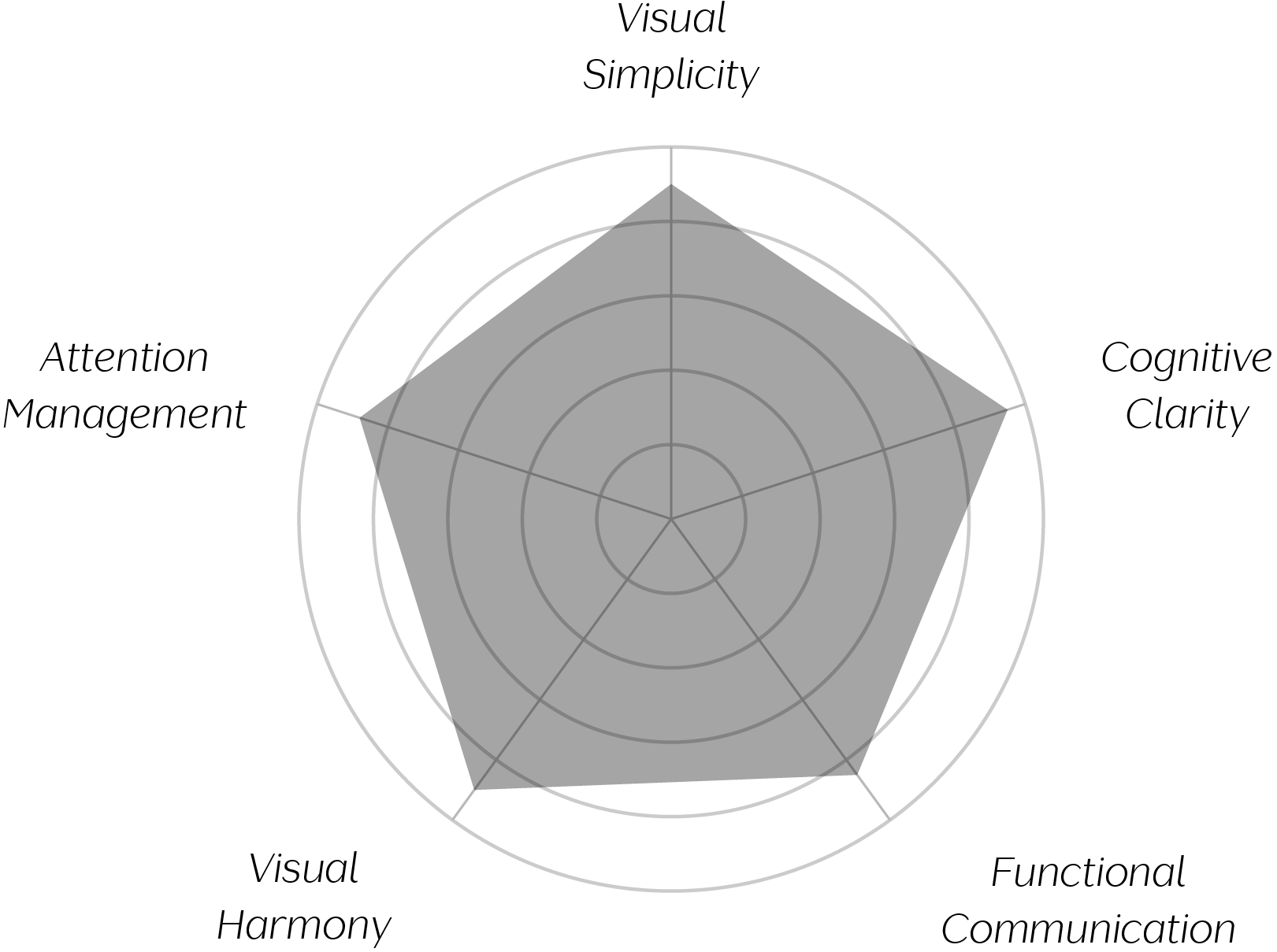
Vand Score 90 / 100
Performance across the five core Vand assessment dimensions.
.jpg)
This car demonstrates that shortening a single proportion — the hood — can cascade into simplifying an entire front-end composition, since less surface area available naturally limits how many competing details can be added.
It also shows that a brand's identity can be carried almost entirely by one recurring geometric motif — here, the circular headlight — reducing the need for additional applied branding elsewhere on the face.
Most instructively, the design proves that colour-blocking, executed with a single clean line rather than a graduated or complex boundary, can read as more confident and premium than a more elaborate multi-tone treatment would.
The evidence supports certification at Class A. This Cooper succeeds by trusting a small number of well-resolved ideas — a shortened hood, a circular headlight signature, a clean two-tone colour split — to carry its entire character, rather than layering on additional surfacing or ornament. That restraint produces a face that is warm and immediately recognizable, achieved through subtraction rather than addition, which is a genuinely difficult balance to strike in a category that often rewards visual assertiveness. Cross-referencing official rear-view photography confirms this same discipline carries through the whole car: the tail lights use their own graphic signature (a Union Jack-derived motif) as a distinct but equally restrained brand marker, mirroring the confidence of the circular headlights at the front. It falls just short of the highest scores because the wheel-arch cladding sits slightly apart from the otherwise unified two-tone logic. As a closing observation: this design shows that an icon doesn't need to be reinvented to feel new — it only needs to be edited down to what still matters, from headlight to tail lamp.