





Product Name: Reverence Aromatique Hand Wash
Brand: Aesop
Category: Personal care / hand wash packaging
Manufacturer: Aesop, Fitzroy, Australia
Designer: No publicly verified designer has been identified for this product.
Identification Confidence: High

The Reverence Aromatique Hand Wash bottle exemplifies a design philosophy in which restraint is the primary communicative tool. Amber glass, a dense apothecary-style label, and a strict typographic hierarchy work together to signal both function and quality without relying on decorative flourish. The front label organizes brand, product name, key ingredients, and bilingual description into legible tiers, while the rear label extends the same discipline into usage instructions and full ingredient disclosure. What elevates this beyond simple minimalism is its consistency: nothing on the bottle competes for attention that hasn't earned it through informational relevance. The certification reflects a design that respects the user's time and comprehension at every point of contact with the object, from shelf to sink.
Vand Score 87/100
Performance across the five core Vand assessment dimensions.
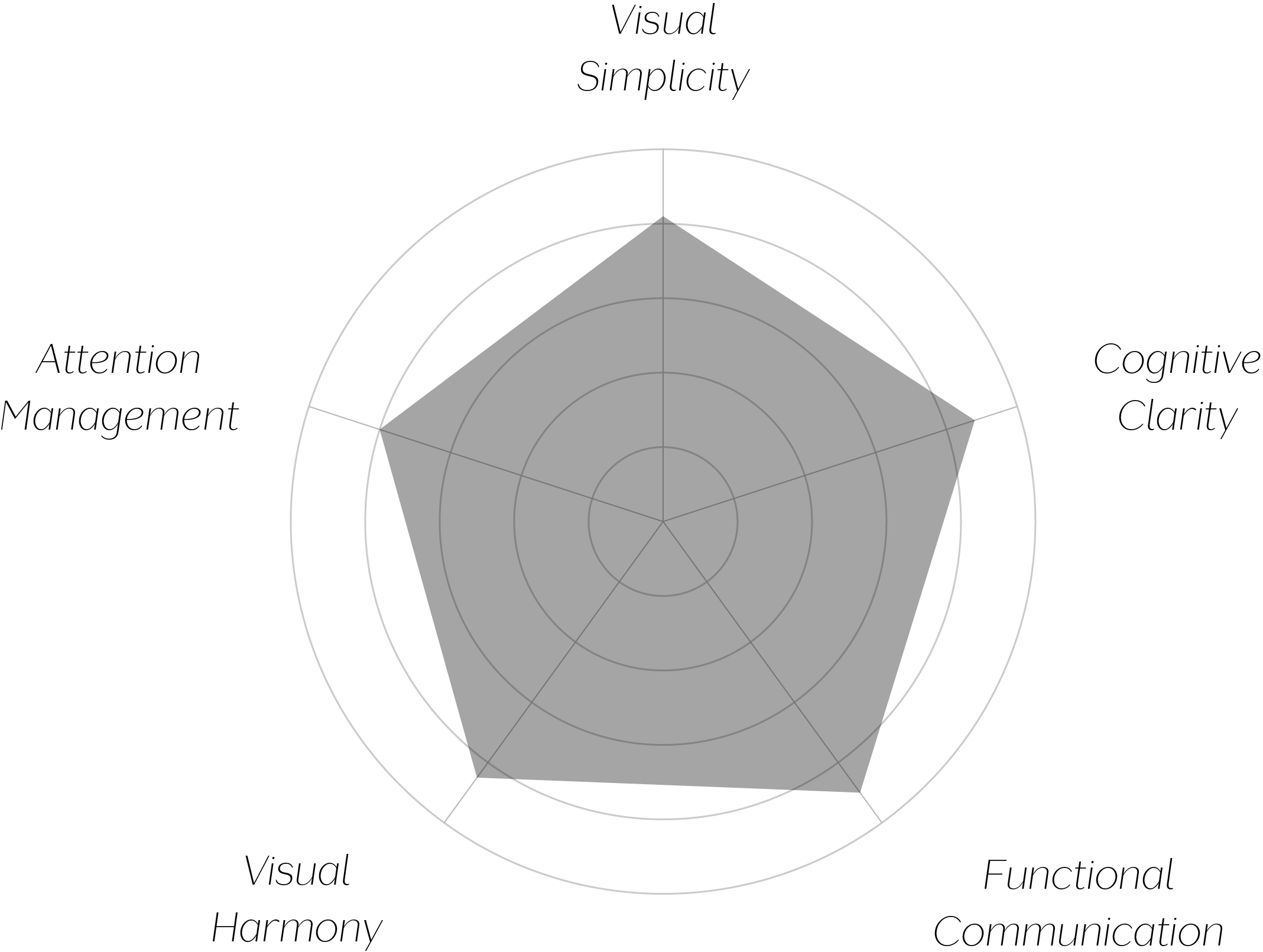

This bottle demonstrates that density and clarity are not opposites — a label can carry ingredient lists, bilingual copy, usage instructions, and multi-country contact information and still feel calm, provided the hierarchy is disciplined enough to sort it.
The apothecary aesthetic works here because it is functional first and referential second: the amber glass has genuine light-protection logic, and the label's document-like structure mirrors an actual paper insert rather than merely evoking one.
The most transferable lesson is sequencing: front label sells and instructs, rear label discloses and complies — a division of labor that keeps each panel legible for its actual purpose rather than trying to do everything at once.
The jury finds this packaging design certifiable at Class A on the strength of its typographic discipline and its evident respect for the user's need to locate information quickly and reliably. Few products in this category carry this much text while asking so little cognitive effort of the person holding the bottle. The minor congestion on the rear label keeps this from the highest tier, but the core achievement — order imposed on density — is exactly the kind of quiet competence VAND Certification is designed to recognize.
Good packaging doesn't reduce what it says; it simply says it in the right order.