Product Name: Flagship Retail Store Interior (5th Avenue)
Brand: Abercrombie & Fitch
Category: Retail environment / experiential store design
Manufacturer: Not applicable — architectural and interior fit-out
Designer: No publicly verified designer has been identified for this specific interior program.
Identification Confidence: Moderate (brand and location identifiable from fixtures, signage character, and merchandising style; specific design firm not confirmed from the photographs alone)
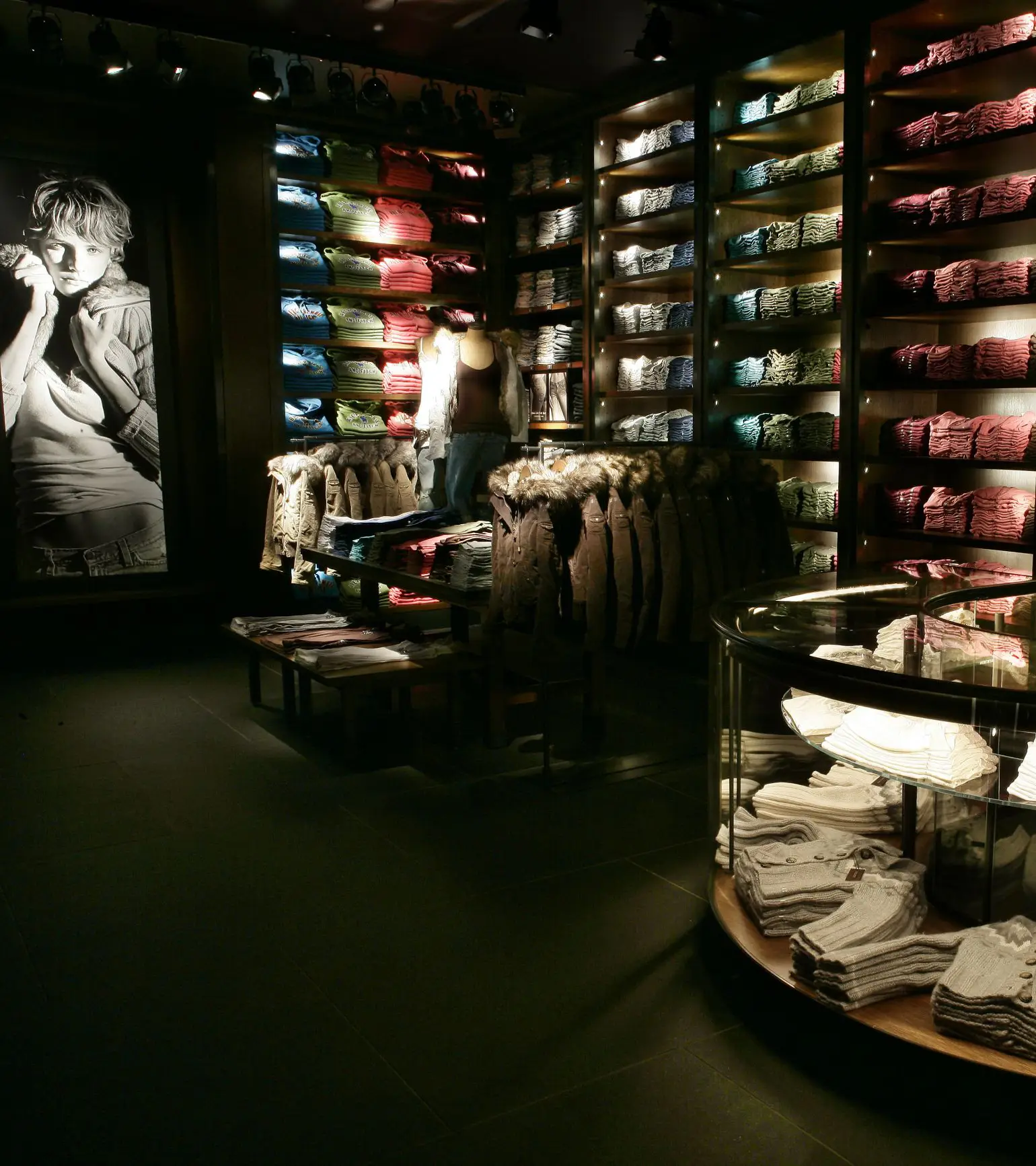
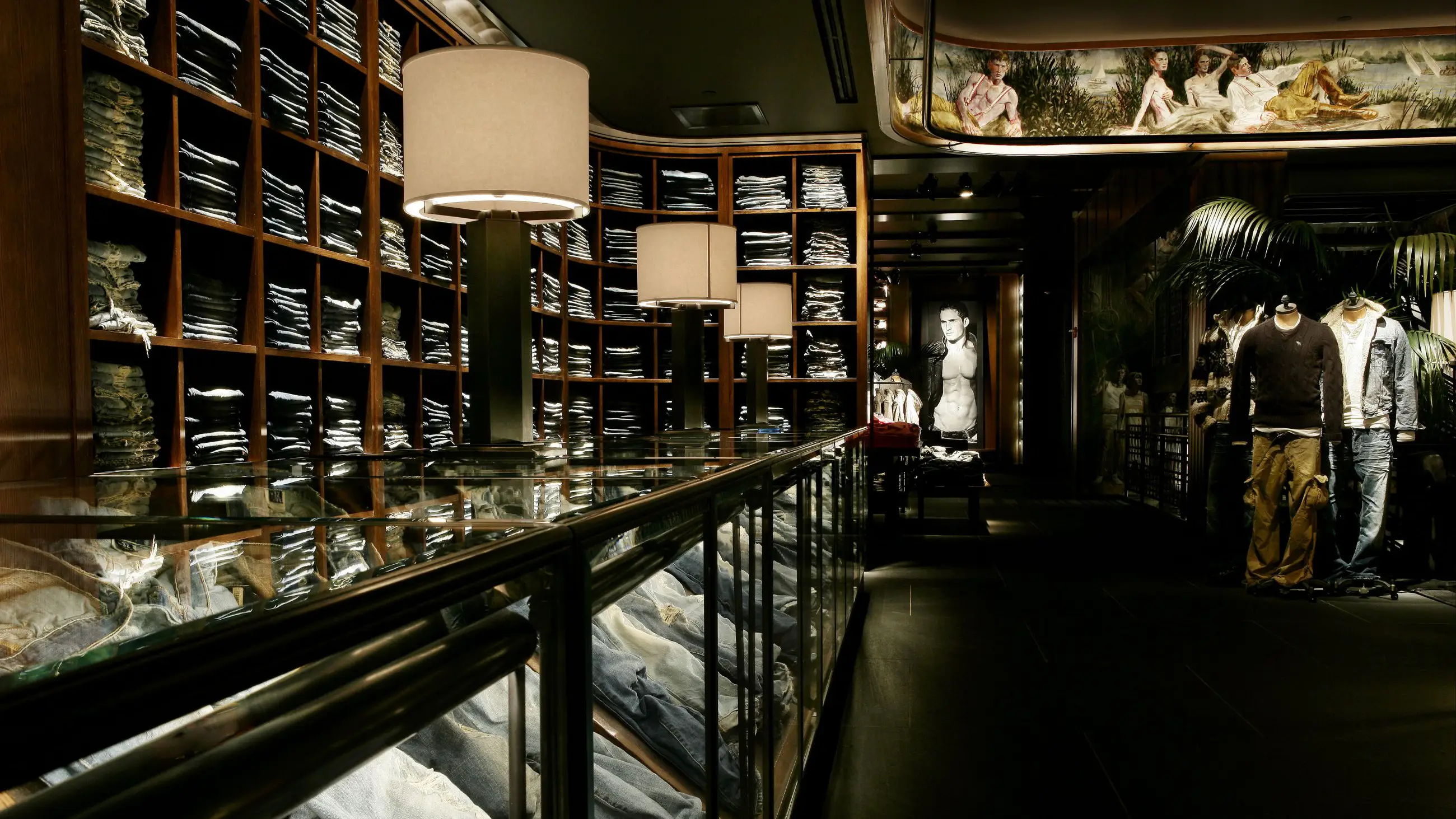
The space under review is a flagship apparel store built around deliberate darkness, dense product walls, and large-scale figurative murals used as environmental branding devices. As a piece of experience design, it demonstrates real craft: the joinery, the lighting choreography, the mural commissioning all reflect intention and resources. But the assessment here concerns how the design treats the person moving through it — and on that count the space consistently prioritizes spectacle over comprehension. Product is folded into dense, repetitive grids that read more as texture than as inventory to browse. Circulation paths are narrow and visually ambiguous. Illumination is concentrated on accent lighting and imagery rather than on the customer's task of finding, evaluating, and selecting garments. The result is a design that is confident in its aesthetic identity but inattentive to the basic courtesies of orientation, choice-support, and visual rest.
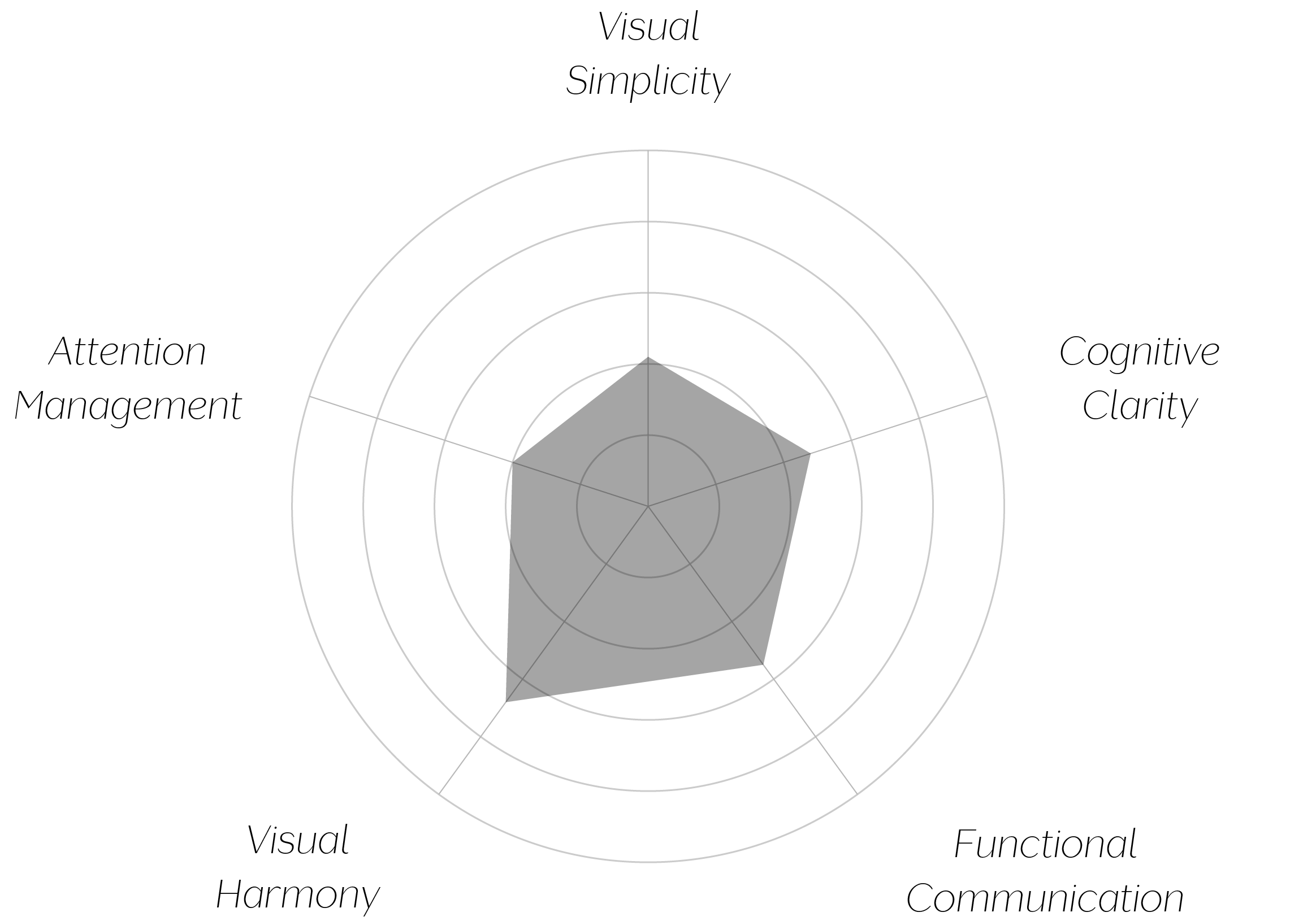
Vand Score 58/ 100
Performance across the five core Vand assessment dimensions.
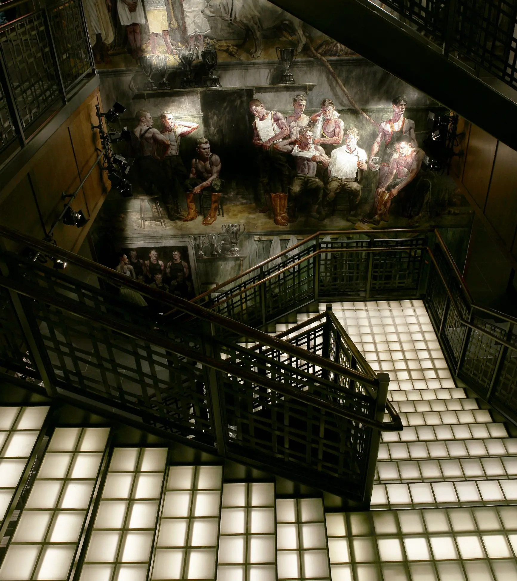
The denim wall demonstrates that repetition, when paired with consistent joinery and warm backlighting, can read as connoisseurship rather than clutter — proof that density is not inherently a flaw when the underlying grid is disciplined enough to carry it.
Darkness here functions as a design decision with a cost: it manufactures intimacy at the direct expense of legibility, and a store that must be squinted through has traded one kind of desirability for another kind of friction.
The most instructive lesson is architectural: when environment and merchandise are lit to the same intensity, neither wins. A space that wants product to be the subject has to let light, not just material, do the pointing.
The jury recognizes craft in this space — in its joinery, its restrained material palette, and the genuine cohesion of its product walls. But VAND Certification asks a narrower question than "is this distinctive," namely: does the design respect the attention and orientation of the person inside it? Here, the answer is inconsistent. Darkness, competing imagery scale, and chromatic-only merchandising logic repeatedly ask the visitor to work harder than the design gives back. A space this deliberate deserved a light plan this deliberate about function, not only mood.
A store that dims the room to raise the mood has still made its customer read in the dark.