



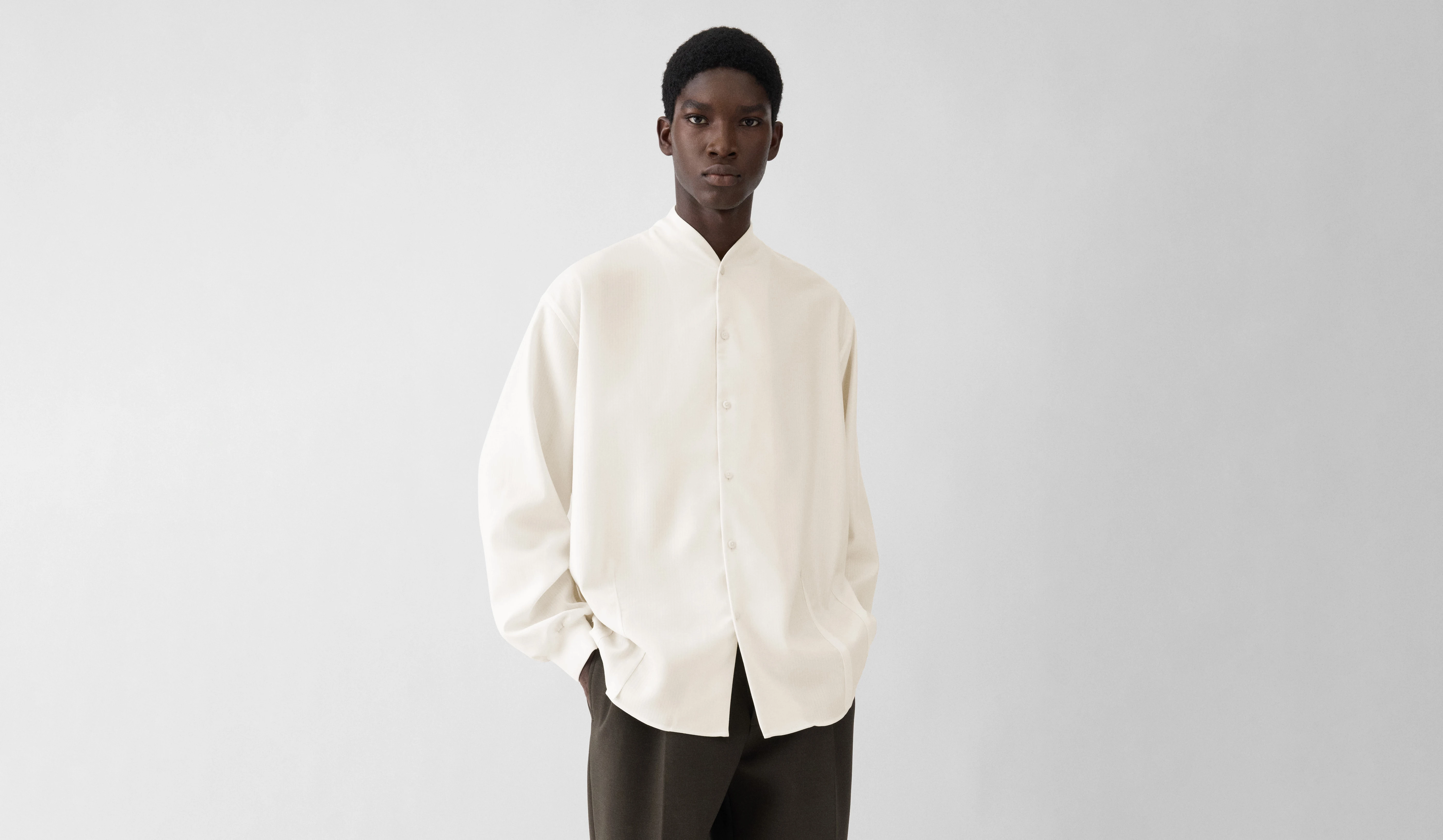
Product Name: The Vendange Shirt
Brand: Jacquemus
Category: Fashion / Apparel
Manufacturer: Jacquemus
Designer: No publicly verified designer has been identified for this product.
Identification Confidence: High
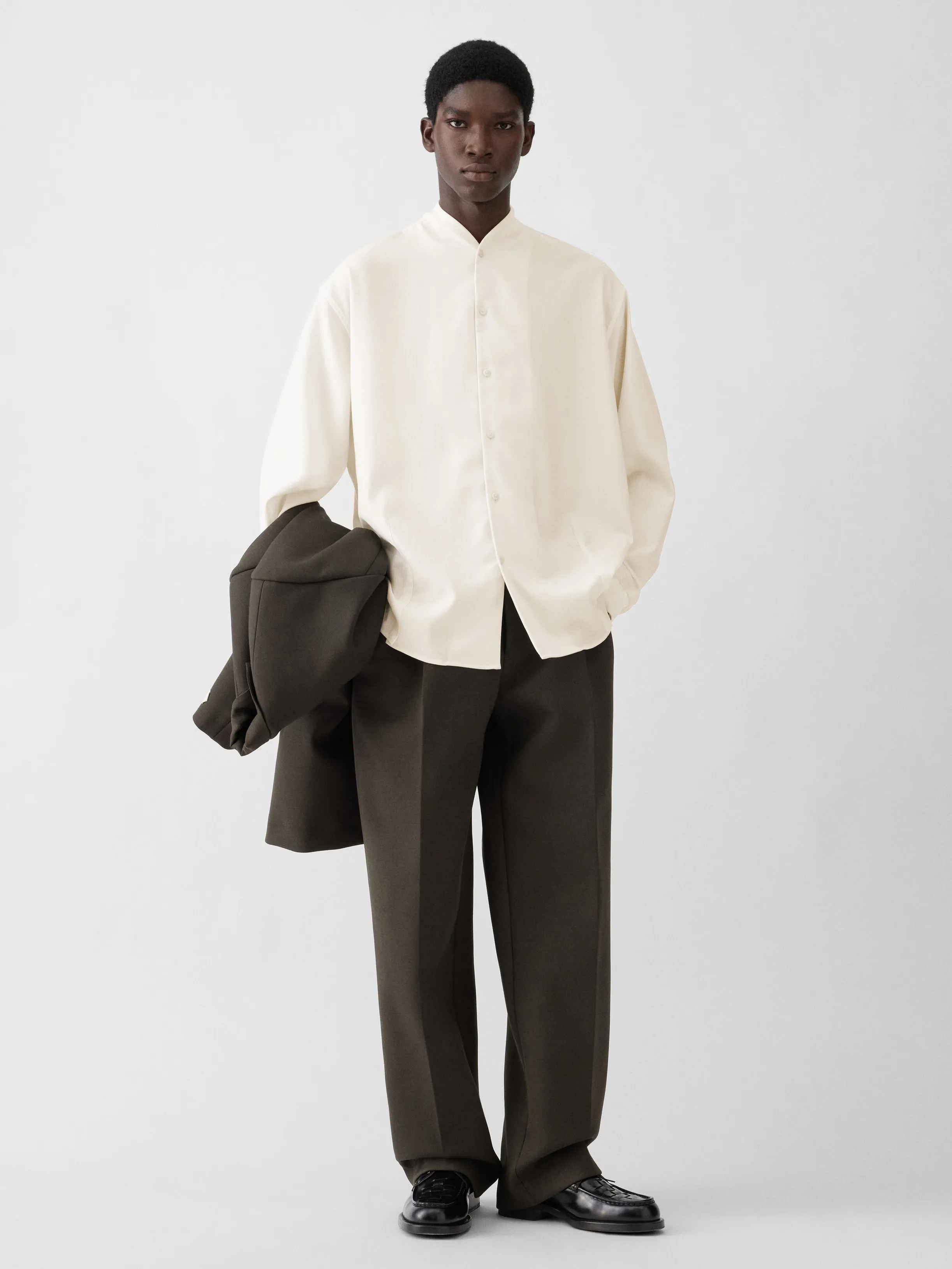
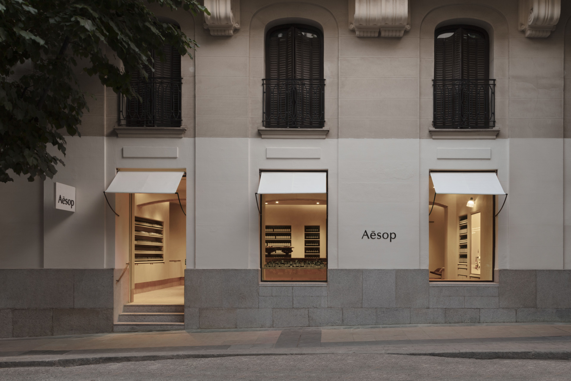
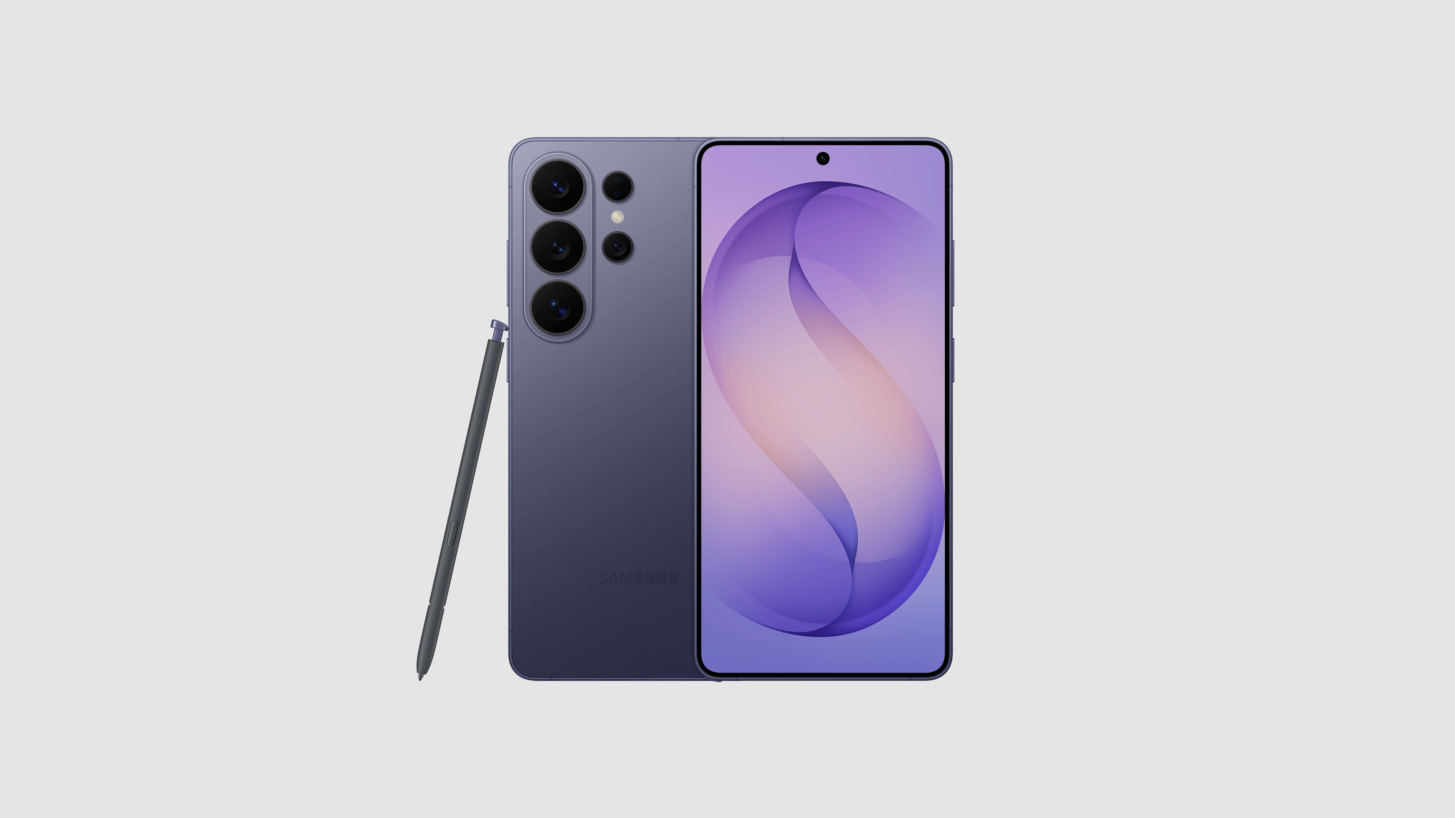
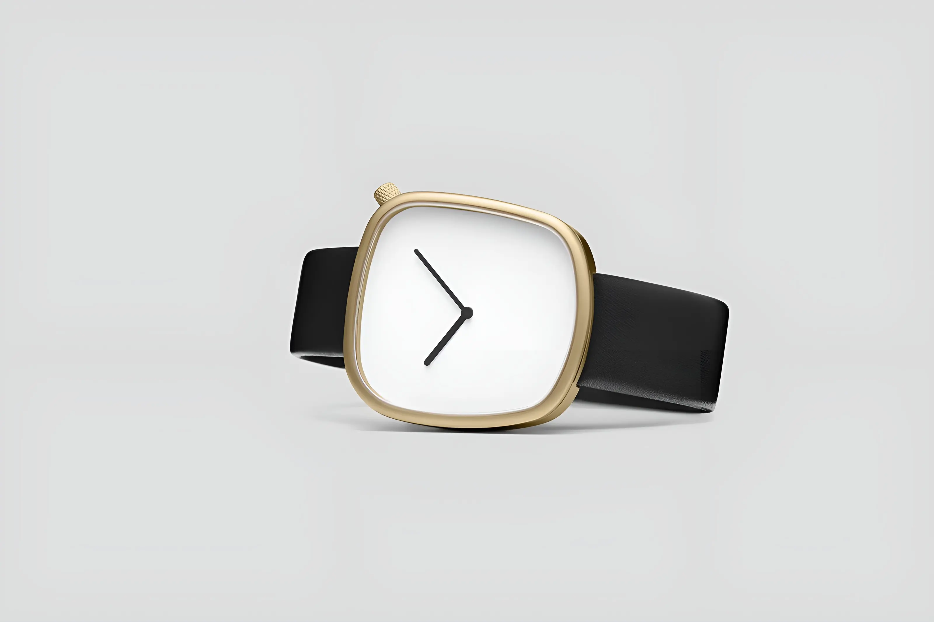
Across the four screens submitted, Jacquemus The Vendange Shirt's digital retail experience demonstrates a rare degree of unity: white space is treated as a structural material rather than empty margin, typography stays within a tight and disciplined range, and product photography is the only element ever permitted visual prominence. Nothing in the interface competes with the garments themselves — not navigation, not promotional messaging, not iconography. This is design behaving as an act of deference, and it is sustained without exception across every screen evaluated. The assessment identifies only marginal softness in a small number of secondary interactive cues, not enough to disturb an otherwise exemplary system. This is certification at the highest class VAND currently awards.
Vand Score 95/ 100
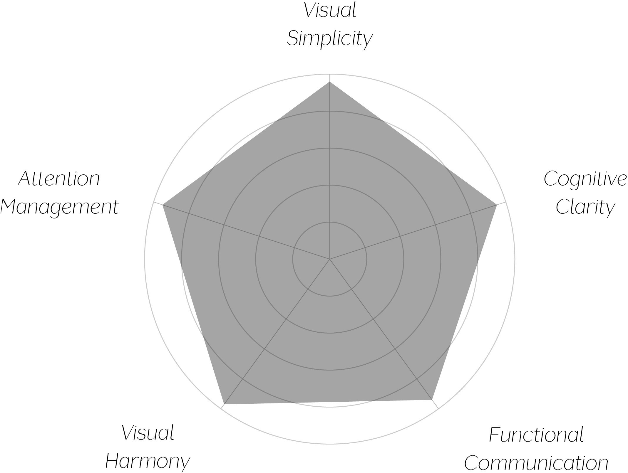
Performance across the five core Vand assessment dimensions.
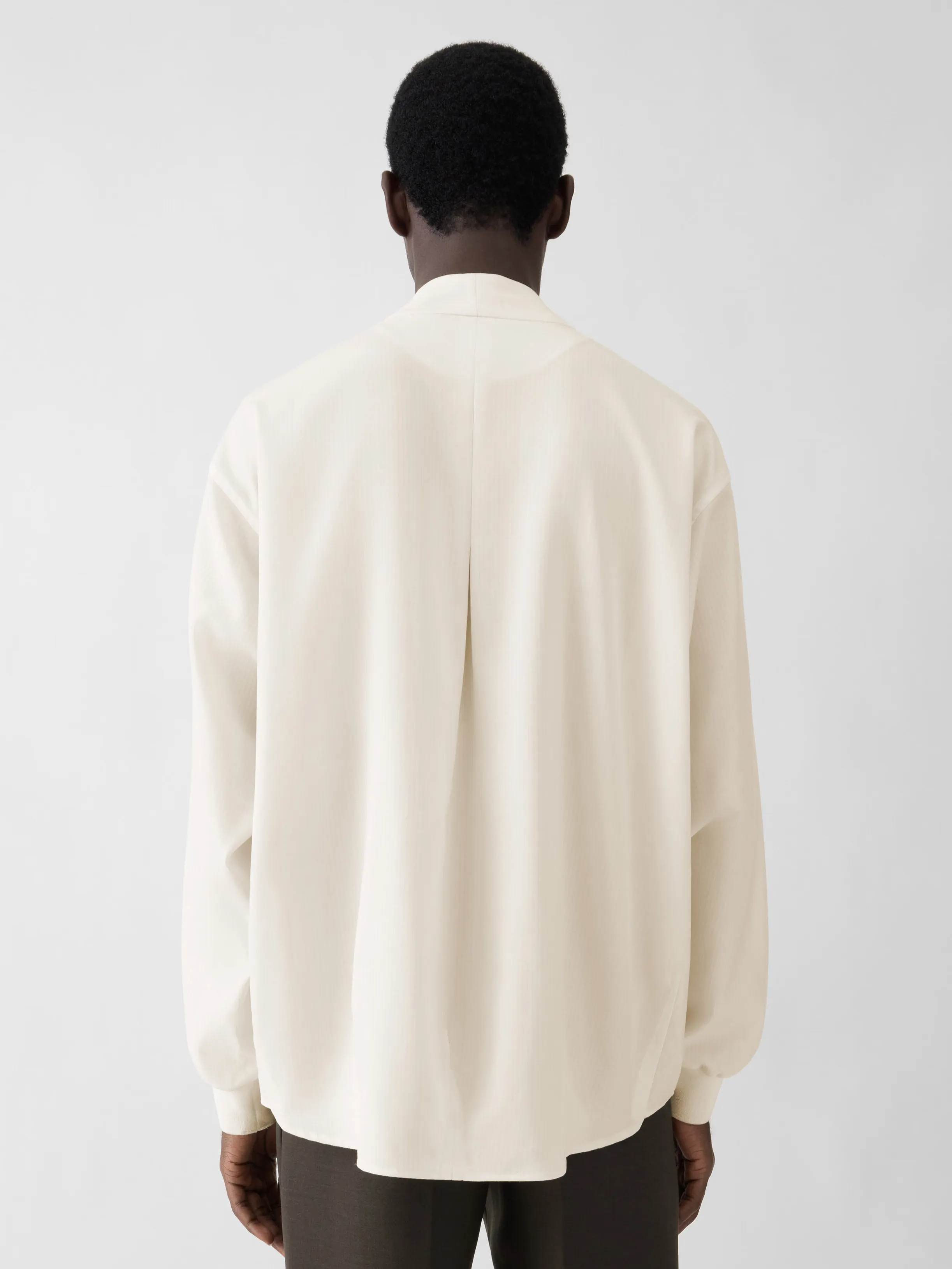
The interface demonstrates that white space, used with enough discipline, can function as the primary design element rather than the absence of one — it is doing more communicative work here than color or typography.
Consistency compounds: because the same grid and spacing logic recur across every screen type, the system reads as a single coherent decision rather than a set of individually designed pages, which is a harder and rarer achievement than any single well-designed screen.
Restraint in a commercial retail context is a genuine test of design conviction, since every stakeholder pressure in that category pushes toward more promotional visibility. This system's ability to hold its discipline against that pressure is its most quotable achievement.
The jury finds a design system that has resolved one of retail design's hardest tensions — the pull between commercial visibility and visual calm — decisively in favor of the viewer. Every screen submitted defers to the same disciplined grammar of white space, restrained color, and quiet typography, letting the product remain the only thing the eye is ever asked to focus on. The rare softness identified in secondary interactive cues is minor against a system this consistent. The highest form of design confidence is knowing when not to speak, and this system rarely forgets it.