




Product Name: Aēsop Store Exterior (Madrid location)
Brand: Aēsop
Category: Retail Architectural Branding
Manufacturer: Aēsop (a subsidiary of L'Oréal)
Designer: No publicly verified designer has been identified for this product.
Identification Confidence: High (brand and category); Not Applicable (individual authorship)
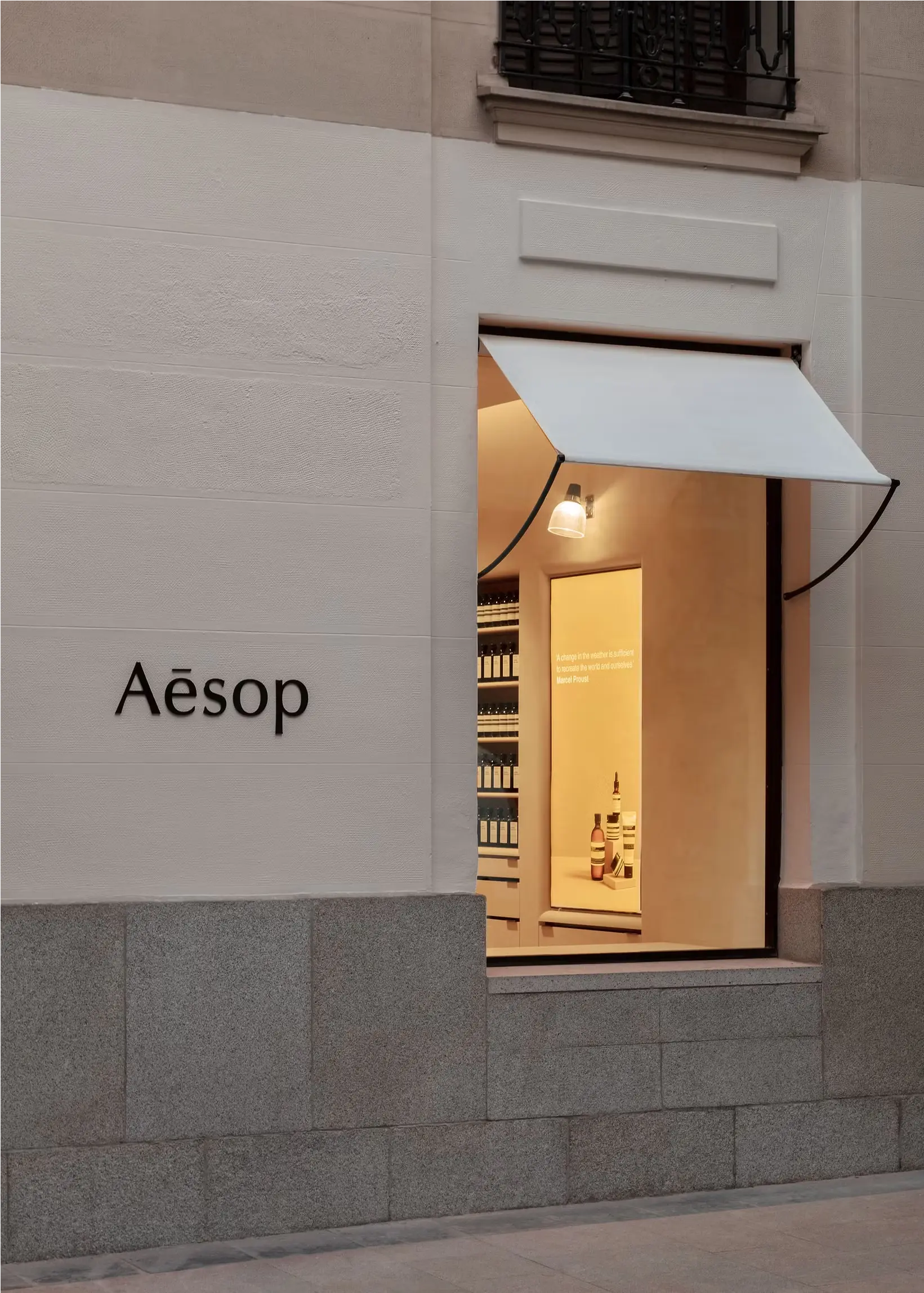
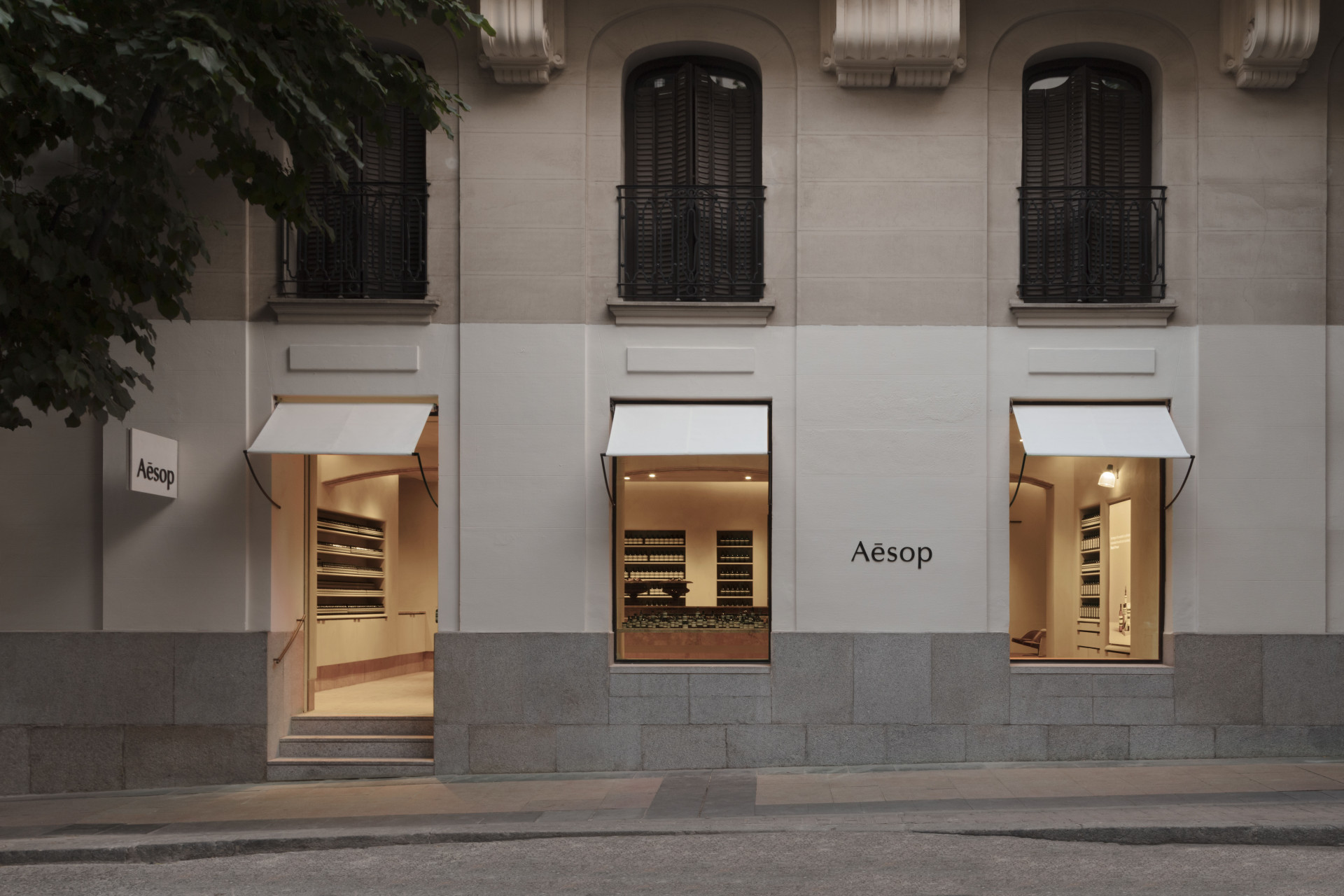
The Aēsop Madrid storefront makes one governing decision and holds to it completely: the historic stone facade is left almost entirely untouched, and the brand's presence is communicated instead through interior warmth spilling out through three arched windows, a single small wall-mounted sign, and one modest instance of the wordmark set directly into the stone between two windows. There is no illuminated box sign, no color intervention, no applied cladding — the building's own nineteenth-century architecture, complete with wrought-iron balconies and carved stone cornices, remains the dominant visual event from the street. The three matching white awnings are the only applied element repeated across the facade, and they are treated with the same restraint as everything else: plain, unbranded, functional. This is a design that trusts its interior lighting and a few quiet marks to do the work most retail brands would assign to loud exterior signage, and the result is a storefront that reads as genuinely respectful of the building it occupies.
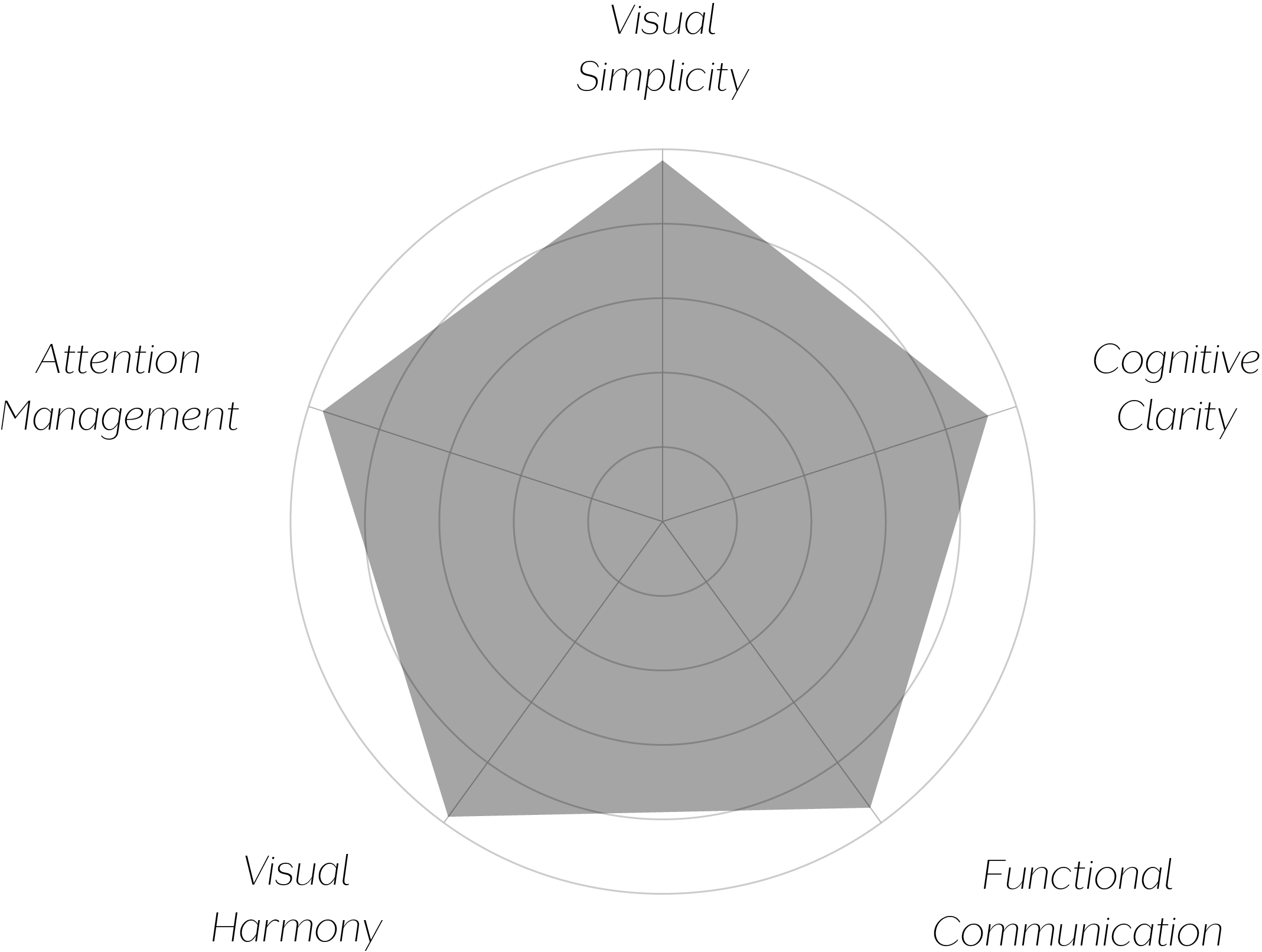
VAND Score 96/ 100
Performance across the five core Vand assessment dimensions.
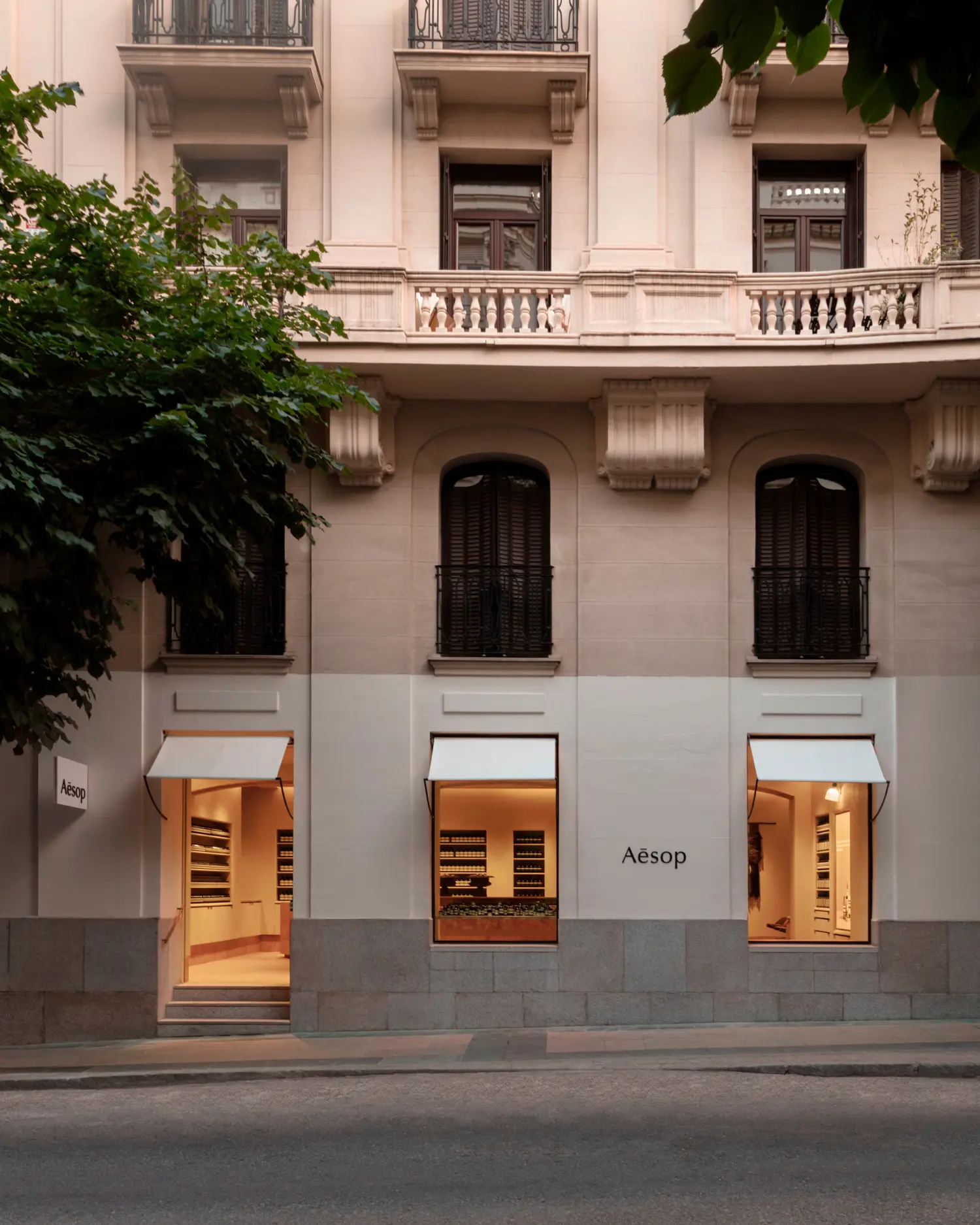
This storefront demonstrates that retail branding does not require exterior signage scaled to compete with its surroundings — interior lighting alone, allowed to spill outward through unaltered historic windows, can communicate a brand's presence more effectively and more respectfully than an illuminated sign ever could.
The design also shows real discipline in restraint applied consistently: it would have been easy to justify a slightly larger sign, a color accent, or a branded awning, and the choice not to take any of these opportunities, sustained across the entire facade, is what gives this storefront its genuine credibility.
The jury's judgment reflects a storefront design of rare restraint and confidence. By leaving the host building's historic facade almost entirely untouched and allowing warm interior light and two small, quiet marks to carry the entire brand presence, this design demonstrates genuine respect for its architectural context — a standard few retail brands are willing to meet.
Certification at the A+ level reflects a design with essentially no unresolved tension between commercial identity and architectural respect, a combination this consistently well-executed is genuinely rare.
A brand this confident does not need to announce itself loudly — it simply needs to be worth discovering, and this storefront trusts a passerby to do exactly that.