




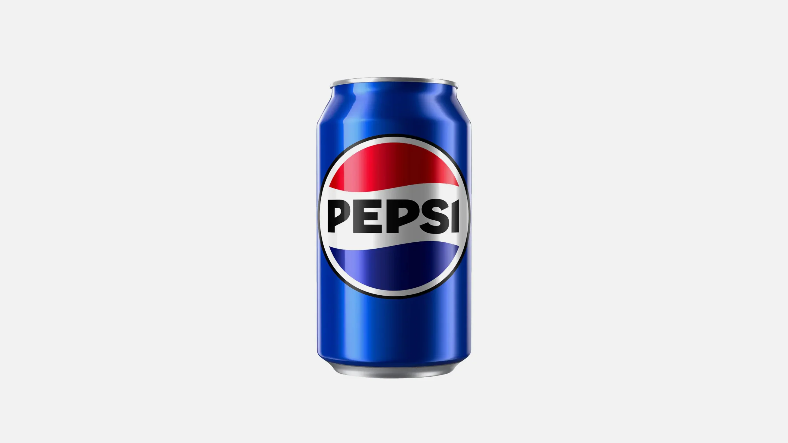
Product Name: Pepsi (standard can)
Brand: Pepsi
Category: Beverage Packaging
Manufacturer: PepsiCo, Inc.
Designer: No publicly verified designer has been identified for this product.
Identification Confidence: High (brand and product); Not Applicable (individual authorship)
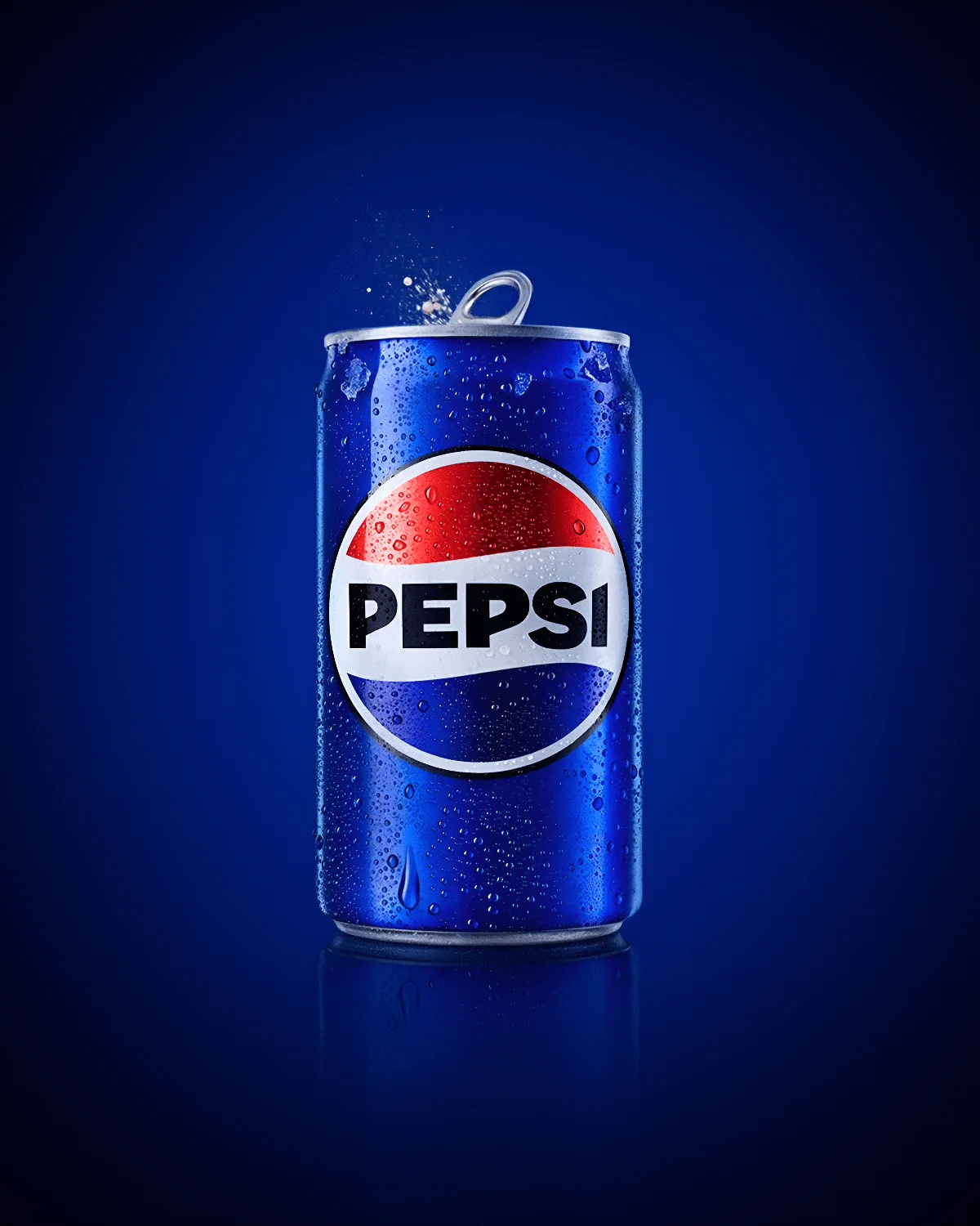
The Pepsi can builds its identity around a single, well-resolved element: the circular globe logo, its red-white-blue swoosh instantly recognizable and cleanly rendered against a white ring that separates it decisively from the can's deep blue body. This separation is the design's strongest decision, giving the mark real figure-ground clarity regardless of what surrounds it. The lowercase "pepsi" wordmark beneath is simple and unfussy, doing its job without competing for attention. Where the design gives up ground is in the body of the can itself: the blue field is rendered as a slightly uneven gradient with a busy pattern of condensation droplets layered across nearly the entire surface, and this texture, while intended to signal refreshment, adds a layer of visual noise that does little to reinforce the logo's clarity and somewhat undercuts the otherwise clean, confident mark at the can's center.
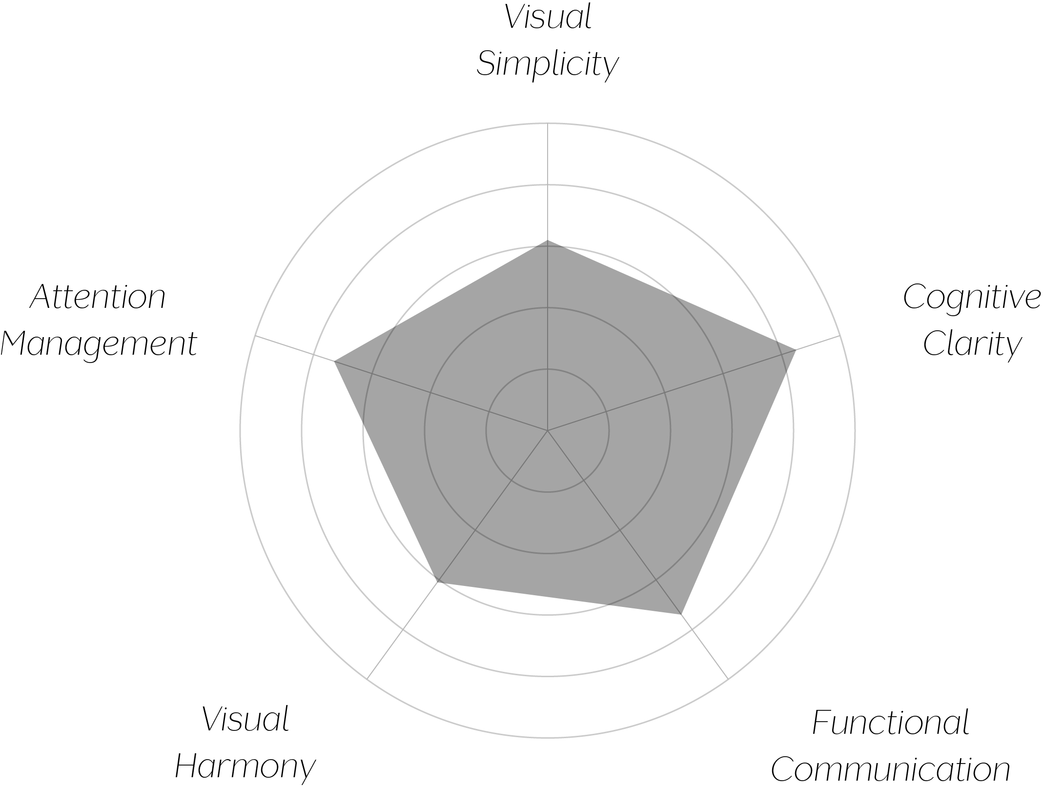
Vand Score 71/ 100
Performance across the five core Vand assessment dimensions.
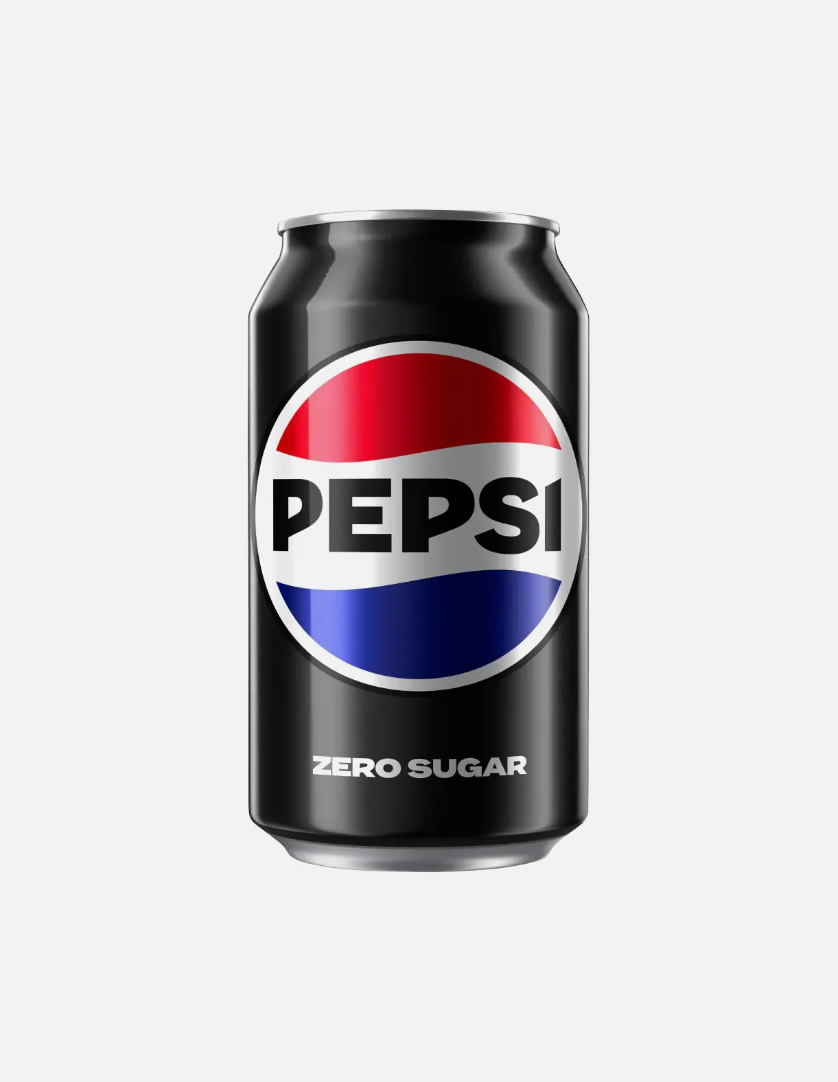
The white ring separating the globe logo from the can's body is a small but effective design decision — it protects the mark's clarity regardless of what happens to the surface color around it, which is precisely the kind of structural safeguard a frequently-reproduced brand mark benefits from.
The condensation graphic is a useful reminder that a design convention intended to communicate something positive (coldness, refreshment) can, if applied too densely, work against the same design's other strengths by adding visual noise the composition doesn't need.
The jury's judgment reflects a design carried by a genuinely strong central element. The globe logo's clarity and its protective white ring are decisions that hold up regardless of context, and they are the reason this can clears certification. What keeps the result at Class C rather than higher is the surface surrounding that mark: a gradient and condensation treatment applied densely enough to introduce visual noise the composition does not need.
A strong mark deserves a calm field to stand on — this can's logo has earned that field, and hasn't quite been given it.