





Product Name: Oatly Barista Edition Oat Drink
Brand: Oatly
Category: Beverage Packaging
Manufacturer: Oatly Group AB
Designer: No publicly verified individual designer has been identified for this product.
Identification Confidence: High (brand, product, category); Not Applicable (individual authorship)
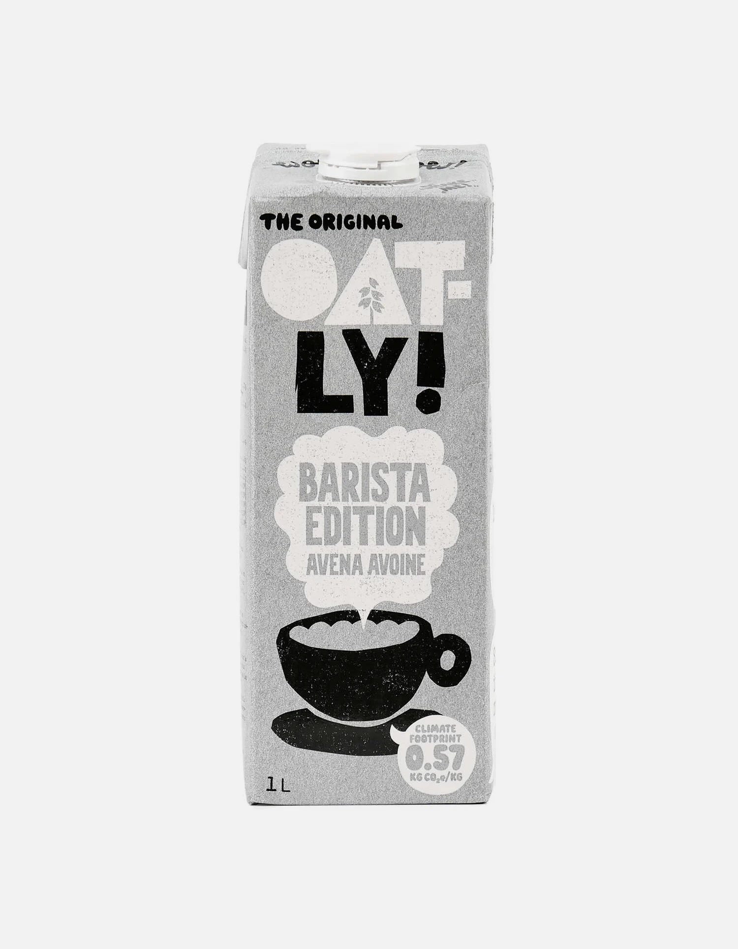
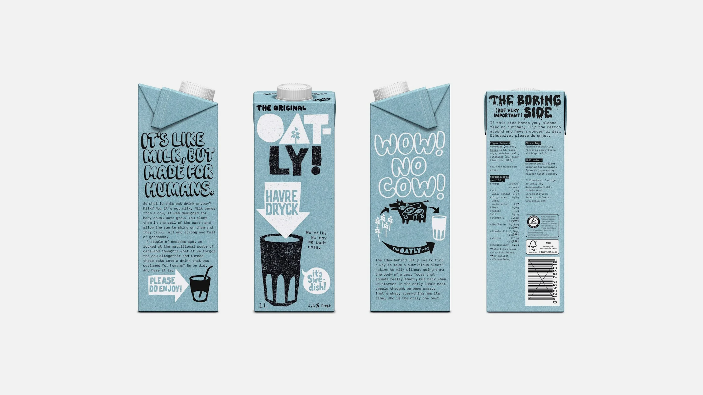
Oatly's Barista Edition packaging builds its entire identity from a single confident idea: hand-lettered, slightly imperfect typography and illustration, rendered in black and warm grey, standing in deliberate contrast to the polished, airbrushed conventions of most dairy and dairy-alternative packaging. The steaming cup illustration, the "OAT-LY!" wordmark, and the climate footprint figure are all drawn in the same rough, marker-like hand, giving the carton a consistent, almost handmade voice from every visible panel. Side panels extend this voice into plainspoken, conversational copy that reads like a person talking rather than a brand asserting itself, and even the "to unlock the carton" opening instructions are folded into this same tone. The design's few shortcomings are minor: the dense side-panel copy, while charming, asks more sustained reading than a carton typically receives at shelf distance, and the climate footprint figure, though a genuinely valuable piece of information, is rendered small enough that it risks being overlooked despite its importance.
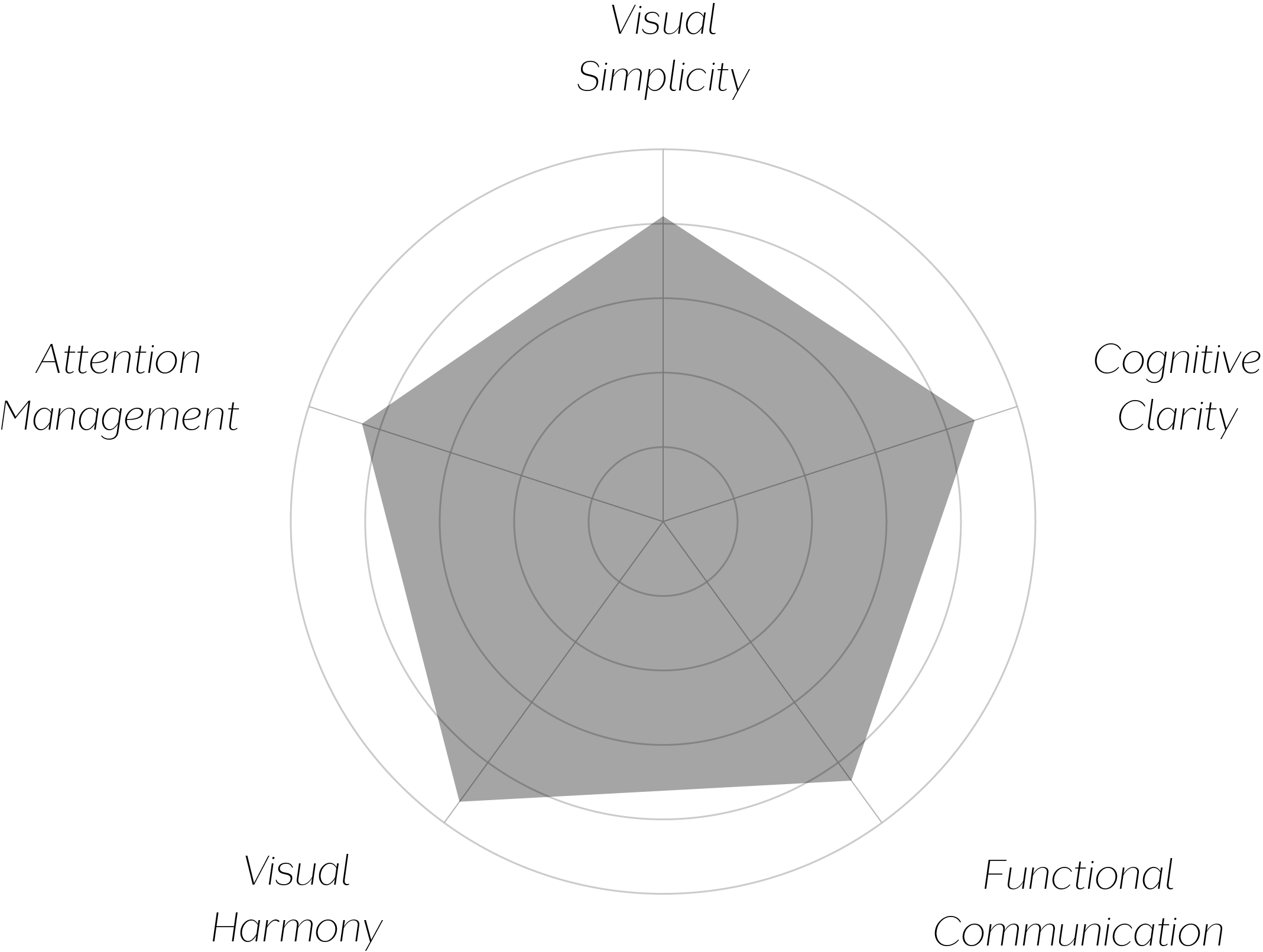
Vand Score 87/ 100
Performance across the five core Vand assessment dimensions.
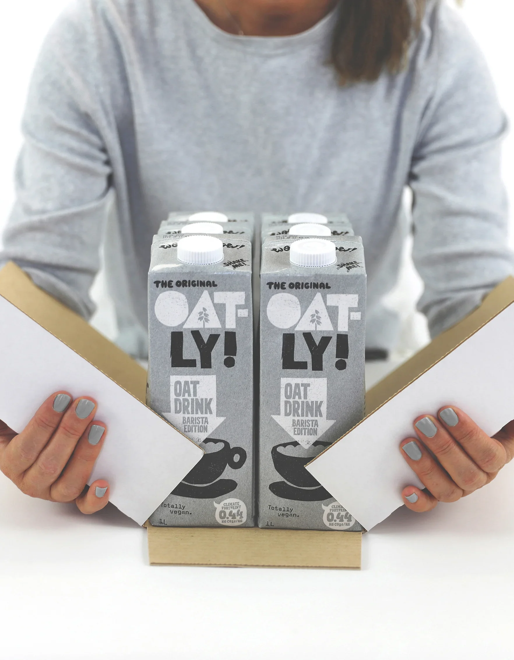
Oatly demonstrates that visible imperfection, applied with total consistency, can function as a design system just as rigorous as any polished, geometric identity — the hand-drawn quality here is not a lack of design discipline but a fully committed alternative to it, sustained across every element on the package.
The prominent treatment of the climate footprint figure is a genuinely instructive choice: by rendering environmental data in the same confident visual register as the brand name itself, the design signals that this information is core content rather than a regulatory afterthought, which is a meaningful example of a design choice actively supporting informed decision-making.
The jury's judgment reflects a design that turns a stylistic risk — visible, hand-drawn imperfection — into a fully resolved and consistently applied system. Every element on this carton, from the wordmark to the climate data to the side-panel copy, speaks in the same plainspoken, human voice, and that consistency is what elevates the choice from novelty to genuine design discipline.
Certification at Class A reflects a package that communicates clearly, treats environmental information as worth featuring rather than hiding, and does all of this with real personality — falling short of A+ only because its density asks slightly more of a hurried shopper than its front panel's confidence would suggest.
A carton willing to sound like a person, consistently, on every panel, earns a kind of trust that a purely polished label rarely does.