




Product Name: Liquid Death Mountain Water (can and Slaughter Bottle formats)
Brand: Liquid Death
Category: Packaged Water / Beverage Packaging
Manufacturer: Liquid Death Mountain Water, LLC
Designer: No publicly verified individual designer has been identified for this product.
Identification Confidence: High (brand, product, category); Not Applicable (individual authorship)

Liquid Death's packaging is undeniably well produced: the gothic blackletter logotype, the metallic gold illustration, and the tall aluminum can format are executed with genuine print and material quality, and the system is applied with impressive consistency across cans, bottles, and multipacks. But the design's central strategy is to disguise its product category rather than clarify it — a plain water and an artesian still water are presented through a visual language borrowed from metal album art and spirits packaging, deliberately built to be mistaken, at a glance, for something else entirely. Copy elements like "Slaughter Bottle," "Murder Your Thirst," and the skull-like linework are crafted with real intent, but that intent is aimed at shock value and category disruption rather than at helping a person understand, quickly and honestly, what is inside the can. This is a design that succeeds emphatically as marketing theater and fails, on its own terms, as clear product communication.
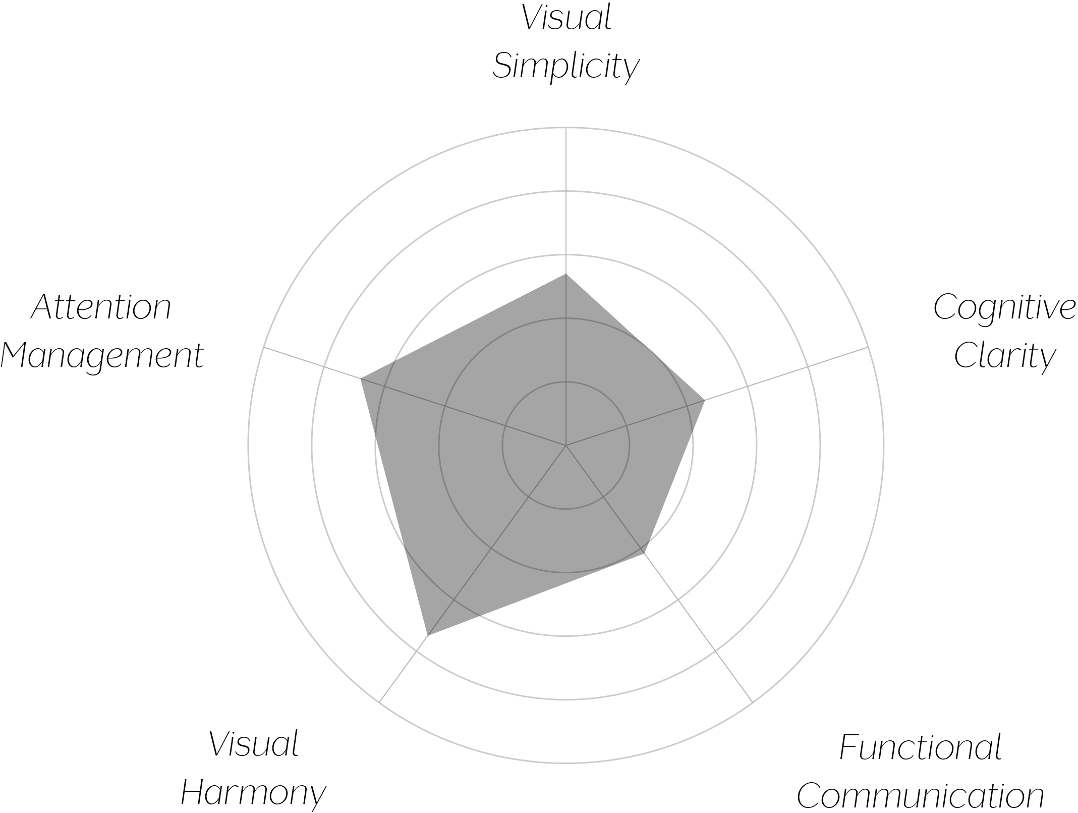
Vand Score 57/ 100
Performance across the five core Vand assessment dimensions.

Liquid Death demonstrates, with real craft, that packaging can function as pure brand theater — successfully borrowing the visual grammar of an entirely different category to generate attention and cultural cachet. As a case study in disruptive shelf presence, the execution is genuinely accomplished.
The design also illustrates a meaningful tension for certification purposes: attention capture and honest communication are not the same design goal, and optimizing hard for one can come at the direct expense of the other. This packaging is a clear example of that trade-off being made deliberately and skillfully in favor of spectacle.
The jury does not dispute the craft on display: the typography, illustration, and material consistency across formats reflect real design skill, applied with discipline. But VAND Certification evaluates whether a design respects the attention and understanding of the person encountering it, and a system explicitly built to be mistaken for a different product category at first glance works against that standard, however deliberately and cleverly it does so.
Cleverness in service of misdirection is still misdirection — and a design's wit does not exempt it from the basic obligation to tell the truth about what it is.