_logo.svg%20(1).webp)





Product Name: Grow to Know (brand identity)
Brand: Grow to Know
Category: Brand identity / wordmark
Manufacturer: Grow to Know (client / brand owner); identity produced by Pentagram
Designer: Marina Willer (Partner, Pentagram), with project team Natalia Witwicka, Marta Gaspar, Cleber de Campos, and Charlotte Harmsworth
Identification Confidence: High — corroborated by multiple independent design-press sources and Pentagram's own case study.

A cohesive, confidently harmonious identity system whose one broken-grid mark trades a small amount of first-read speed for real memorability.
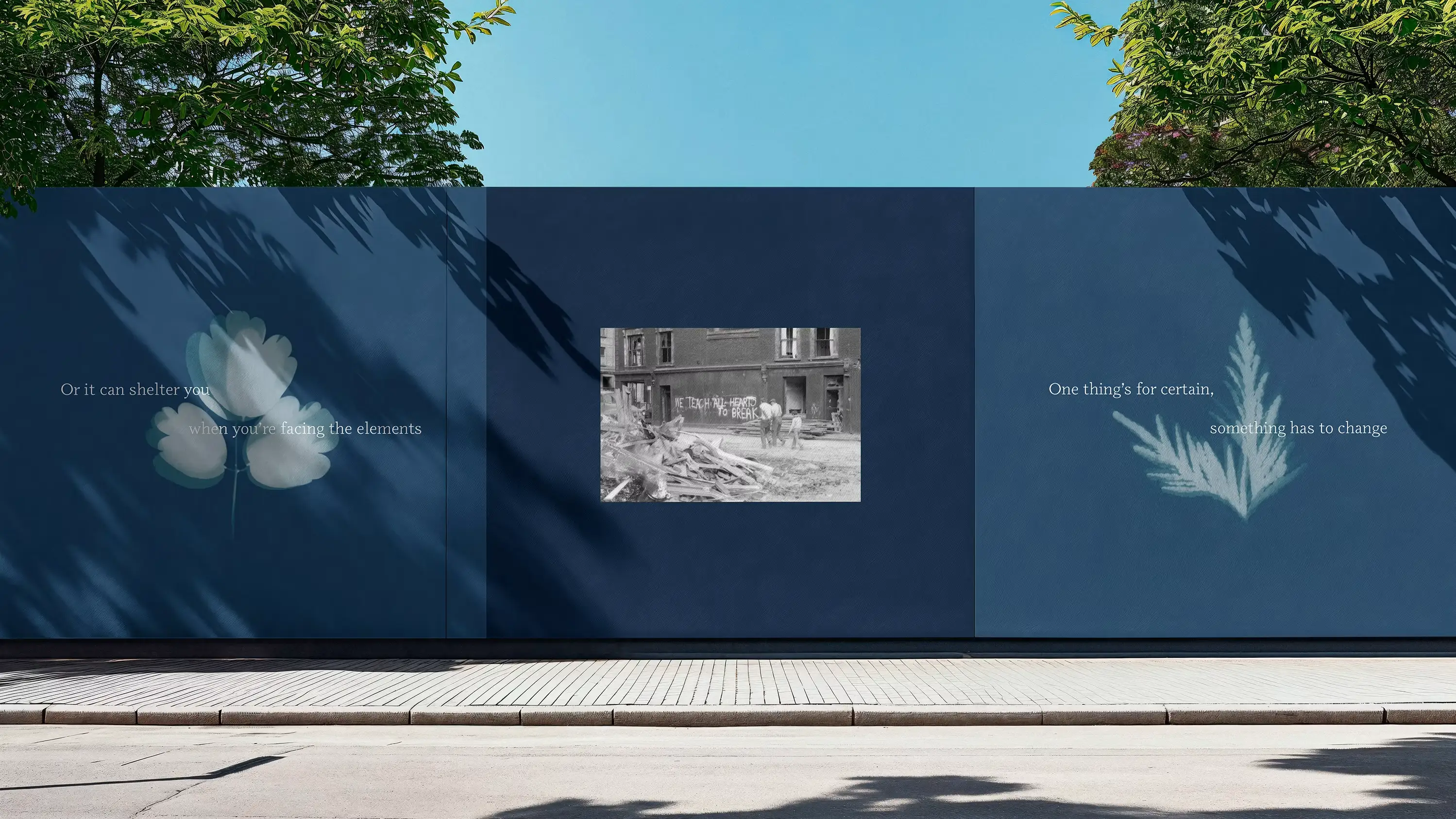
Grow to Know's identity is built on a striking formal idea: a strict three-by-three word grid, broken open at its centre by a delicate illustrated flower that stands in for the letters it displaces. The gesture is genuinely memorable, and the blue-and-white palette is a deliberate, legible reference to the cyanotype process — a camera-less photographic technique for rendering plants directly onto paper — which gives the mark's central image real conceptual grounding rather than generic botanical decoration. Reviewed alongside real applications — a tote bag pairing the same motif with the tagline 'Making green spaces,' and a printed piece combining it with documentary photography and a quoted reflection on the project's origins — the same cyanotype palette and typographic treatment recur consistently, confirming a genuinely cohesive system rather than one well-composed mark in isolation. That system also communicates its purpose with real clarity; a bare logo was never meant to carry that job alone, and here the system around it does that work convincingly. What is often treated as this mark's central weakness deserves reframing: after a first encounter, a logo functions as a recognized pattern rather than re-read text, and the broken grid's unconventional structure arguably aids that recognition precisely because it doesn't look like every other wordmark. The one remaining, genuine cost is narrow — a first-time viewer needs a beat longer to parse 'Grow to Know' as a phrase before that recognition is established. It certifies in the A class for a system that is cohesive, well-communicated, and more memorable than conventional for exactly the reason it was initially marked down.
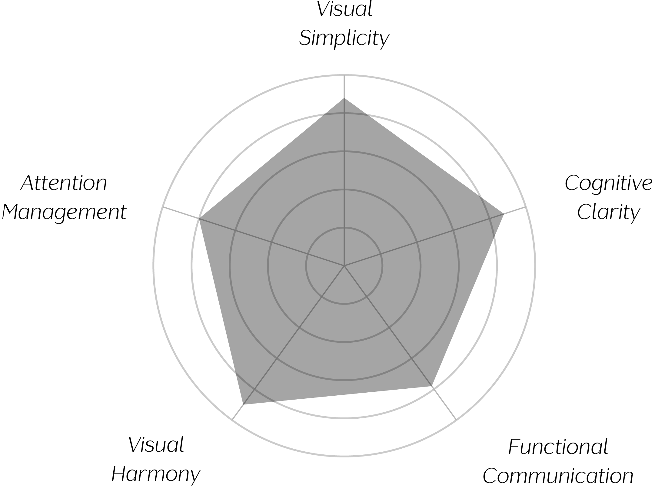
Vand Score 85 / 100
Performance across the five core Vand assessment dimensions.
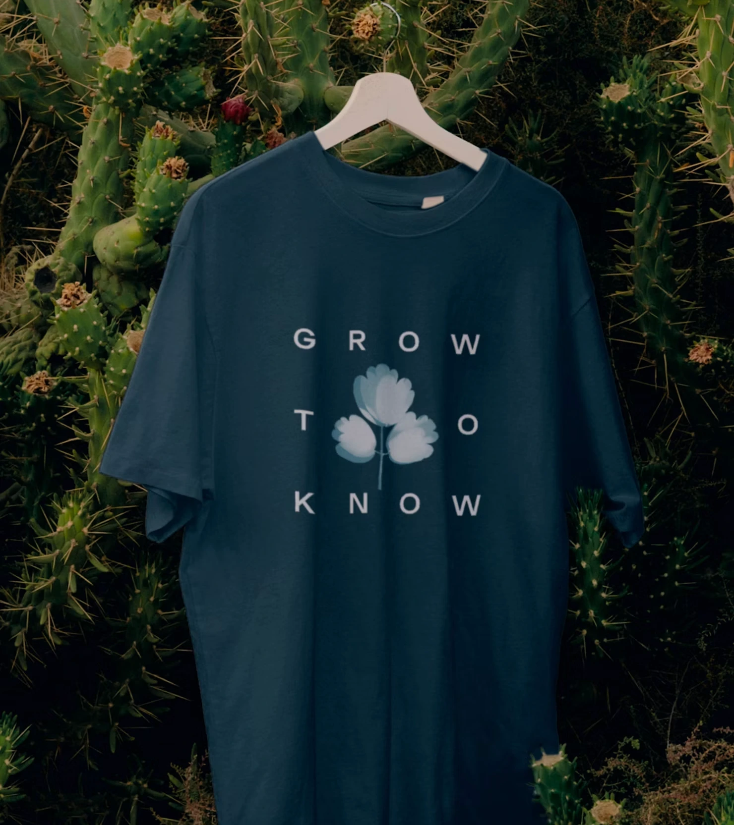
This identity demonstrates that a strict grid can be broken at a single point to create real visual interest, without abandoning the underlying structure that gives the mark its calm, considered feel.
It also shows how an illustrated motif can substitute for missing letterforms rather than merely accompanying them, turning a gap in the grid into the mark's most memorable feature.
The mark's blue-and-white palette is a genuine case of colour as concept rather than colour as decoration — by referencing the cyanotype process, the identity ties its central image to its subject matter (plants rendered directly, almost scientifically, onto paper) in a way that rewards a closer look without requiring it.
Confirmed by the design studio's own case study, the central image is one of four rotating cyanotype variants rather than a single fixed mark — a system-level flexibility that lets the identity keep introducing new botanical specimens across applications while the surrounding grid and wordmark stay constant, extending the mark's central metaphor rather than repeating it identically.
Most instructively, the identity is a useful case study in the real trade-off between atmosphere and legibility — generous spacing and a central interruption make a mark feel more considered and slow to parse in equal measure, and neither effect can be had without the other.
The evidence supports certification at Class A. Grow to Know's identity succeeds at creating a genuinely memorable, atmospheric mark through a disciplined grid and a single, well-placed illustrated interruption, and — confirmed across its tote bag and print applications — carries a consistent cyanotype palette and typographic treatment across every touchpoint reviewed, a real and fully demonstrated harmony rather than a claim resting on one lockup alone. Its category legibility, fairly assessed as a system rather than a bare mark, is a strength too. What remains is a narrow, specific cost rather than a broad one: a first-time viewer needs a beat longer to parse 'Grow to Know' as a phrase before the mark becomes something recognized at a glance rather than read letter by letter — and that unconventional structure is arguably what makes it memorable once recognition sets in. As a closing observation: Grow to Know asks its viewer to slow down exactly once, on the very first encounter, and rewards that patience with a mark that is harder to forget precisely because it was never trying to be read quickly.