





Product Name: Airbnb (mobile application)
Brand: Airbnb
Category: Travel and marketplace mobile application
Manufacturer: Airbnb, Inc.
Designer: No publicly verified designer has been identified for this specific interface iteration.
Identification Confidence: High
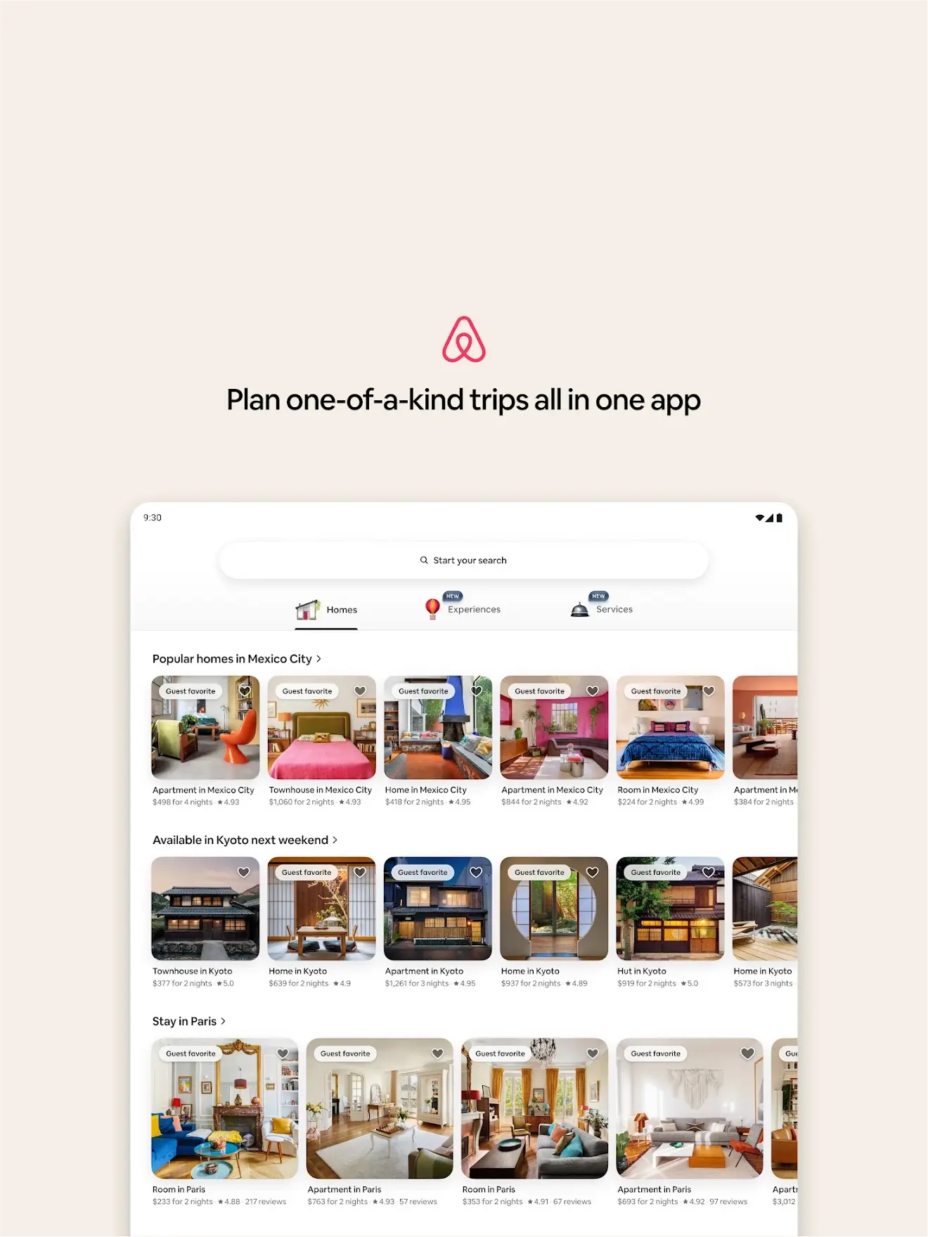
Across the five screens reviewed, the design demonstrates a mature understanding of how to scale a product without fragmenting its interaction model. Homes, Experiences, and Services each present fundamentally different content types — a room, a guided activity, a personal service — yet all are delivered through the same card-and-search structure, the same rounded search pill, and the same restrained iconography. The messaging and hosting-onboarding screens extend this consistency further. Where the design shows its age slightly is in visual density on the discovery screens, where badges, hearts, ratings, and pricing compete within a small card footprint. Overall, this is confident, systemized design that treats the user's time as valuable and rarely asks them to work to understand where they are.
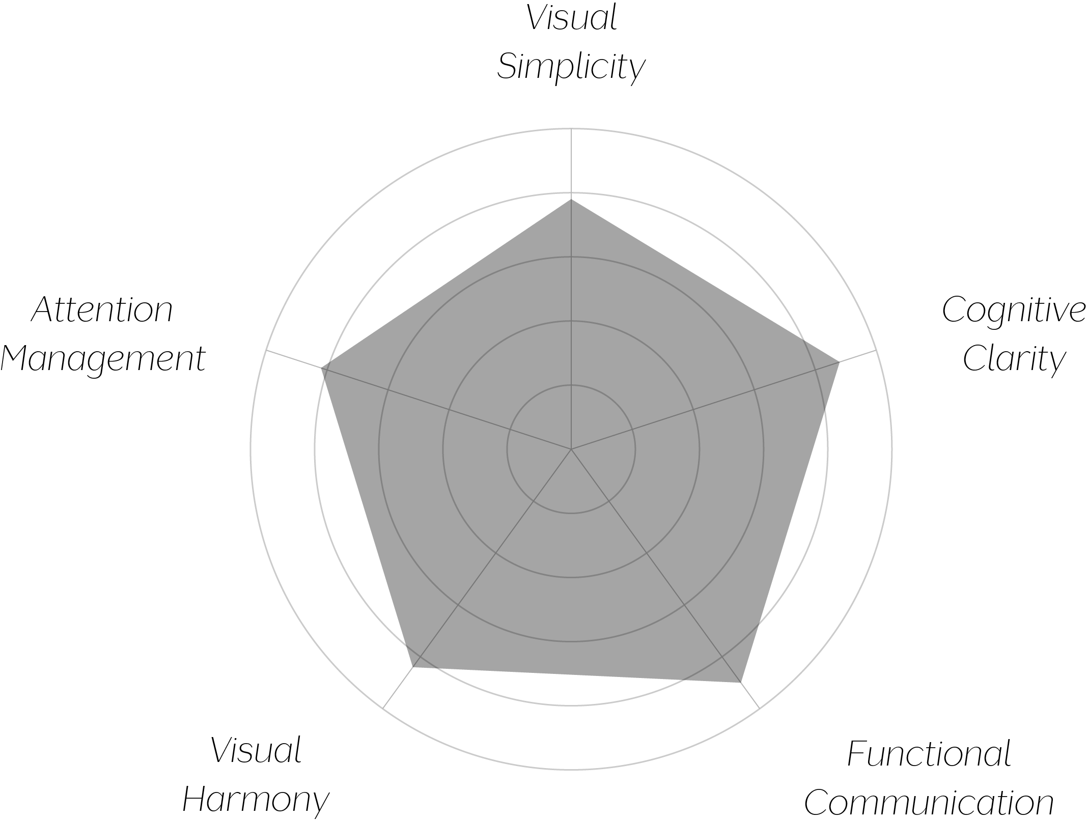
Vand Score 86/ 100
Performance across the five core Vand assessment dimensions.
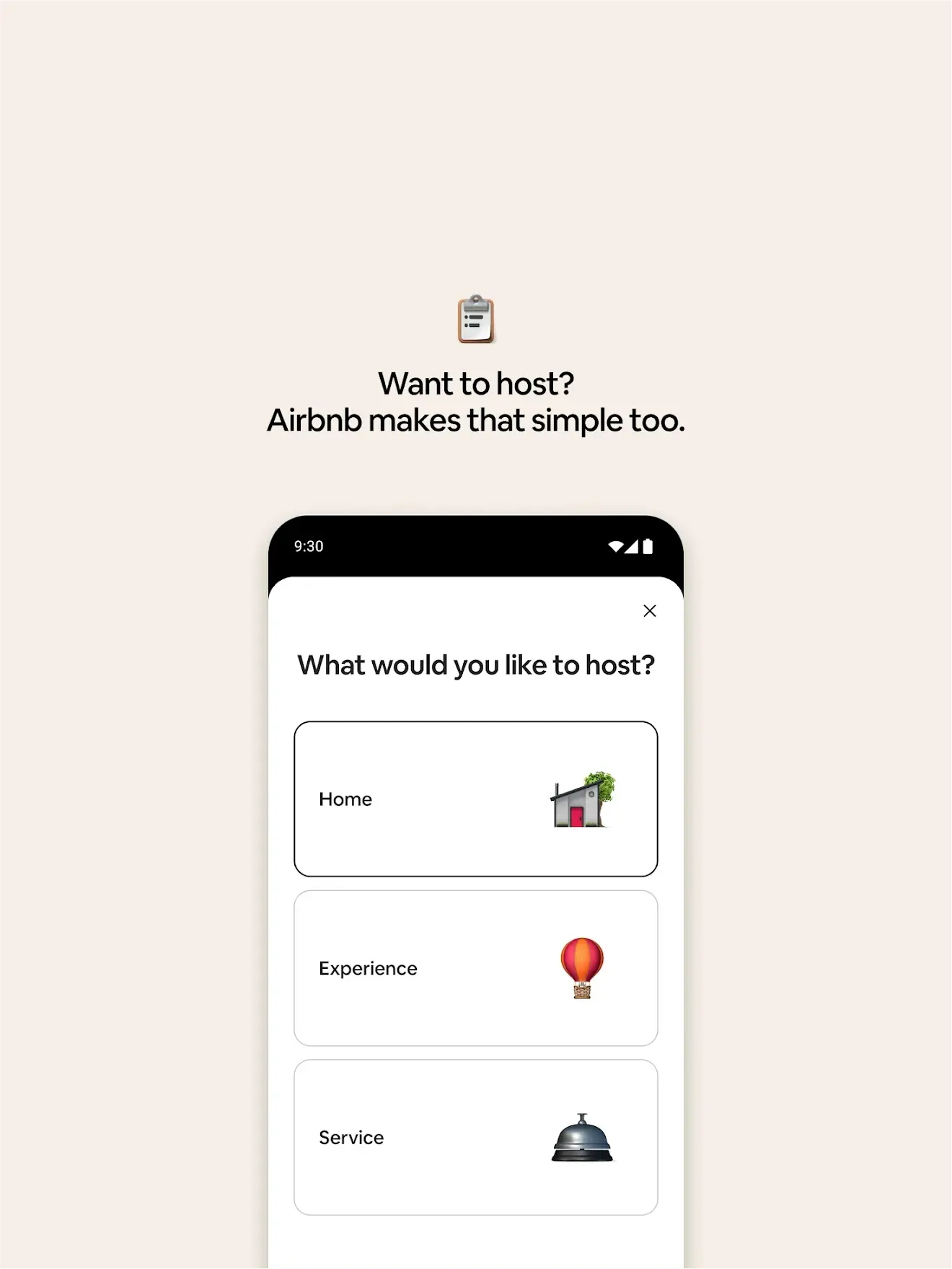
The strongest lesson here is that a shared interaction grammar — not shared content — is what makes a multi-vertical product feel unified; Homes, Experiences, and Services are entirely different offerings wearing the same search-and-card skeleton, and that skeleton is doing the trust-building work.
The onboarding sequence proves that a single emoji-scale icon paired with a short, benefit-stated headline can communicate an entire product surface faster than a screenshot alone — the icon becomes a category label the user carries into the interface itself.
The messaging screen's inline video handling shows restraint in a place many apps overdesign: a simple play button and duration badge, no autoplay chrome, no extraneous controls, letting the human content of the message stay the focus.
The jury certifies this interface at Class A for building genuine structural coherence across a product that could easily have fragmented into three separate apps. The repeated search-and-card grammar, the plain-language filters, and the restrained onboarding sequence all point to a design team that valued the user's cumulative familiarity over each screen's individual novelty. The card-density issue on discovery screens is real but minor, and does not undercut the system's core discipline.
The best sign of a well-designed system is that learning one part of it teaches you the rest.