
We honour the designers who make it quiet.
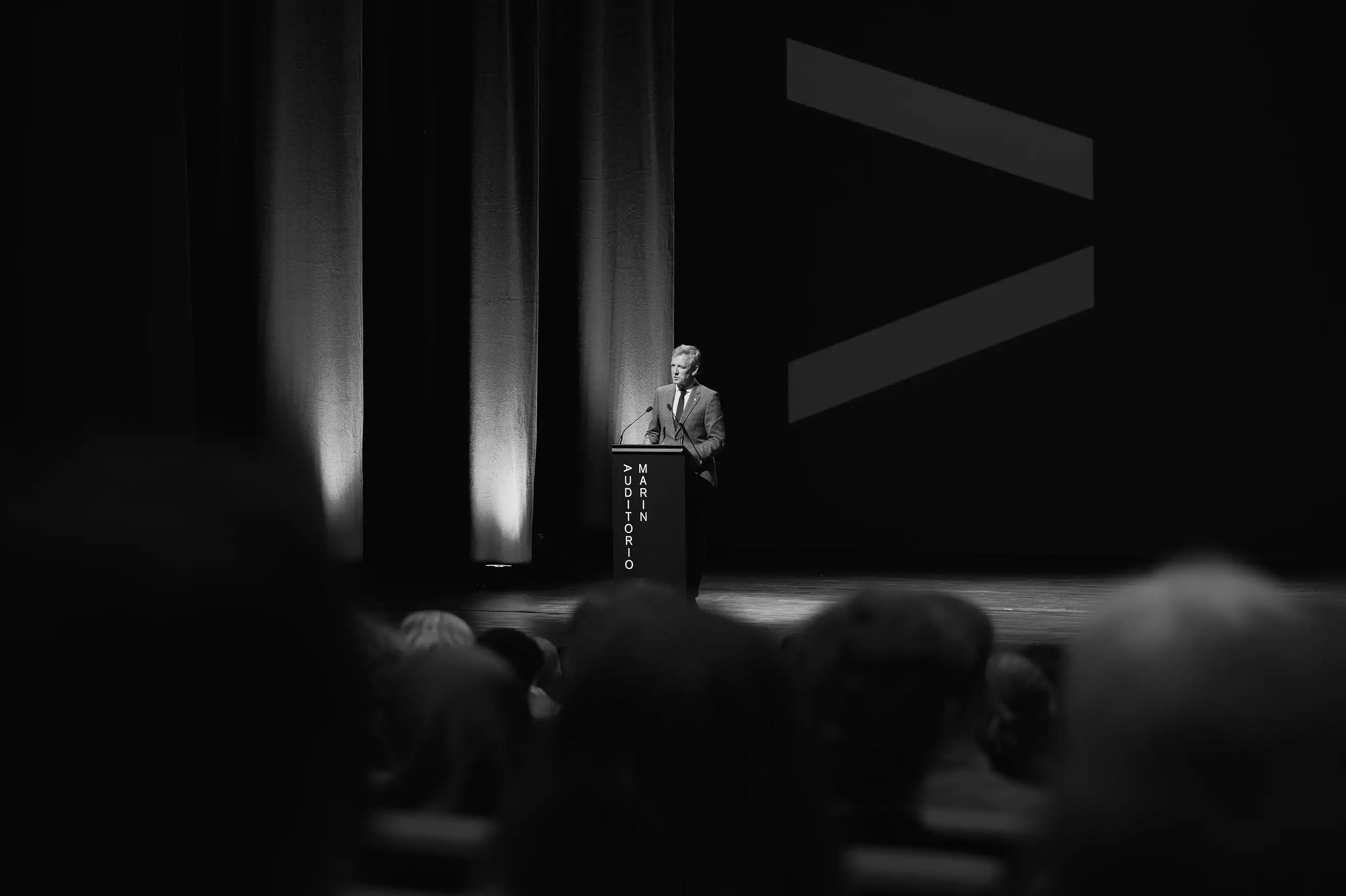
The visual identity of the Marín Auditorium is based on a fundamental idea: an auditorium is a public space where we see, hear, and project. These three actions—all linked to the cultural experience—serve as the starting point for developing a visual language capable of representing not only a building but also a meeting place where culture, citizenship, and the local community converge. The symbol encapsulates this concept through a minimalist gesture. The letter “A,” rotated on its axis, moves beyond its strictly typographic interpretation to take on new meanings: a gaze, a beam of light, a direction, an act of listening, or a point of view. This deliberate ambiguity allows for the condensation of different ways of experiencing culture into a single open, recognizable, and memorable symbol. From this symbol, a flexible and systematic visual identity is developed, in which typography becomes a graphic element. The name of the Auditorium and the various disciplines featured in its programming—music, theater, dance, film, festivals, and recitals—vary in orientation, scale, and rhythm, generating diverse compositions based on common rules. In contrast to a rigid identity, this approach establishes a system capable of evolving alongside the cultural activities themselves. This approach allows the identity to be consistently applied across physical, digital, and spatial media: institutional communications, programming, publications, wayfinding, the urban environment, the stage, digital devices, and objects associated with the Auditorium. Each application is different, but they all share the same code, facilitating recognition of the space and creating a continuous visual experience both inside and outside the building. The exclusive use of black and white also reflects this desire for synthesis. The absence of color eliminates extraneous elements and transforms the identity into a neutral framework for a wide variety of cultural content. The system does not compete with the works or impose an aesthetic on them: it provides a common structure from which music, theater, dance, film, and the visual arts can take center stage. As a project linked to a public institution, the identity views design as a tool for mediation. Its function is not merely to identify the Auditorium, but to make it more recognizable, accessible, and present in collective life, extending its language into the urban space and creating connections between the institution, its cultural programming, and the public The result is a contemporary and enduring identity, built with a minimum of resources and a maximum of possibilities. A replicable and adaptable visual system that demonstrates how design can help transform a public cultural facility into a shared brand: recognizable as an institution, yet open to the many voices, disciplines, and experiences that take place within it.
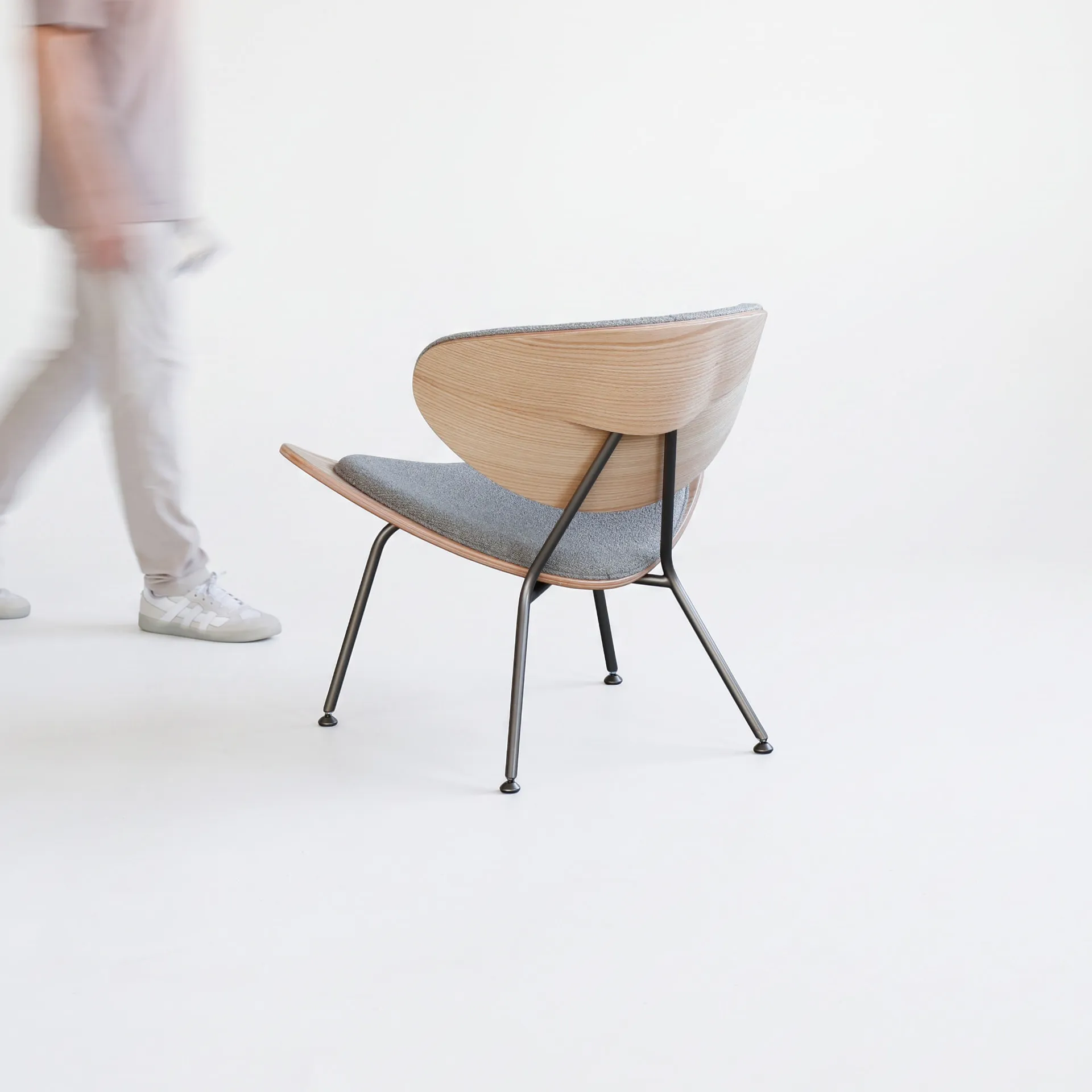
Andorinha Armchair Named after the swallow, the Andorinha Armchair translates the bird’s lightness, movement and open wings into a fluid, embracing silhouette. Its curved backrest surrounds the body while maintaining a visually delicate profile, balancing comfort, structural clarity and elegance. A specific three-dimensional shaping and molding technique was developed for the piece, allowing the backrest to form a continuous compound curve and a subtle lifted edge—an expressive detail that recalls the movement of a swallow in flight. The upholstered surfaces, shaped wood and slender metal structure work together as a single composition, combining artisanal precision with contemporary production methods.
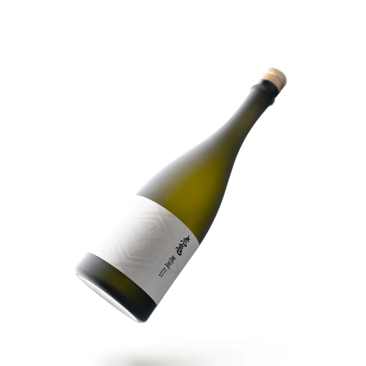
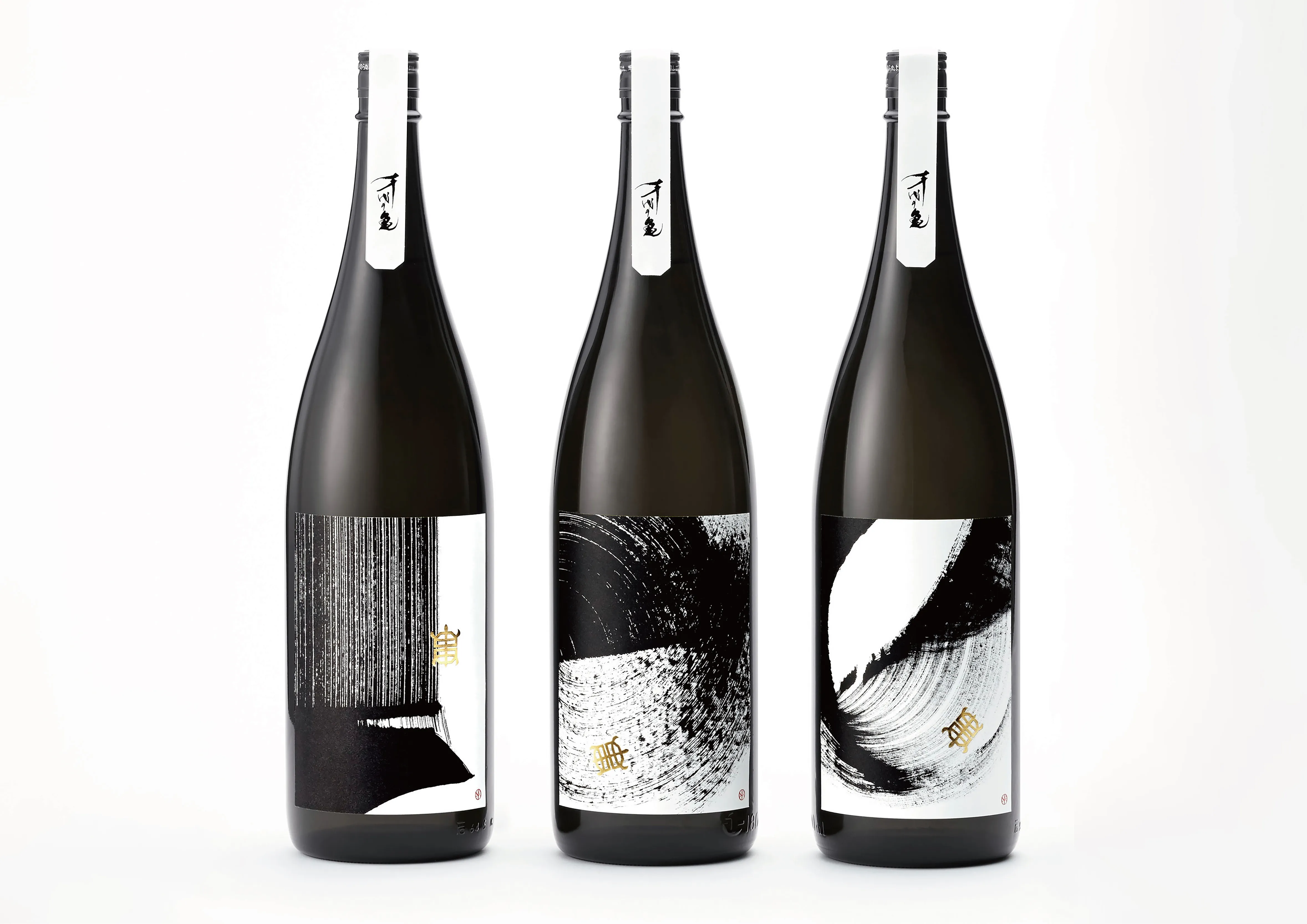
OIGAME package design by Shinji Arashigawa.
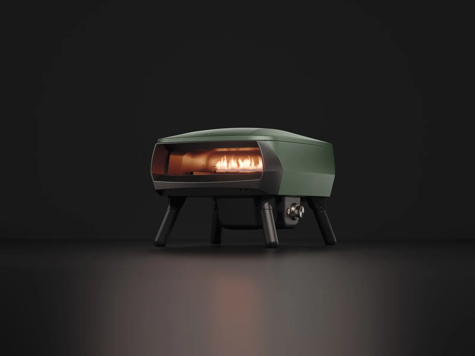
Witt PICCOLO Rotante 13" redefines the traditional pizza oven through a harmonious combination of Scandinavian design, intuitive functionality, and high performance. Its compact shape, clean lines, and thoughtful design make it an elegant addition to any outdoor space, while the rotating pizza stone and efficient burner ensure a simple and engaging cooking experience with consistent results. Designed to bring people together around cooking, PICCOLO Rotante combines technology, ease of use, and design in one seamless experience. Developed by Witt Denmark, the product reflects the company's ambition to combine innovation, aesthetics, and functionality in solutions that enhance everyday experiences and bring people together.
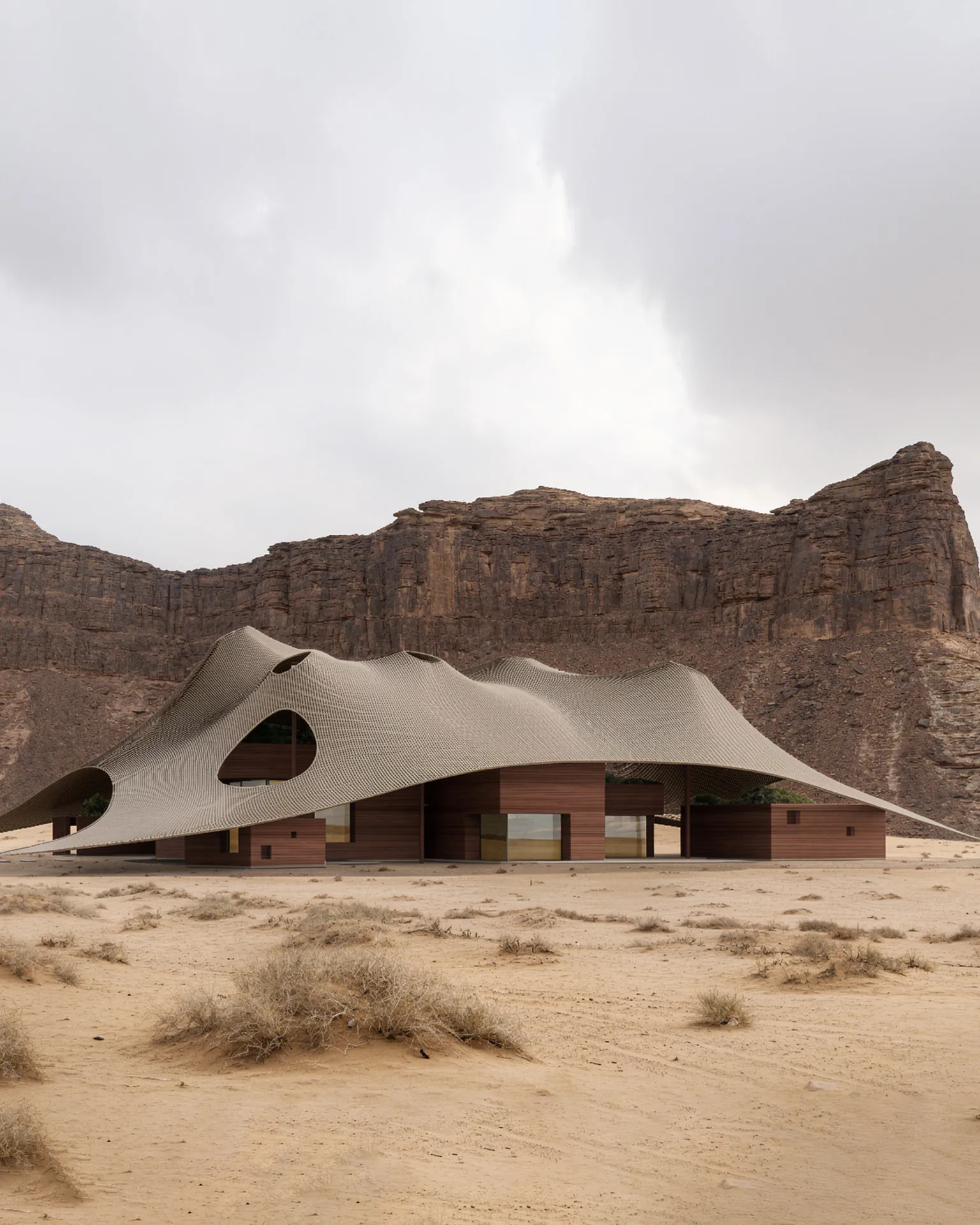
Tensile Architecture in the Desert Human habitation has been organized around nature for thousands of years. The comfort that nature provides human beings has become indispensable for their well-being, and different architectural systems have been developed to optimize life within distinct natural settings. This proposal addresses this human need to create comfortable, biophilic, and sustainable living environments, focused within the Al Ula region of Saudi Arabia. The design aspires to achieve a synthesis of fixed and movable building systems, drawing on the architectural heritage of the region by combining the enduring solid structures of ancient dwellers with the light tensile tent architecture of the nomadic desert communities. Merging these two systems, a grouping reflects the carved monolithic dwellings of the Nabateans, the ancient Arab peoples of the area, blended with a sturdy, ultra-light ‘intelligent’ tensile structure that serves as a contemporary interpretation of the nomadic heritage of desert tribes found in Al Ula. These monolithic structures are set within the topography of the site, positioning them as structural blocks that define the clear layout on the desert landscape while optimizing privacy and views. Above them, an innovative tensile canopy made of perforated solar fabric is draped over the volumes, shielding them from the harsh natural elements. It optimizes energy, water, and sunlight, creating a shaded microclimate for a flexible and holistically ecological setting for 21st-century life in Al Ula. This design draws on layers of memory with a vision towards the future, offering a house that allows for living within nature and adapts to the natural conditions of Al Ula.
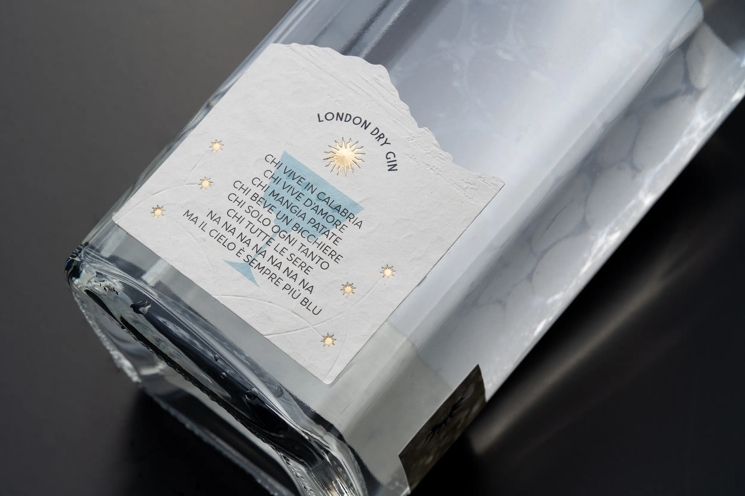
Contrasti (Contrasts) is a Premium Craft Gin label designed by Studio La Regina for Ginnasium 2025. Ginnasium is an Italian neuromarketing research project in which twenty design studios, one per region, explored how packaging details shape the consumer’s emotional response. The concept draws from Calabria’s defining duality: the Mediterranean sea and the snow-capped peaks of the Apennines. The design reveals itself progressively. From a distance, it attracts with its deep blue and sea-green palette. Up close, it surprises with iridescent reflections. At touch, it delivers a tactile experience. The main label combines a sea-inspired colour wash with Lumafin foil stamping. This recreates the shifting shimmer of light on water. A second label in finely die-cut white paper adds physical relief and evokes the texture of sea foam. A reverse-printed clear label is applied to the back of the bottle. It is visible only through the transparency of the gin itself and reveals a snow-capped summit alongside a quote by Pythagoras: “Do not stop where you have arrived.” The system is completed by a Vinolok glass stopper and a white paper neck collar. The result is a bottle that tells the story of a region through contrast: fluid and solid, warm and cold, visible and hidden.

Airback is a Dutch travel brand redefining modern luggage through smart engineering, space-saving innovation, and functional design. Airback MORE is a high-capacity travel suitcase designed to make space work smarter. Offering an impressive 120-liter capacity, expandable up to 156 liters, MORE combines generous storage with Airback’s signature built-in vacuum compression technology. The integrated system compresses clothing directly inside the suitcase, allowing travelers to pack up to 50% more without separate compression bags or additional accessories. Despite its substantial capacity, MORE is designed around organization and ease of use. Multiple internal dividers create dedicated zones for different belongings, while a separate odor-free compartment provides a practical space for shoes, worn clothing, or anything travelers prefer to keep isolated from the rest of their luggage. Its expandable construction allows the suitcase to adapt easily from longer trips to journeys that require additional packing space. Every element has been designed with real travel situations in mind. A built-in TSA lock secures the main compartment, while a discreet hidden pocket keeps valuables protected and easily accessible. The weather-resistant exterior helps protect belongings in changing conditions, and all-terrain wheels provide smooth mobility across a variety of surfaces. An adjustable telescopic handle offers multiple height settings, while the integrated weight handle allows travelers to check their luggage weight before reaching the airport, helping prevent unexpected baggage fees. Available in Forest Green and Matt Black, MORE pairs a minimal, contemporary aesthetic with a highly functional construction. Rather than simply increasing the dimensions of conventional luggage, Airback MORE rethinks how large-capacity travel can be designed. By bringing together 120–156 liters of adaptable storage, built-in vacuum compression, intelligent organization, weather resistance, security, and effortless mobility in one cohesive system, MORE turns a large suitcase into a smarter and more efficient packing solution.
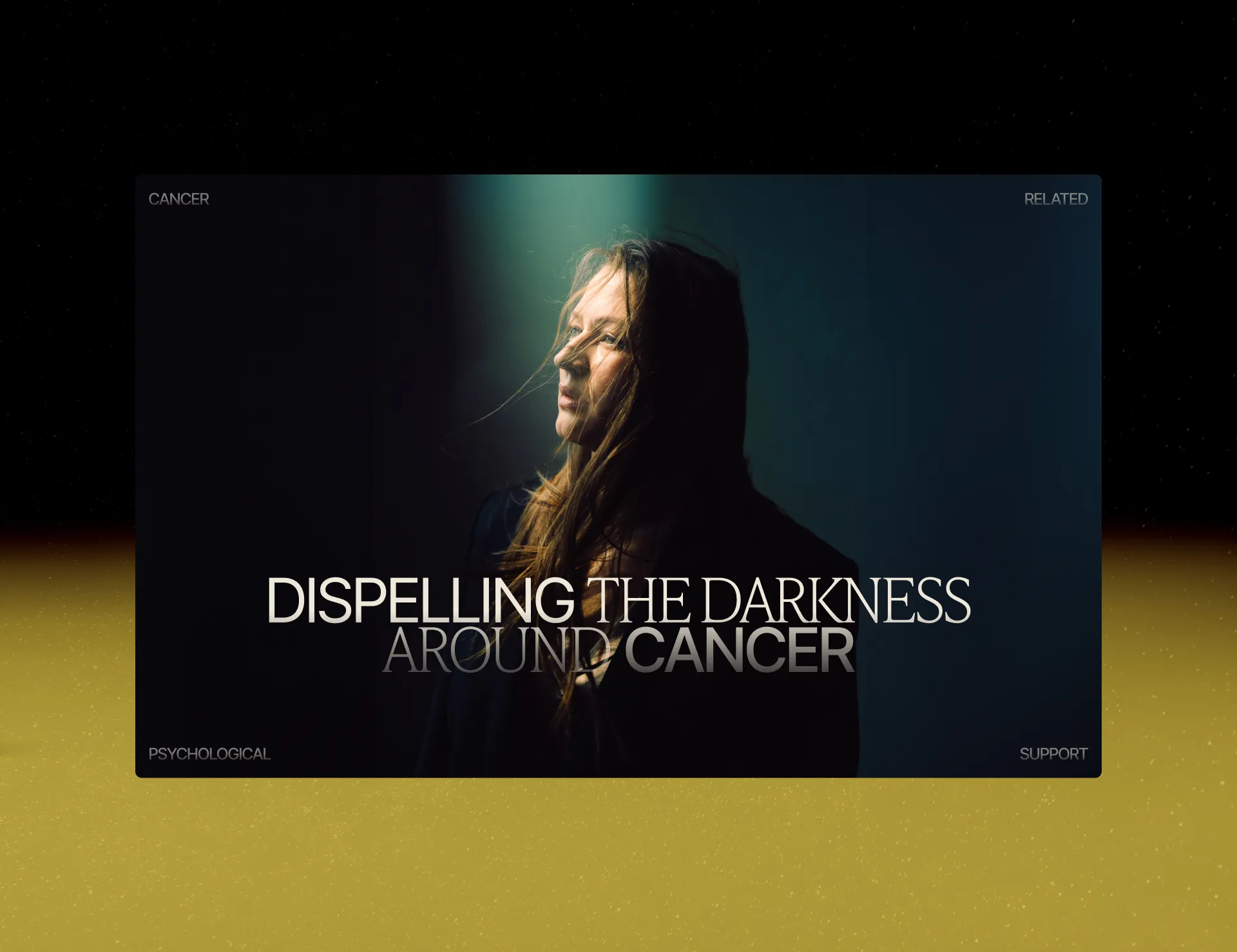
The website was created for the awareness campaign “Dispelling the Darkness Around Cancer.” It is a project of the “I Love Life” Foundation, which provides psychological support to cancer patients. The campaign debunks myths about cancer and gives people the right to any emotions. The design is based on the stories of four heroes who have overcome the disease. The visual language is built on the metaphor of light in darkness: a cold starry background with a warm glow breaking through. The campaign took place in 10 cities, and in three months the number of requests to the foundation doubled.
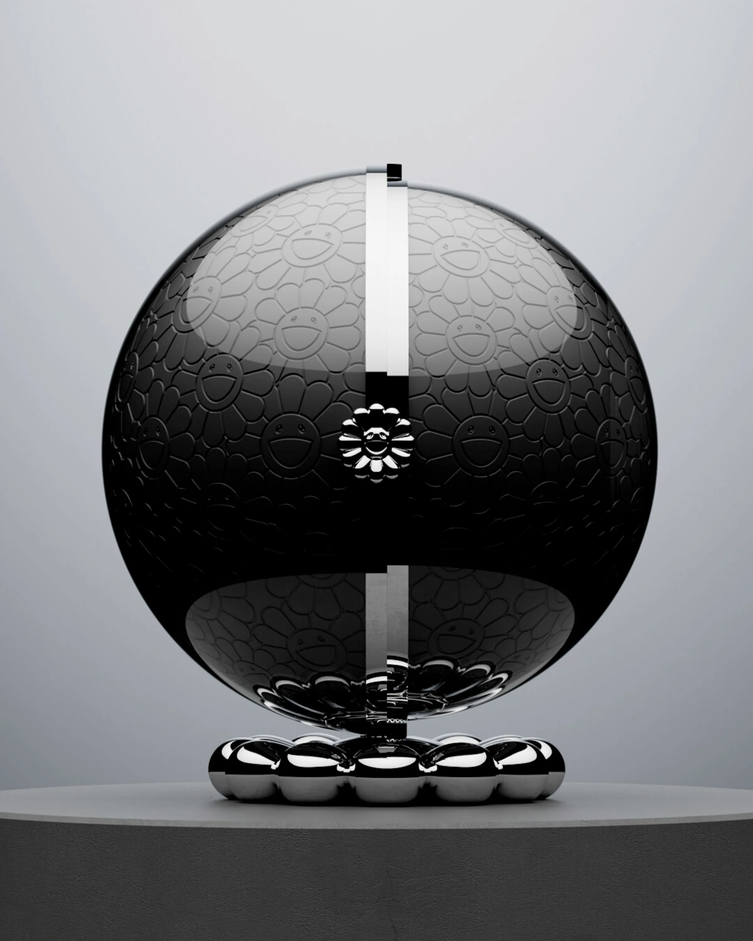
Dom Pérignon x Takashi Murakami - Masterpiece - is a highly-exclusive sculptural creation bringing together contemporary art, exceptional champagne and craftsmanship. Produced in only a handful of numbered pieces worldwide, it houses an exclusive magnum of Dom Pérignon Rosé Vintage 2002 Plénitude 2, one of the Maison’s rarest cuvées. Conceived under the creative direction of Sébastien Servaire, the piece features a structural and decorative design developed by Servaire & Co, built around the experience of revelation. A refined and enigmatic sphere opens to unveil a spectacular secret garden of 108 hand-sculpted flowers, drawing on Takashi Murakami’s iconic floral universe. The contrast between the restrained exterior and the vibrant, intricate interior creates a dramatic reveal, transforming the object into a true work of collectible art. To bring this ambitious design to life, Servaire & Co collaborated closely with Leblon Delienne atelier, whose exceptional sculptural expertise and artisanal savoir-faire enabled the concept to be translated into a highly intricate physical piece. The project brings together Sébastien Servaire and Servaire & Co’s creative and design vision, Takashi Murakami’s iconic artistic language, Dom Pérignon’s heritage and pursuit of excellence, and Leblon Delienne’s exceptional craftsmanship and sculptural savoir-faire, combining creativity, art, champagne and craftsmanship within a single collectible piece. Created for an extremely select circle of international collectors, the Masterpiece transcends the traditional champagne case to become an exceptional art object, designed to be contemplated and preserved as much as to celebrate the champagne it contains.
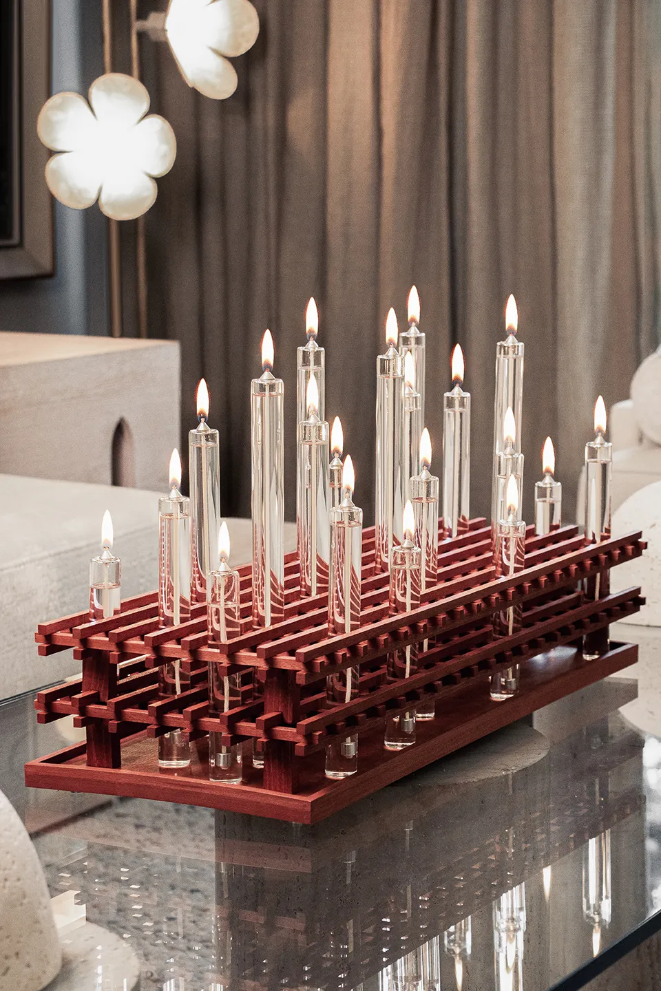
Miyan is a sculptural lighting piece inspired by a fundamental principle of Iranian architecture: creating a dialogue between light, shadow, geometry, and layered space. The design consists of two precisely positioned wooden lattice structures, arranged in parallel layers. Between these layers, cylindrical glass vessels containing liquid fuel are placed, allowing the flames to emerge within the architectural framework. The lighting is powered by liquid fuel, allowing the vessels to be continuously refilled and the flames to be maintained for repeated and extended use. The fuel used is designed to be environmentally friendly, long-lasting, and clean-burning, producing no unpleasant odor or soot during operation. The interaction between the flames, the perforated wooden surfaces, and the surrounding space creates a constantly changing composition of light and shadow. Rather than functioning solely as a source of illumination, Miyan transforms light into an architectural element, revealing depth, rhythm, and spatial relationships through its layered structure. The project reinterprets traditional Iranian architectural ideas through a contemporary object, combining natural wood, transparent glass, and fire in a restrained and sculptural form.
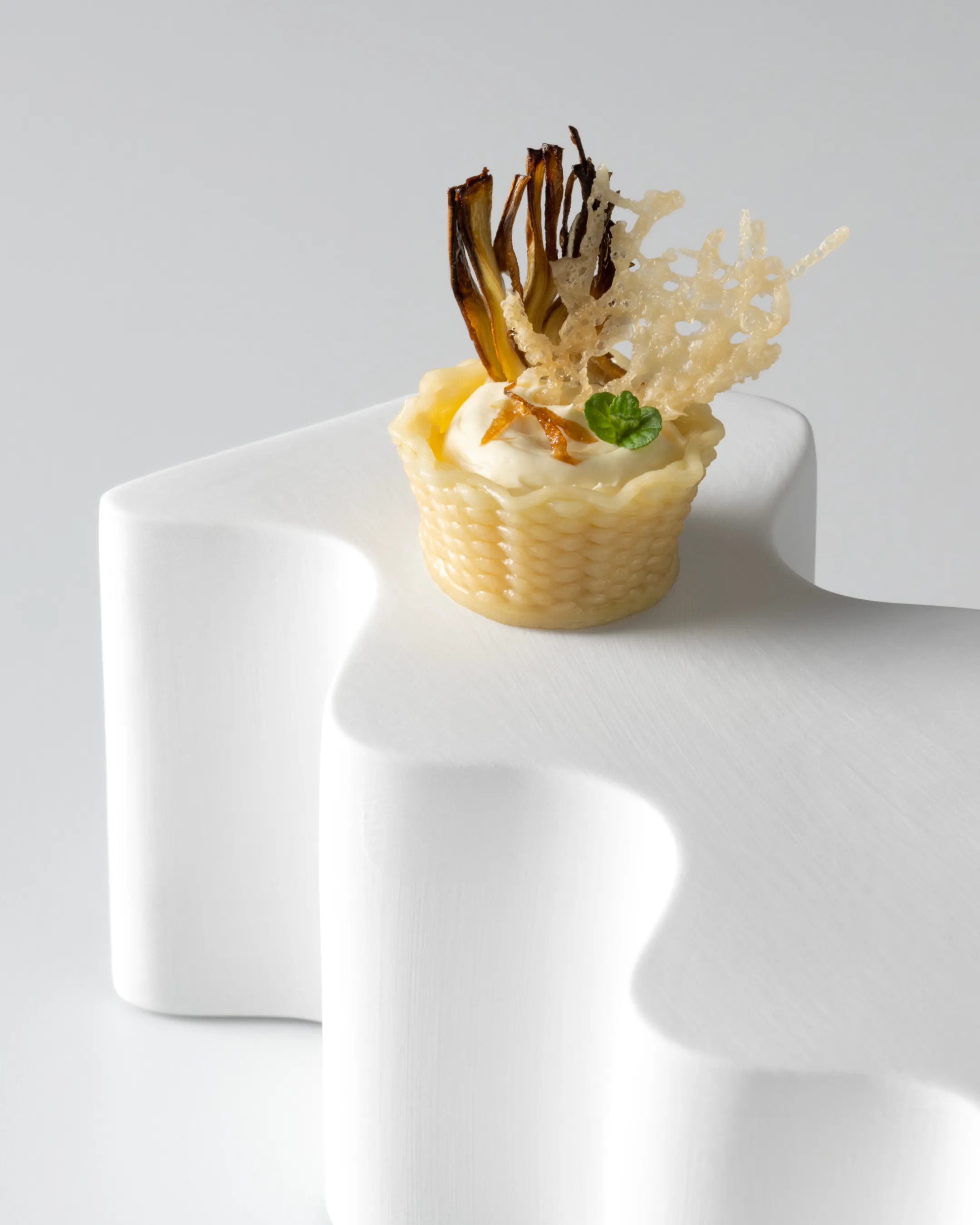
For this project, we designed A-Grid, a collection of ceramic display stands created to enhance the visual experience of food presentation and showcase Artisia’s finger food creations. The project originated from the brand’s identity: the shape of the stands is derived from the same grid used to construct the logo, a sequence of smooth, parallel lines inspired by the geometry of the pasta shapes and the flow of the 3D extrusion process. The collection consists of three pieces sharing the same design language but varying in height, allowing them to interact with one another and generate ever-changing configurations, patterns, and interlocking compositions. A project where branding, product design, and material expertise come together to form one coherent system. Designed by Next Concept - Manufactured by Royale - For Artisia.
The VAND Design Award is evaluated by an international jury of experienced designers, creative directors, educators, and design leaders from around the world.


Featuring members of the VAND Responsible Design Movement, VAND Award Winners, and selected Shortlisted projects from around the world.
Selected 2027 Winners and Shortlisted projects may be featured in the next edition.
Closes: 31 November 2026
Entries received after 31 November are considered in the next Round.
We honour the designers who make it quiet.



Selected every month.
• A dedicated video on the VAND Social Media
• A dedicated page on the VAND website
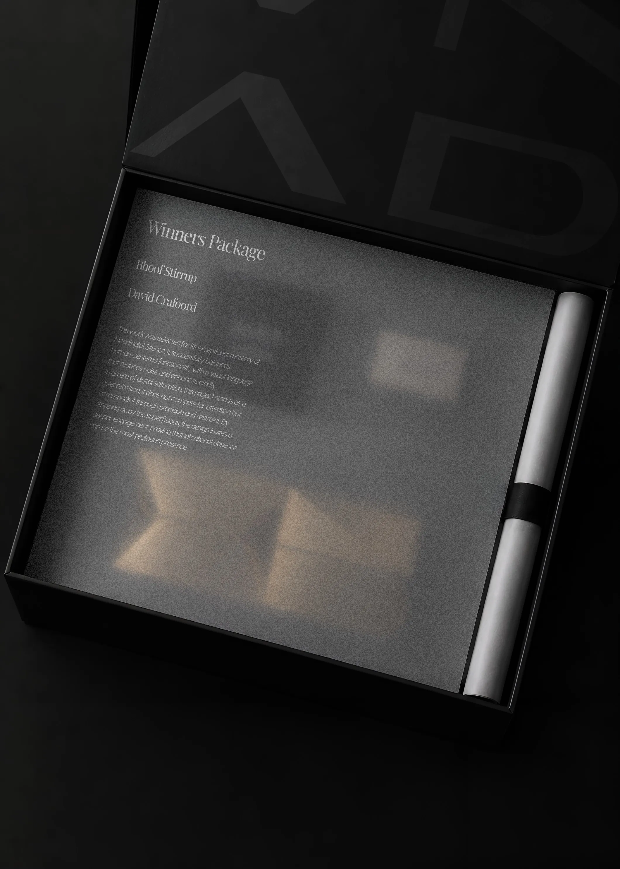
Everything in the Shortlist, plus access to the optional Winners Package (from €500):
• VAND Trophy
• Printed Certificate
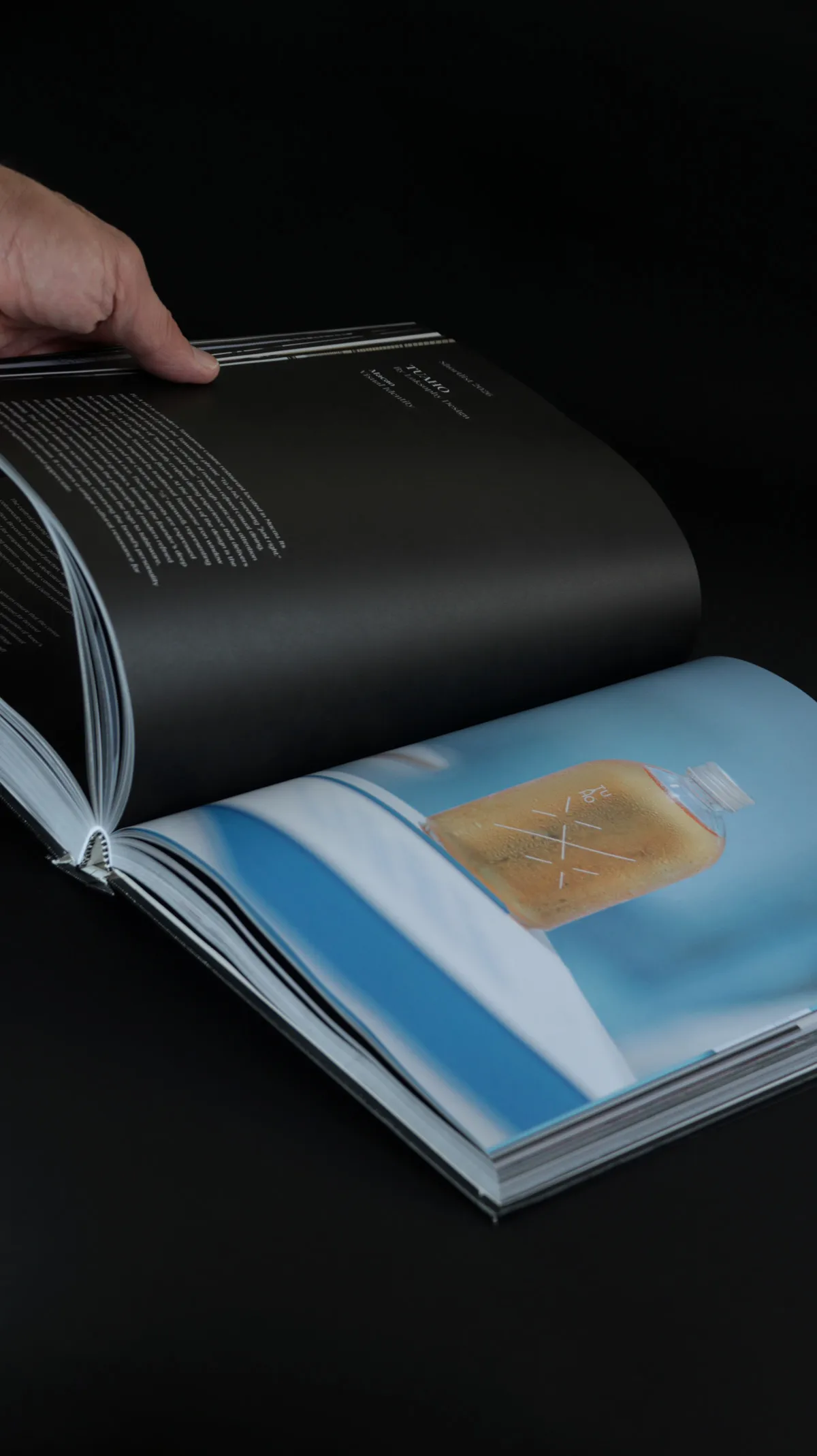
• VAND Year Book
• Winner Card
All selected projects receive digital certificates, badges, and web publication at no extra cost. Optional physical trophy & hardcover yearbook packages are available for confirmed winners.
• Premium printed VAND Certificate recognition.
• VAND Trophy
• Publication in the VAND Design Award Book
• Dedicated Winner Page on the VAND website
• Premium presentation and packaging
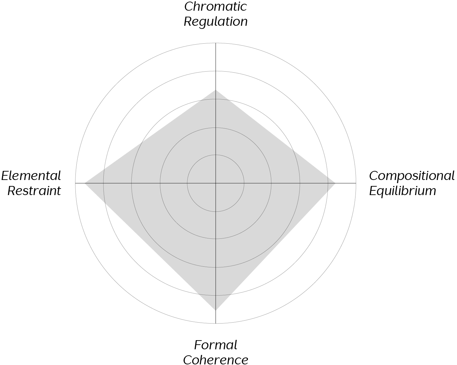
Every submission is evaluated through a structured judging process.
The jury considers the quality, clarity, relevance, innovation, craftsmanship, responsibility,
and human impact of each project.
Recognition is based on the strength of the work, not popularity or personal preference.