

We honour the designers who make it quiet.

SONG is a visual identity that brings together elegant typography, a carefully selected color palette, and subtle graphic details. The design focuses on simplicity and consistency, creating a recognizable brand across packaging and other applications. A contemporary identity with a timeless feel, where every element has its place.

This whisky needed to appeal to connoisseurs globally, particularly China and Australia, and be premium, desirable, natural, contemporary and unique amongst traditional “Scotch-inspired” competitors, and reflect its Tasmanian home. The coastline of Tasmania is unique given the proliferation of dolerite; the largest surface exposure of dolerite in the world is found in Tasmania: 40% of the island’s landscape. One of the spectacular features of dolerite is its steep columnar cliffs. Dolerite has a huge influence on the soil which in turn influences the Tasmanian-grown grain which imparts a unique floral note. The extraordinary and sculptural dolerite cliffs were our inspiration. Each stopper was produced from a reconstituted stone material, rough-hewn to emulate the stone formations, texture and colour. The typography stacked vertically to mirror the tall columnar cliffs and language spoke to the artisanal nature of the product. “Made by Tasmania” on the back speaks to the 100% Tasmanian ingredients and the influence of the landscape and terroir on the liquid. An off-the-shelf bottle was customised with a grey vignette, connecting back to dolerite, progressing to clear to show off the beauty of the liquid. The gift box was made of 100% recycled pulp, with the dolerite columns blind embossed.

Nicole Oatley Wines is a new brand developed for this third-generation wine owner. These wines are sourced from the Margaret River region, with its proximity to the ocean being a defining factor in the quality of the fruit produced in this region. This new brand was created for the on-premise market, with a high list price of $AUD130. Aimed at high-involved wine consumers, this brand needed to exude premiumness, look elegant but bold, modern and sophisticated. Our creative solution was to commission two different pieces of art that were created using water techniques in order to semiotically tie to the vineyard’s proximity to the ocean. Although each artwork is by a different artist, the monochromatic colour palette and water-based techniques ties them both together. The monochromatic colour palette is sophisticated, highlighted with a touch of gold for the logo. The removal of any other typography is a bold move, indicating the confidence of the brand and wine quality. The brand was named NOW. signalling the next generation of ownership to the business.

The Rosé category continues to show growth globally, however there is not a specialist brand that enables consumers to explore its various styles. Additionally, the category is dominated by French Rosé, yet Australia is the perfect climate for making and drinking Rosé – sipping on a verandah as the sun sets. We felt there was an opportunity to tackle both opportunities: create a Rosé specialist brand inspired by Australia. Paddington Lane was named after a charming, up-market part of urban Sydney which abounds in Victorian-era terraces with beautiful wrought iron balustrades. These inner-city folk are also the perfect target. The use of use wrought iron patterns cue to the occasion and impart cues for the wine style: elegance and beauty. The proprietary bottle features the wrought iron and branding with no label interfering with the colour of the liquid, which semiotically ties to the sunset occasion. On the back there is an embossed quote by Robert Louis Stevenson. To ensure the embossing wasn’t disrupted by labels, the bottle has two side label panel areas, ensuring that the liquid and branding remain heroes. The three wines have colour-coded neck labels calling out the number and varietal to encourage cross selling.

Aratoro is Isabel Estate's foray into the luxury wine market, encapsulating the essence of one of Marlborough's original vineyards. Priced at $80, and only limited release available each vintage, this premium range represents the pinnacle of the Estate's winemaking journey, offering a sophisticated blend of tradition, innovation, and meticulous craftsmanship. Aratoro, meaning 'path to discovery', is crafted from 30+ year vines, emphasising Isabel Estate's commitment to quality and terroir. The brief was to create a luxury wine tier that enhances Isabel Estate's brand awareness and cements its position in the premium market. The challenge lay in balancing the rich heritage of the vineyard with the need for a modern and distinctive identity that could stand out in a competitive landscape. Our objectives were to communicate the wine's premium quality cues—like single vineyard sourcing, old vines, and hand-picking methods—while ensuring the range's design and storytelling reflected its boutique nature and luxury positioning. The creative solution was a label design that intricately showcases the native flora, fauna, and river surrounding Isabel Estate, emphasising the wine's single estate origin. The result is a strong shelf presence that draws consumers into Isabel Estate's world, driving premium perception and distinctiveness from competitors.

Conceived as a physical expression of the studio's design philosophy, Jasmine Fisher transformed its London space from a white box into a richly layered and enveloping interior. Asian silks, Amazonian masks, contemporary British art, and artisan textiles are quietly interwoven within a grounding palette of rich, earthy tones. The space offers an intimate insight into the studio's creative world, where the value in an interior lies in how it makes us feel. Photographer: Felix Speller

Dim is an AI-powered iOS app that helps users quickly capture, organize, and rediscover their ideas through smart tagging.
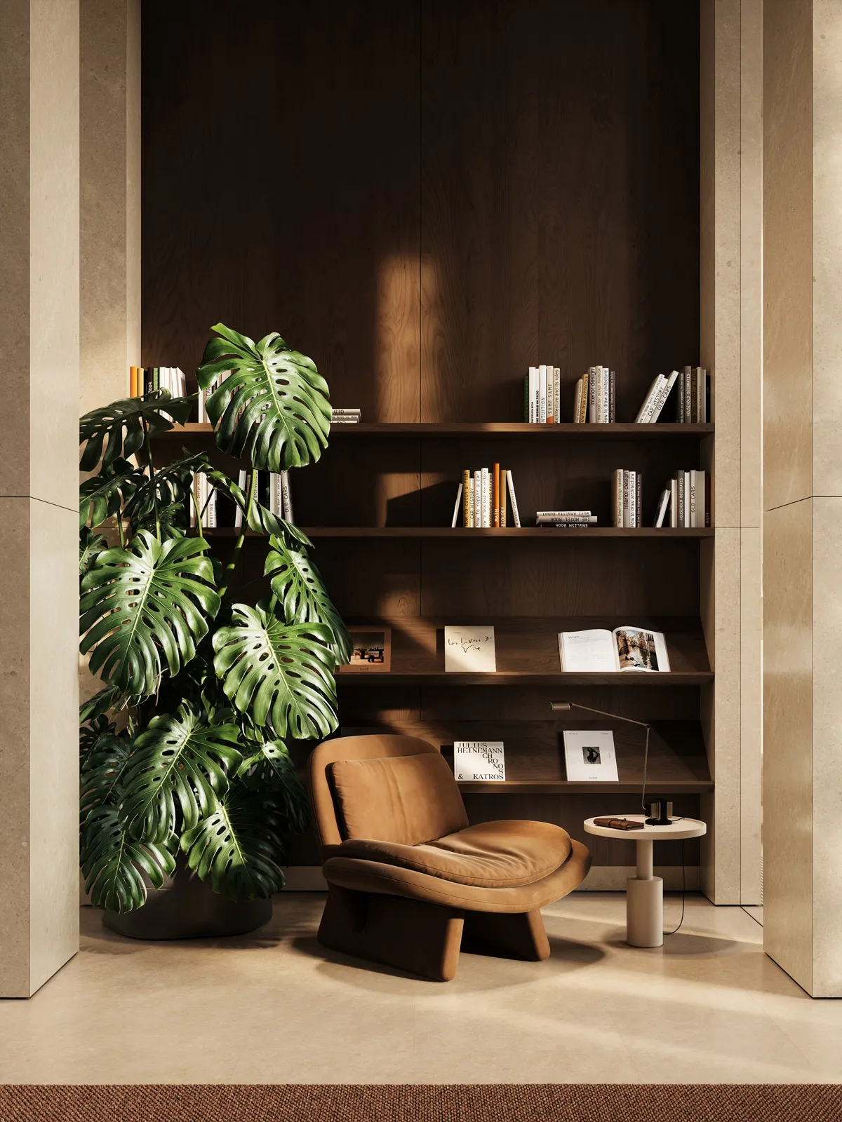
The purpose of this project is to create a sense of calm, harmony, and quiet. The concept is built around subtle architectural gestures and natural materials—stone, wood, and metal—presented in their inherent purity and perceived almost as elemental forms. The design seems to bring us back to the essence of things: to form, texture, light, natural warmth, and tactility.
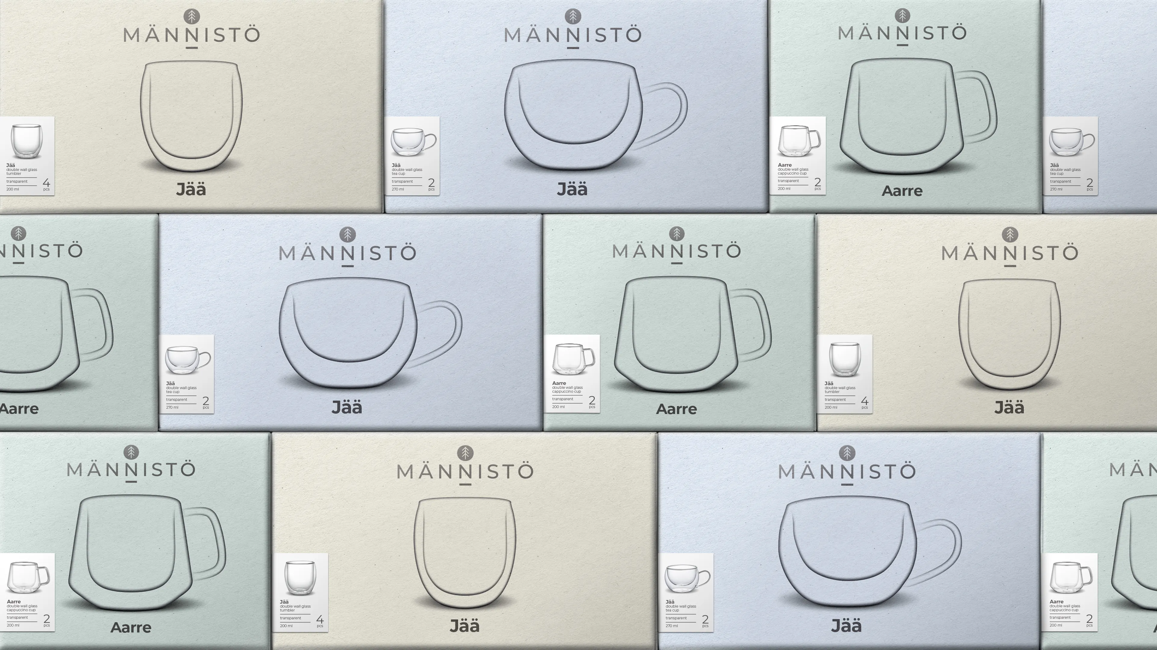
Männistö was founded by Andu Männistö, an Finnish designer with a passion for bringing the beauty of Finnish nature into people’s homes. The brand name is inspired by the Finnish word “männikkö,” meaning “pine forest,” reflecting Männistö’s strong connection to nature and its commitment to using natural materials. Alongside the brand communication, we designed the packaging for Männistö’s glassware collections, Jää and Aarre. Together, the collections feature a total of 12 different glasses. The Männistö glassware packaging range was developed with a less-is-more approach, perfectly reflecting the brand’s core values of simplicity and functionality. For each glass in the collection, we created an iconic, transparent-style illustration that mirrors the shape and character of the product itself. Simplicity at its best.
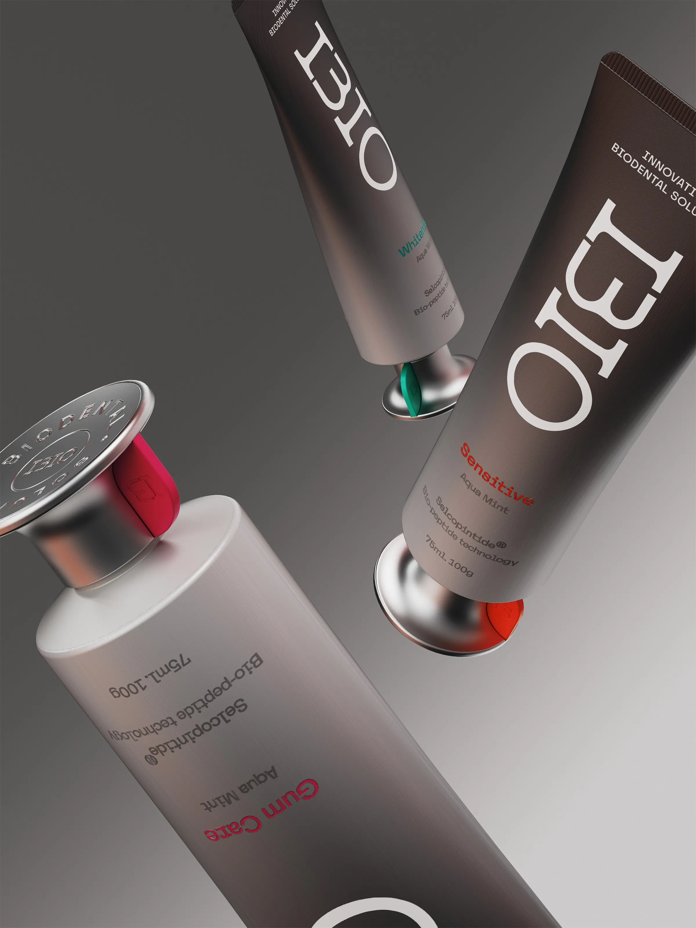
I3IO is Orion’s bio-dental solution brand built on Selcopintide technology. While conventional specialized oral care products have remained focused on the temporary relief of tooth sensitivity and gum problems, I3IO introduces a next-generation bio-dental solution built on the world’s first dentin-regenerating technology. The brand design was developed in a futuristic visual language that helps consumers intuitively understand and trust this innovative technology. The name I3IO is derived from dentin regeneration on the 3rd day. The combination of “I” and “3” was designed to be read as “BIO.” The wordmark conveys both this technological meaning and the concept of regeneration with a refined expression. The orange gradient rising from the bottom of the package visualizes regeneration and recovery, and when combined with bright silver, creates a distinctive identity in the oral care market. By translating advanced technology into a refined and differentiated brand experience, the design embodies Aesthetic Science.

Cauce (Spanish for “riverbed”) is a chair based on a modest idea of the river as a structure that shapes cities and their surroundings. Its name refers to the terrain through which water flows, a shifting boundary that guides movement without settling into a fixed form. The design draws from the relationship between the city of Rosario, Argentina, and the Paraná River, a vast territorial system that defines the region’s geography and ways of inhabiting it. In Rosario, the river is an active edge, a space of encounter, transition, and continuous redefinition between the built environment and open territory. The chair translates this condition into a concise, architectural language. Developed in collaboration with the Rosario-based gallery Darkhaus and in dialogue with local production networks, the project forms part of an ongoing reflection on how objects are made and circulated, and on the role of design within Argentina’s broader creative scene. Like the river itself, Cauce reflects a sustained process shaped over time, grounded in durability and in the capacity of design to become part of everyday life.
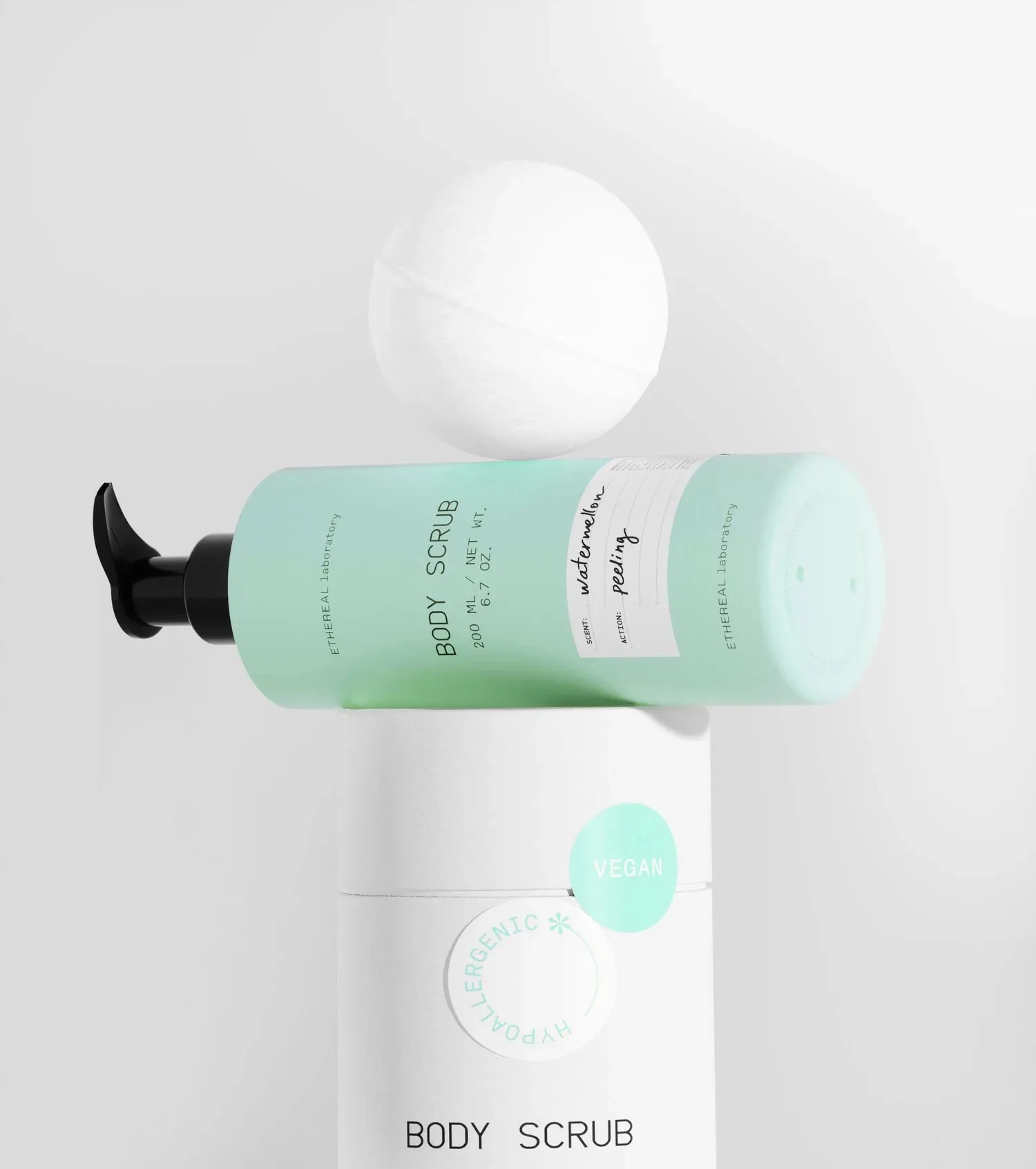
Ethreal Dermocosmetics is a new Greek brand producing body & foot care products. It's vision is to harmoniously combine the wonderful feeling of the essential care of our body with unique aromas and textures. Ethereal Lab is their new series which has a more pharmaceutical character. All the products are build to order with ingredients selected by each customer according to their needs. We were assigned to design the series' packaging where our main goal was for the materials and the color palettes to reflect the special tailor made character of the brand.
The VAND Design Award is evaluated by an international jury of experienced designers, creative directors, educators, and design leaders from around the world.


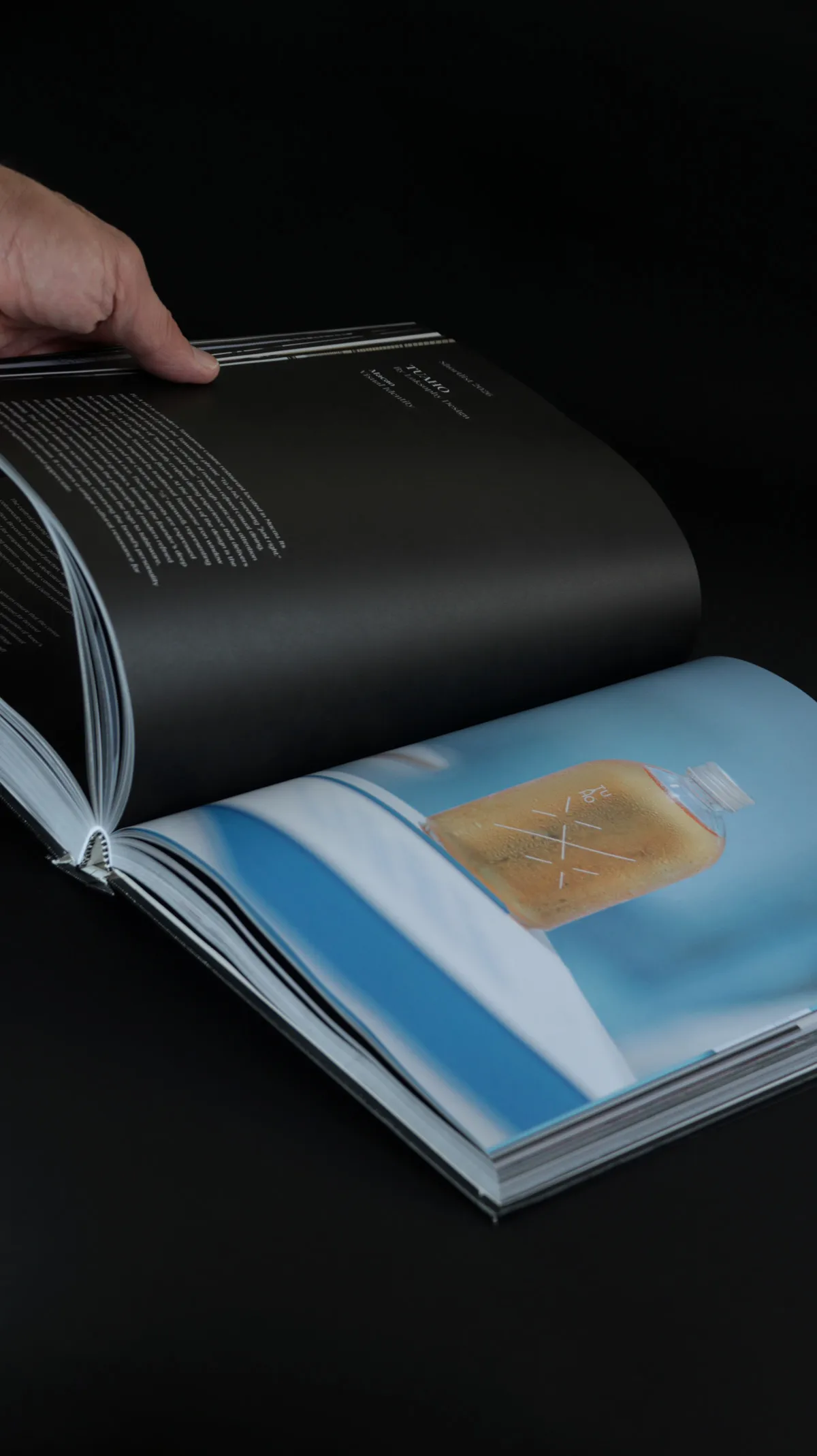
Featuring members of the VAND Responsible Design Movement, VAND Award Winners, and selected Shortlisted projects from around the world.
Selected 2027 Winners and Shortlisted projects may be featured in the next edition.
Closes: 31 November 2026
Entries received after 31 November are considered in the next Round.
We honour the designers who make it quiet.


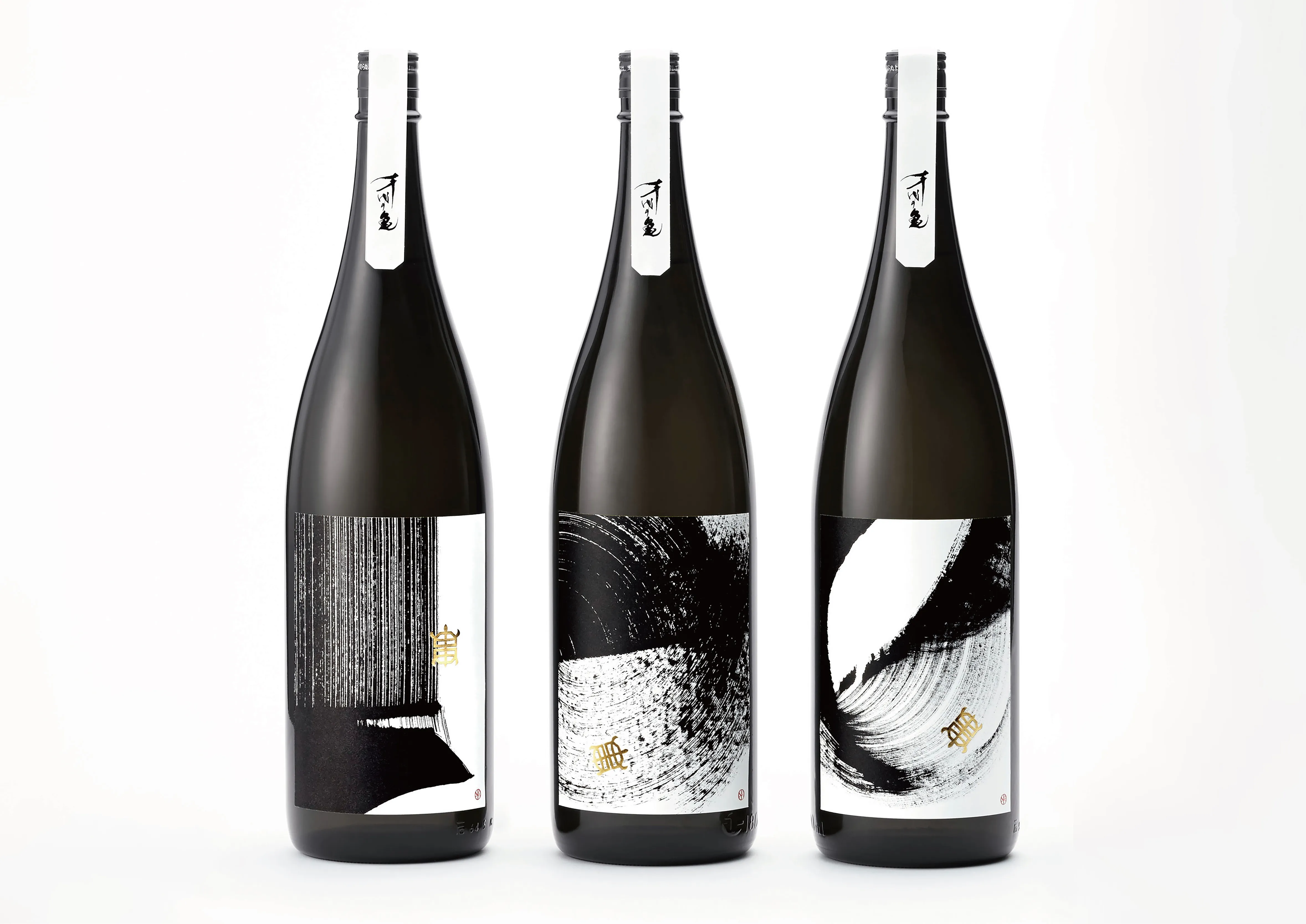

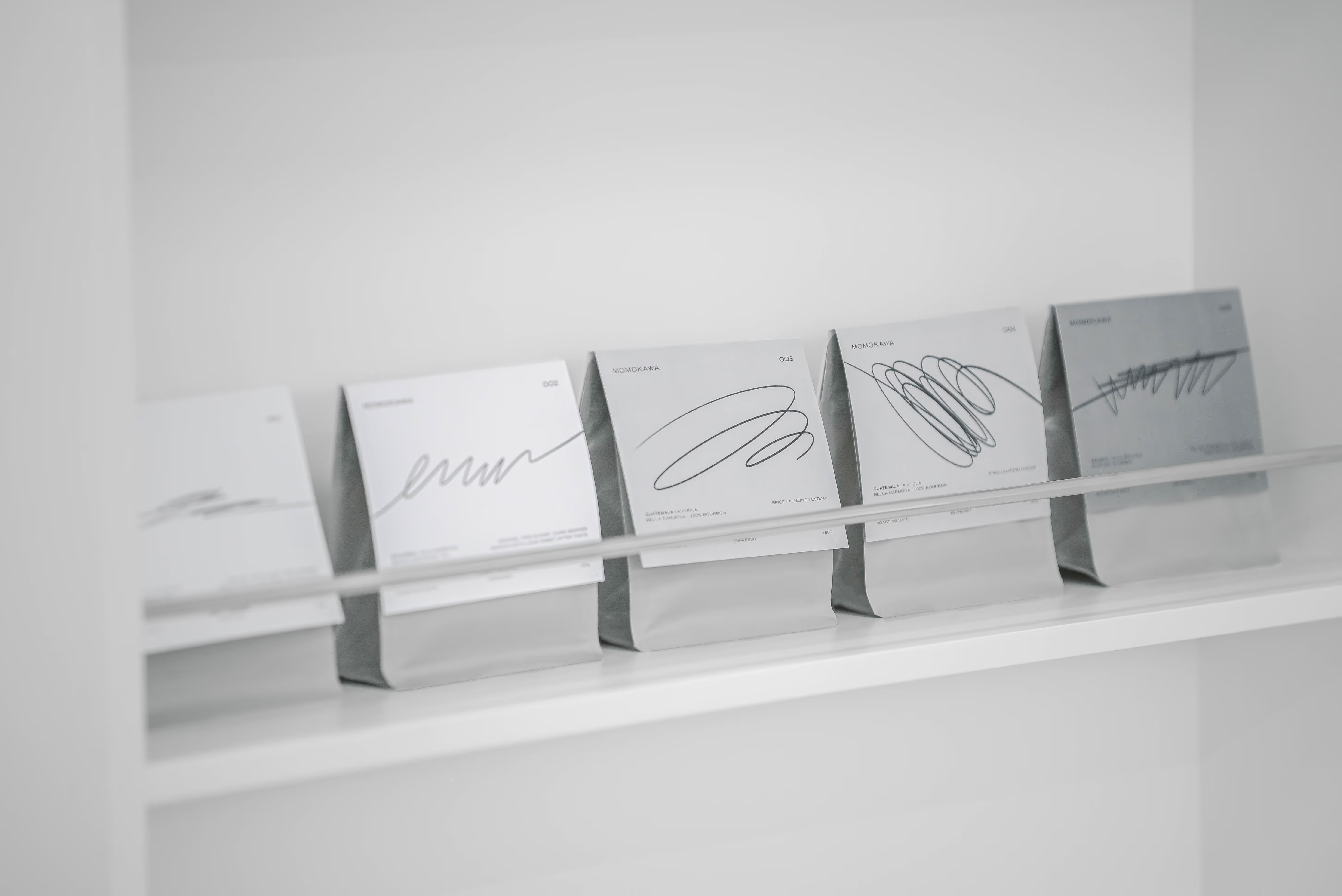
Selected every month.
• A dedicated video on the VAND Social Media
• A dedicated page on the VAND website
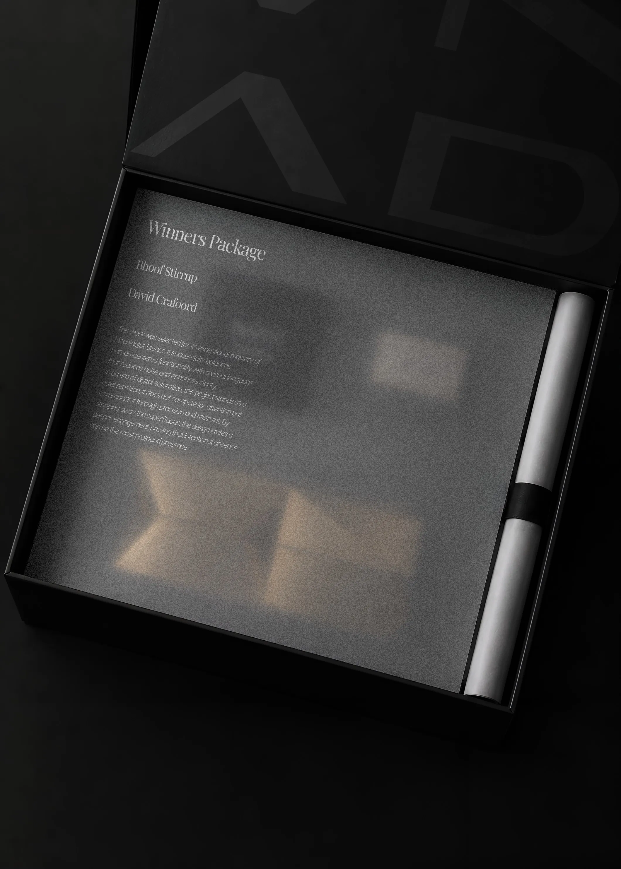
Everything in the Shortlist, plus access to the optional Winners Package (from €500):
• VAND Trophy
• Printed Certificate
• VAND Year Book
• Winner Card
All selected projects receive digital certificates, badges, and web publication at no extra cost. Optional physical trophy & hardcover yearbook packages are available for confirmed winners.
• Premium printed VAND Certificate recognition.
• VAND Trophy
• Publication in the VAND Design Award Book
• Dedicated Winner Page on the VAND website
• Premium presentation and packaging
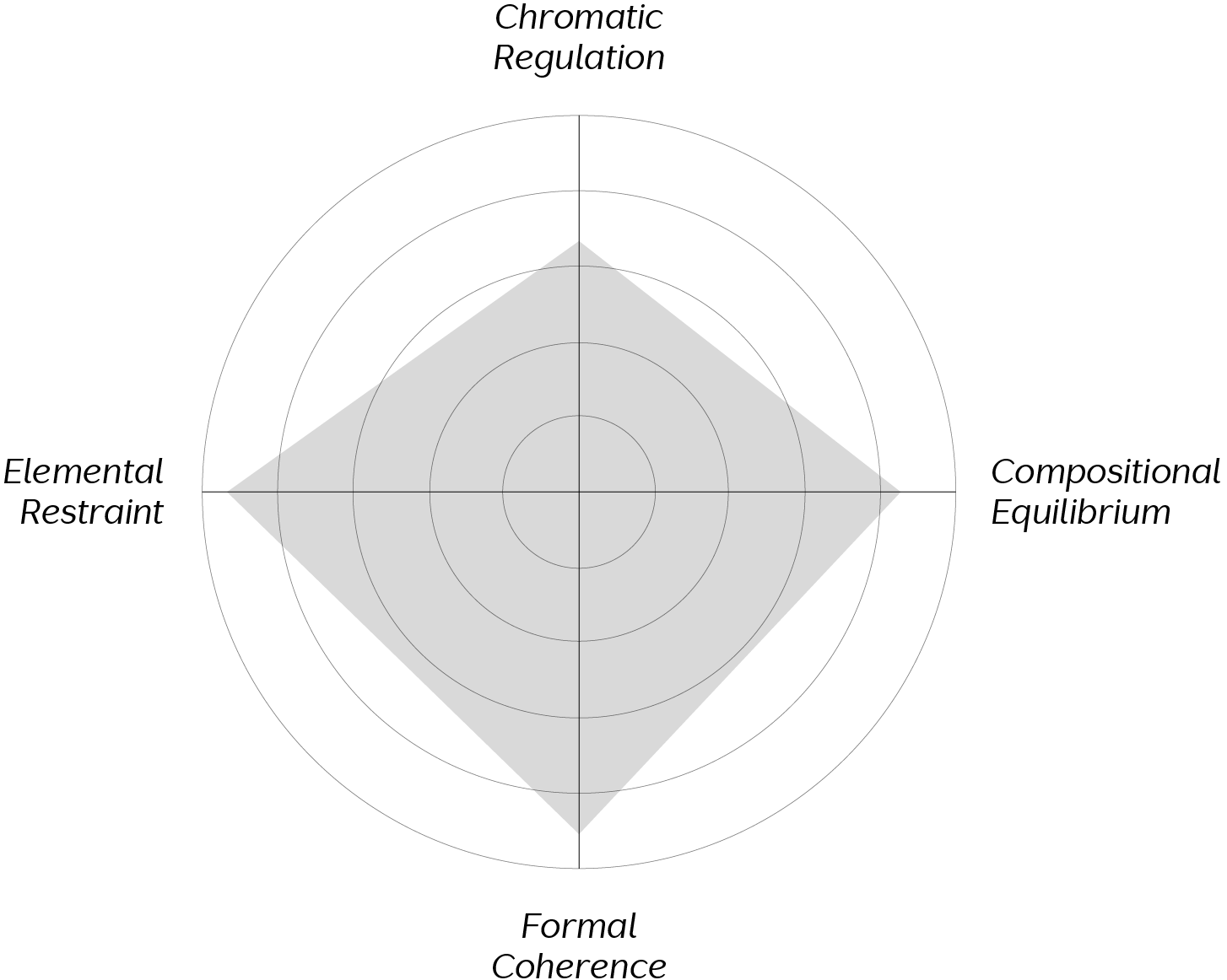
Every submission is evaluated through a structured judging process.
The jury considers the quality, clarity, relevance, innovation, craftsmanship, responsibility,
and human impact of each project.
Recognition is based on the strength of the work, not popularity or personal preference.