.svg.webp)





Product Name: Windows 11 — Start menu and taskbar
Brand: Microsoft
Category: Operating system user interface
Manufacturer: Microsoft Corporation
Designer: Microsoft Windows Design team
Identification Confidence: High — corroborated by multiple independent Microsoft and press sources.
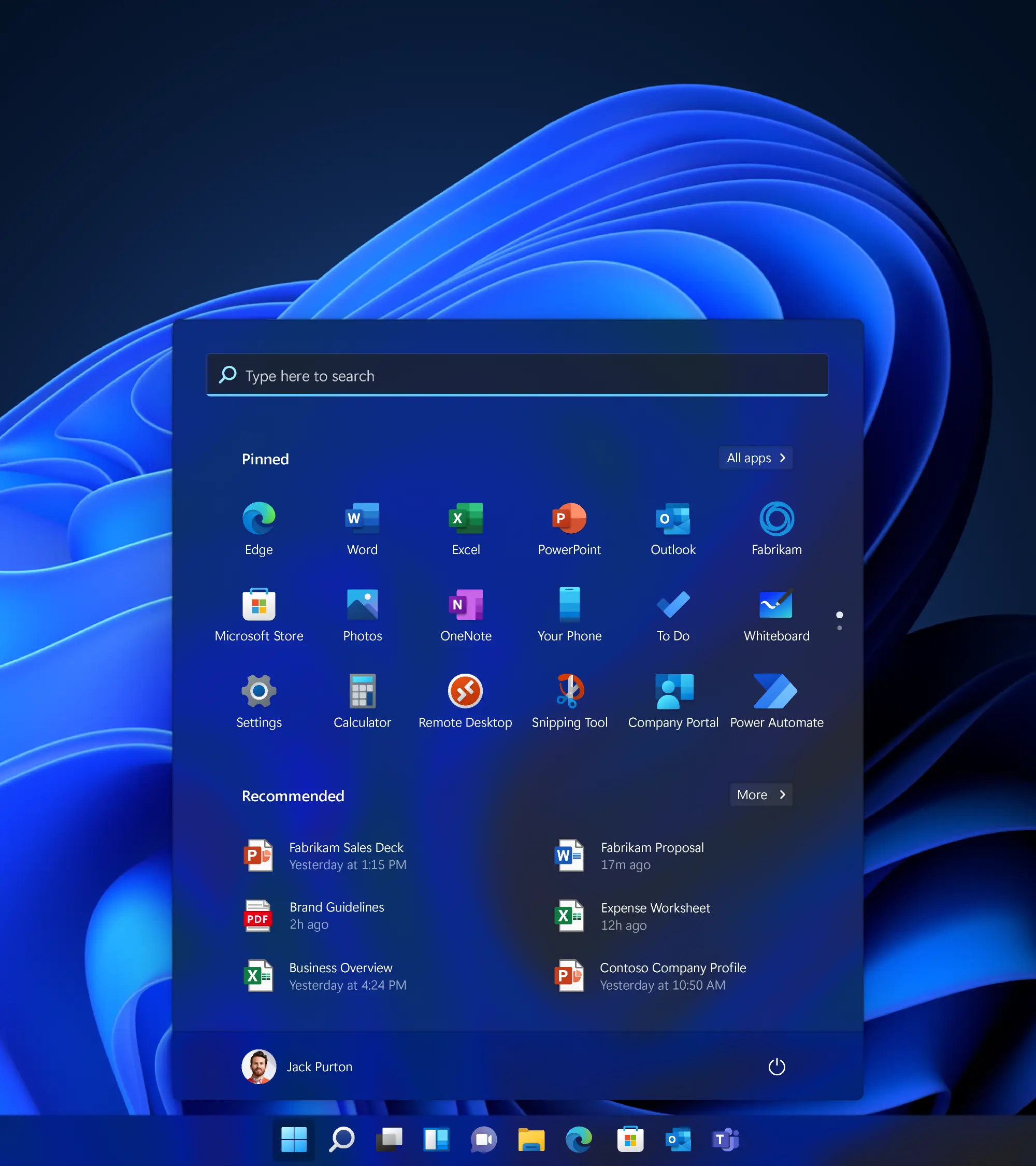
A calm, centred interface whose consistent geometry is undercut by a secondary content zone that competes with its own primary purpose.
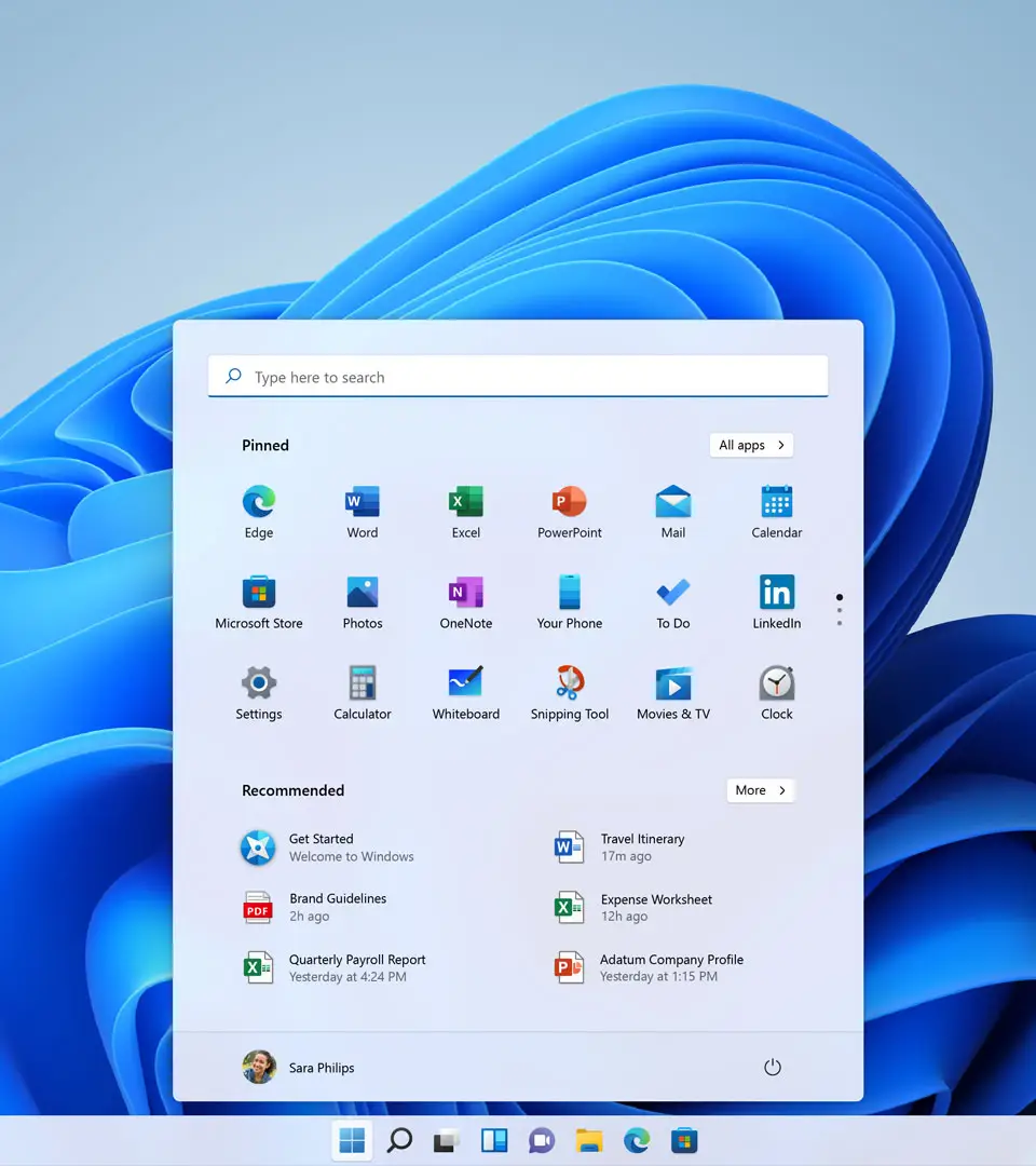
This Start menu and taskbar represent one of Windows 11's clearest departures from its predecessor: a centred taskbar, rounded corners applied consistently across every window and menu, and a translucent background that ties the interface visually to the desktop behind it. The search bar sitting at the top of the Start menu establishes a clear primary action, and the grid of pinned app icons below it is evenly spaced and legibly labelled. Where the design's hierarchy becomes less certain is in the 'Recommended' section beneath the pinned apps — a list of recently used files and suggestions that occupies roughly half the menu's vertical space, competing directly with the pinned apps for attention despite being, for many users, of secondary importance. This is a well-crafted piece of visual language undercut by a content-hierarchy decision that doesn't fully serve the interface's own stated goal of fast, calm app access. It certifies in the B class.
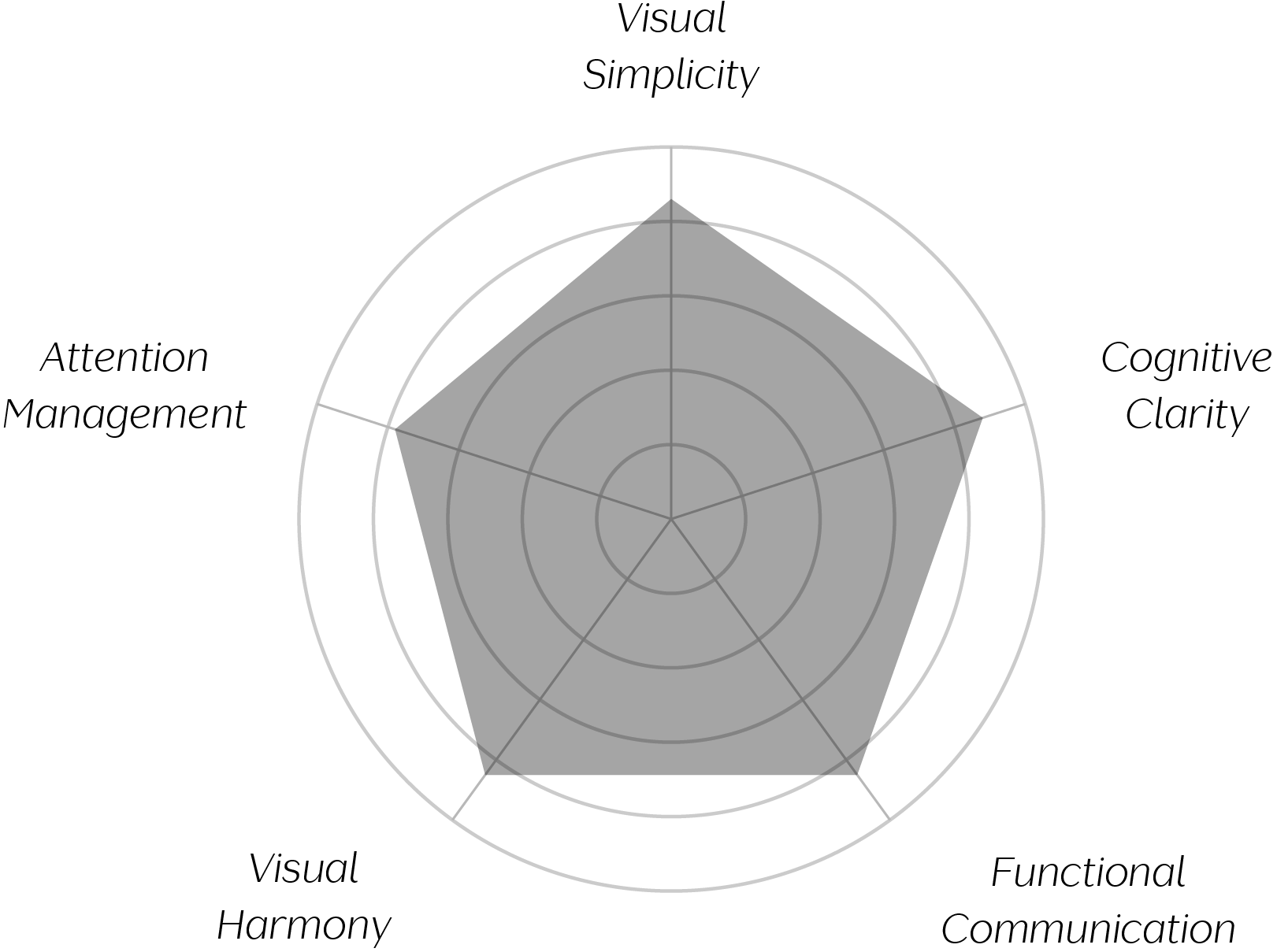
Vand Score 84 / 100
Performance across the five core Vand assessment dimensions.
This interface demonstrates that a consistent geometric language — one corner radius, one translucency treatment — can unify a screen built from dozens of small, individually interactive elements into something that reads as calm rather than busy.
It also shows that centring a primary navigation element, rather than defaulting to a traditional edge alignment, can meaningfully change the perceived balance of an entire screen, even when the individual components themselves are largely unchanged.
Most instructively, the design is a clear case study in how giving two sections of different purpose — deliberate user choice versus system-generated suggestion — similar visual weight can undermine an otherwise clear hierarchy, regardless of how well each section is individually designed.
The evidence supports certification at Class B. This Start menu succeeds at applying a consistent, calm geometric language across a screen with many individually functional elements, and its centred taskbar represents a genuine, well-executed formal departure from prior conventions. Its search bar correctly establishes the interface's primary purpose, and its labelling is consistent and clear throughout. What holds it back from a higher tier is the relationship between its two main sections: Pinned apps and Recommended content are given close to equal visual priority despite serving different purposes, a tension echoed in public feedback about the design since its release. This is an interface built with real material discipline, whose next challenge is bringing that same discipline to its own internal hierarchy. As a closing observation: a calm surface still needs a clear order of attention beneath it, and that order is this design's one unfinished argument.