




Product Name: Trade Republic (mobile application interface)
Brand: Trade Republic
Category: Mobile brokerage / investing application
Manufacturer: Trade Republic Bank GmbH
Designer: No publicly verified designer has been identified for this product.
Identification Confidence: High
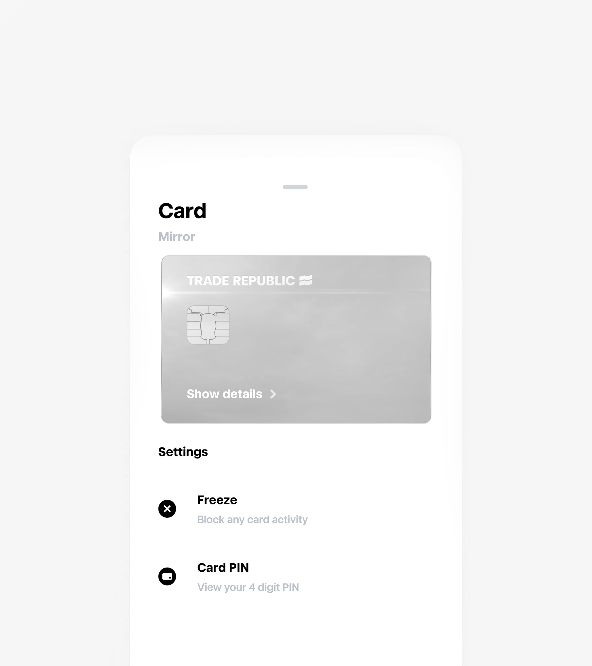
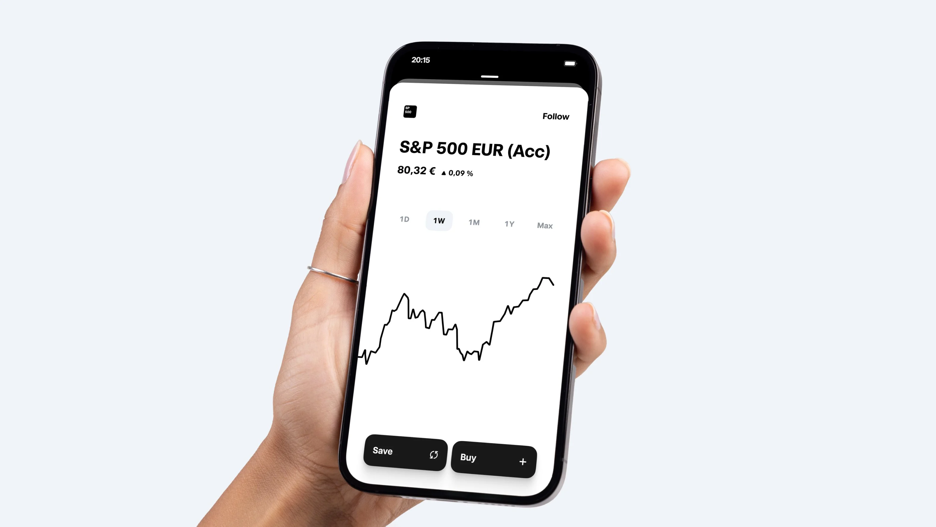
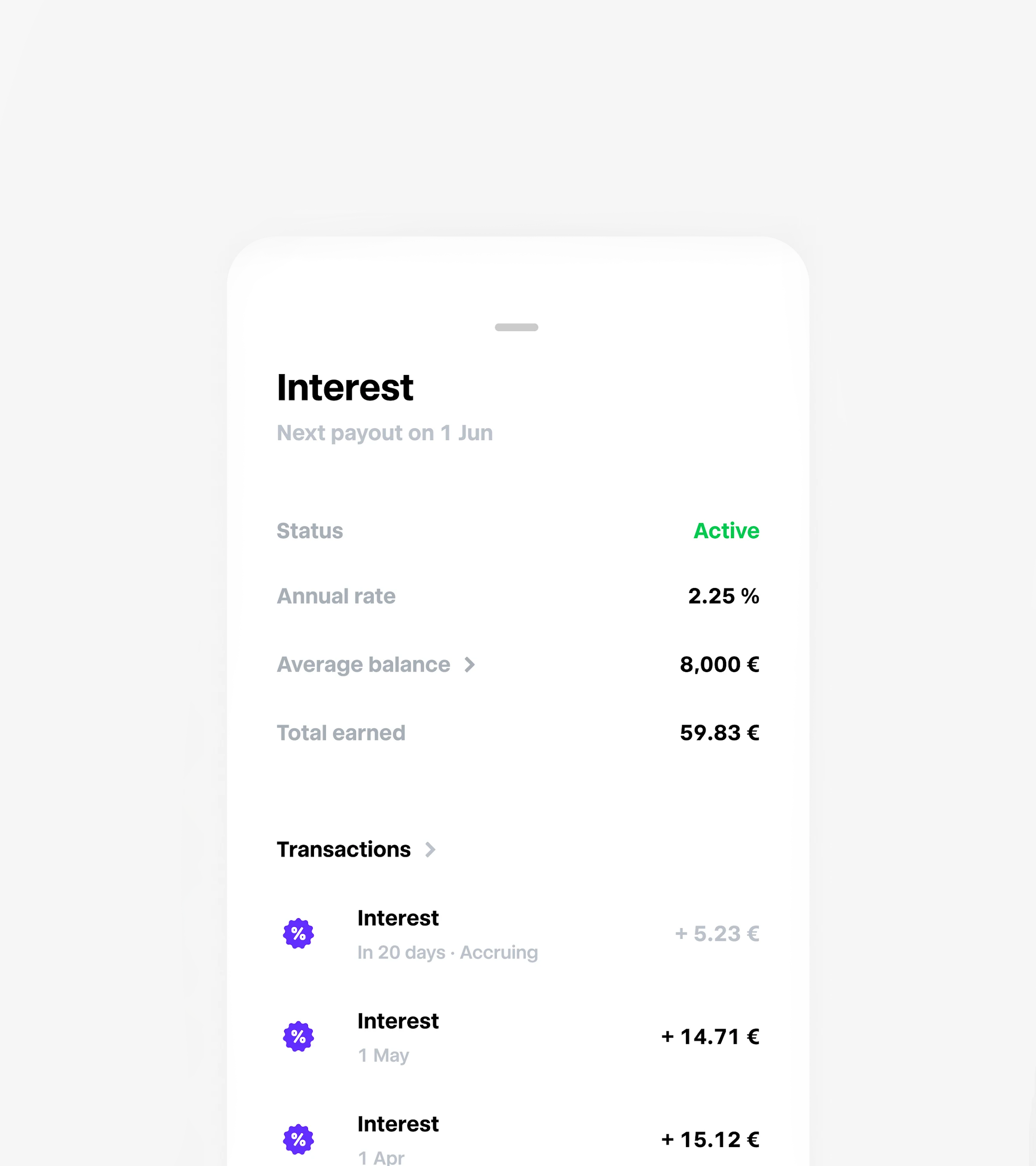
Trade Republic's interface belongs to a category — investing and brokerage apps — where visual restraint is genuinely rare; the category norm is dense tables, competing colors, and information stacked without hierarchy. What is submitted here does something different across every screen evaluated: a near-black or near-white surface, one accent color used sparingly, and numbers given room to be the largest thing on the page. The order-confirmation screen, the portfolio overview, and the interest-earnings screen all share the same visual discipline despite representing very different tasks. The one meaningful gap is in the portfolio chart view, where an unlabeled percentage-only axis and dense timeframe tabs introduce a small amount of the density the rest of the interface otherwise avoids. This is a strong, well-earned Class A certification.
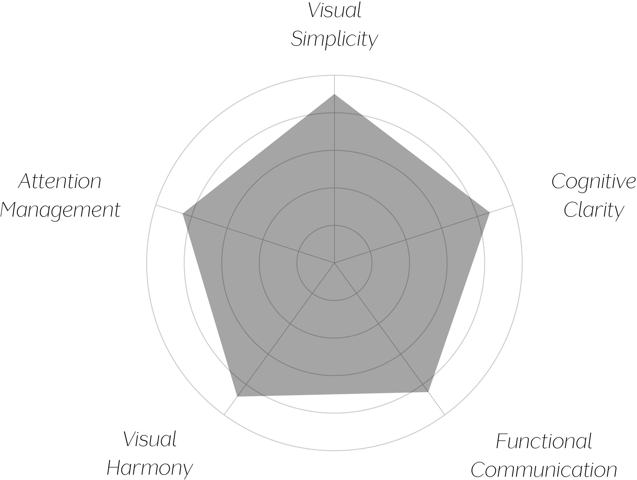
Vand Score 87/ 100
Performance across the five core Vand assessment dimensions.
Financial interfaces are usually loud by default, because the category assumes that more visible data signals more trustworthiness. This submission argues the opposite: that trust is communicated through what the interface chooses not to show, and the restraint itself becomes the credibility signal.
The decision to render a real-money transaction confirmation as a short, calm list rather than a dense summary table is the single most consequential design choice in the set — it treats a high-stakes moment with less visual pressure, not more, which is precisely the inversion VAND's protocol rewards.
Consistency of accent color across radically different screens — from an interest ledger to a live percentage chart — demonstrates that a single well-chosen color, used sparingly, can carry more identity than a broader palette would.
The jury finds an interface that treats restraint as a design strategy rather than an aesthetic preference — in a category built on the assumption that more information displayed means more confidence earned, this design consistently chooses to show less and trust the viewer more. The confirmation flow for a real financial transaction, rendered with the same calm as a passive interest ledger, is the clearest evidence of a design philosophy applied without exception. Minor density in the chart and watchlist views keeps this short of the highest tier, but the underlying discipline is sound throughout. The interface that earns the most trust in finance is often the one that asks the least of the eye.