



Product Name: Lufthansa Aircraft Livery (current identity)
Brand: Lufthansa
Category: Corporate/Aviation Visual Identity
Manufacturer: Deutsche Lufthansa AG
Designer: No publicly verified individual designer has been identified for this product.
Identification Confidence: High (brand and livery); Not Applicable (individual authorship)
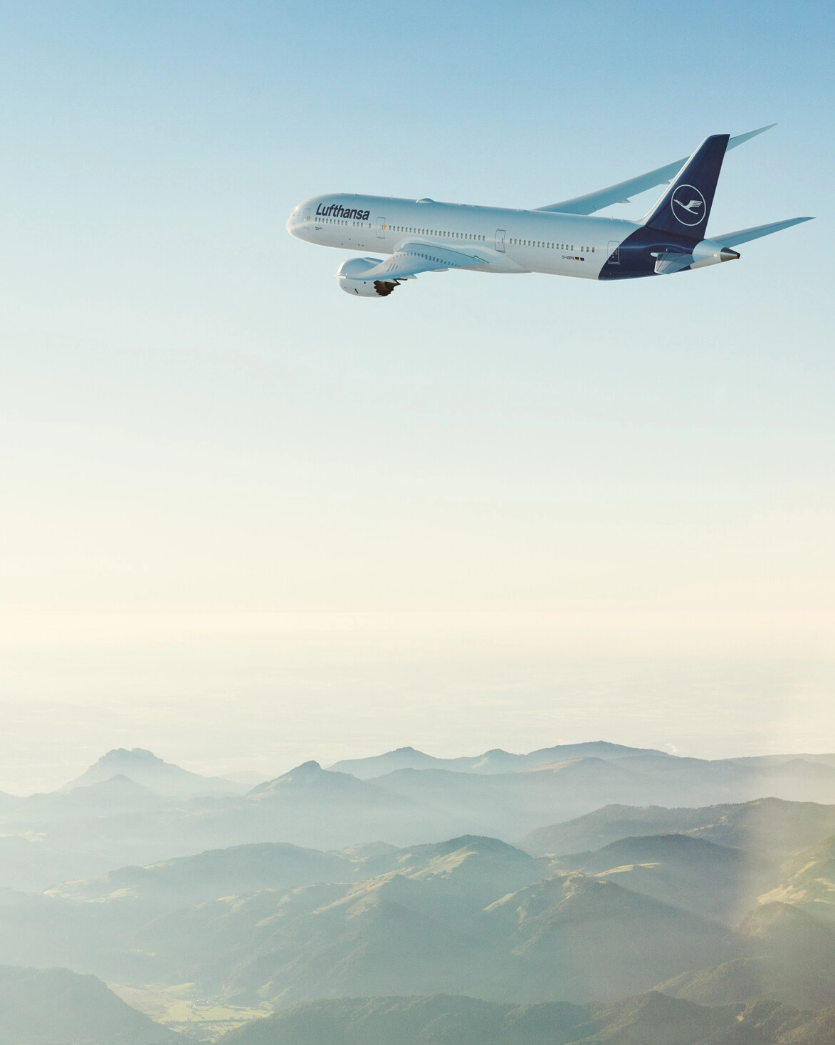
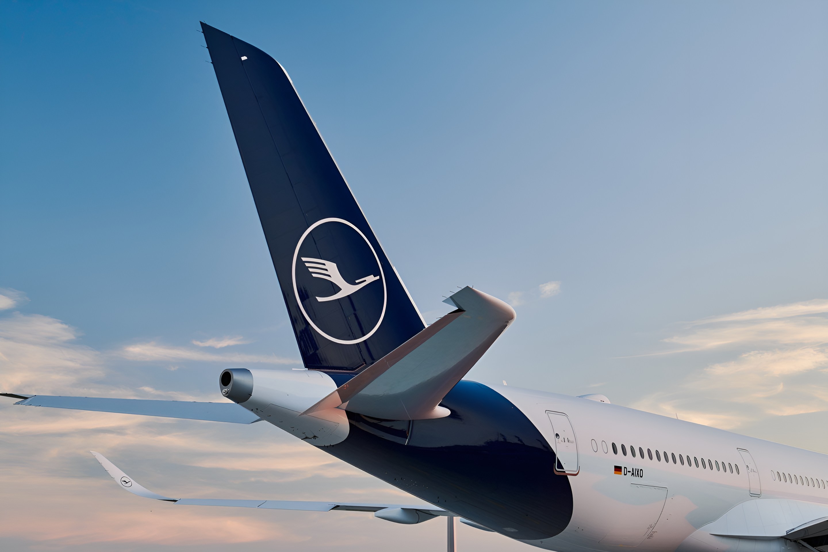
The current Lufthansa livery is built on restraint applied with real confidence. A single deep navy tail, anchored by the circular crane emblem, is set against an otherwise unbroken white fuselage, with the wordmark rendered in the same navy and placed with generous, uncluttered spacing along the forward cabin. Nothing else competes for attention: no secondary graphic, no accent stripe, no applied pattern along the belly or engines. This is a livery that treats an aircraft's considerable surface area as an opportunity for calm rather than an obligation to fill, and the result reads as credible and composed from every angle shown, whether banking against clouds or climbing against open sky. The design's few points of friction are minor: the crane emblem, while iconic, is a dense mark rendered at a scale where its internal linework is difficult to resolve at a distance, and the transition between the navy tail and white fuselage, though clean, is the only area where the design asks a small amount of visual negotiation. Overall, this is a mature identity applied with unusual discipline to a genuinely difficult canvas.
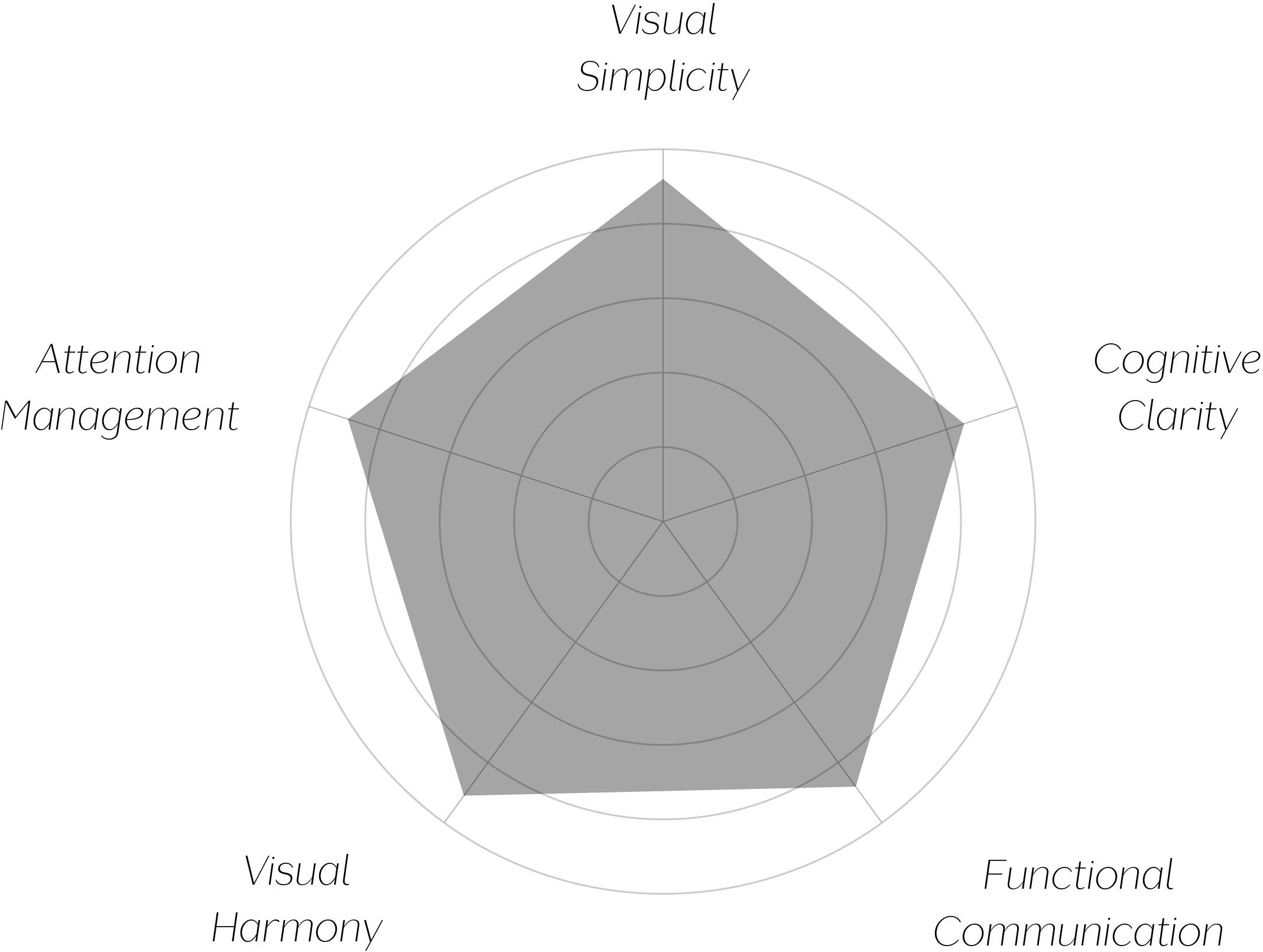
Vand Score 89/ 100
Performance across the five core Vand assessment dimensions.
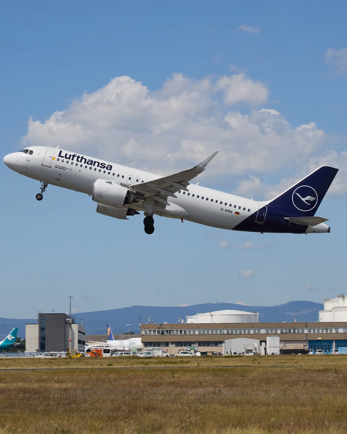
The Lufthansa livery demonstrates that restraint, applied to a canvas as large as a commercial aircraft, is not a default but an active decision requiring real discipline — every empty white panel here is a choice not to add something, sustained consistently across the entire body. That discipline is precisely what gives the tail mark and wordmark their authority.
The livery also shows that a legacy emblem can be preserved without needing to dominate the surface it appears on. By concentrating the crane mark at the tail rather than repeating or enlarging it elsewhere, the design lets a historically significant symbol do meaningful identity work without requiring visual reinforcement throughout the rest of the aircraft.
The jury's judgment rests on the discipline this livery demonstrates across an unusually large and unforgiving canvas. Rather than filling the aircraft's considerable surface area with reinforcing graphics, the design trusts two elements — a historic tail mark and a confidently spaced wordmark — to carry the entire identity, and that trust is repaid in a livery that reads as calm, credible, and consistent across aircraft types and lighting conditions.
Certification is awarded at Class A rather than A+ because the crane emblem's detail slightly outpaces its own legibility at distance, a minor tension in an otherwise highly resolved system.
Restraint, sustained across a surface this large, is its own form of confidence — and this livery wears that confidence well.